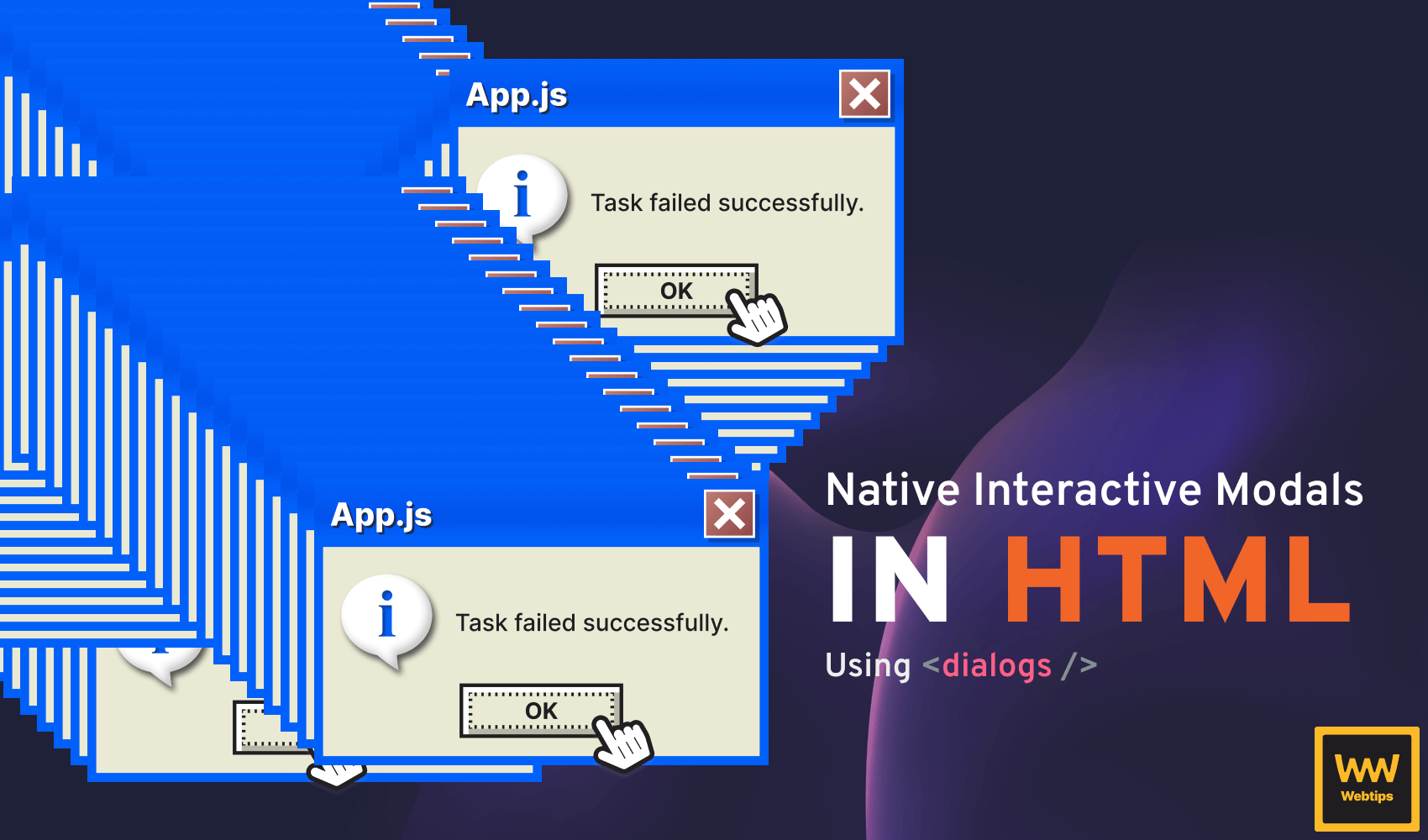
How to Create Native Interactive Modals in HTML
 8 min read
Modals are often a core part of interactive web applications. They appear on top of the existing page after a user action, often accompanied by a backdrop to draw attention to the popup and ask for further actions from the user, such as confirmation, like deleting information.
In this tutorial, we will take a look at how to create an interactive modal in HTML natively using the dialog element introduced in HTML5.

Create the Modal in HTML
To create a native modal in HTML, we need to use the dialog element. A dialog represents a dialog box, often called a modal, that is displayed on top of the existing content. Everything that goes inside the dialog will be displayed inside a modal:
<dialog id="dialog">
    <p>✅ Task failed successfully.</p>
    <form method="dialog">
        <button>Ok</button>
    </form>
</dialog>

<button onclick="dialog.showModal()">Open Dialog</button>Elements with ids are available in the global scope. Therefore, a dialog variable will be created globally for the above element.
The above code will create a fully functioning modal that can be opened and closed with the buttons. To make this work, we need the following three things:
- Line 1: Add an
idfor thedialogthat can be referenced later on. - Line 3: Create a
forminside thedialogwith amethod="dialog"attribute. This will automatically tell the browser to close the dialog when the button is clicked. Dialogs can also be closed by hitting theEsckey. - Line 8: Add an
onclickevent to a button that calls theshowModalmethod on thedialog. This will open the dialog on click.
Handle modals in JavaScript
This is already working. However, a better way to handle dialogs is to attach the event listener in JavaScript. This way, we can separate the logic from the HTML file.
Furthermore, using IDs as global variables is not recommended. When your application grows, it is easy to create a different element with the same ID and break the functionality of your application. To achieve the same in JavaScript, change the above to the following:
- <dialog id="dialog">
+ <dialog>
      ...
  </dialog>

- <button onclick="dialog.showModal()">Open Dialog</button>
+ <button class="trigger">Open Dialog</button>
Remove the id from the dialog and the onclick attribute from the button. Instead, add a new class that can be referenced through JavaScript. Based on this class, we can attach the event listener inside JavaScript:
const dialog = document.querySelector('dialog')
const button = document.querySelector('.trigger')

button.addEventListener('click', () => dialog.showModal())Handle multiple modals on the same page
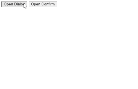
Now the logic from the HTML is uncoupled. However, what happens if we have two separate modals on the same page that can be triggered with two different buttons? Take the following as an example:
<dialog>
    <p>✅ Task failed successfully.</p>
    <form method="dialog">
        <button>Ok</button>
    </form>
</dialog>

<dialog>
    <p>⚠️ Please confirm your action.</p>
    <form method="dialog">
        <button>Confirm</button>
    </form>
</dialog>

<button class="trigger">Open Dialog</button>
<button class="trigger">Open Confirm</button>We have two different modals and two different .trigger buttons. However, if we click on the "Open Confirm" button, it will do nothing.
This is because, in JavaScript, document.querySelector will only grab the first element it finds. Therefore, only the first button has an event listener attached and linked to the first modal. In order to get around this, we can introduce data attributes to connect the reference from any button to any modal:
<dialog data-id="okModal">
<p>✅ Task failed successfully.</p>
<form method="dialog">
<button>Ok</button>
</form>
</dialog>
<dialog data-id="confirmModal">
<p>⚠️ Please confirm your action.</p>
<form method="dialog">
<button>Confirm</button>
</form>
</dialog>
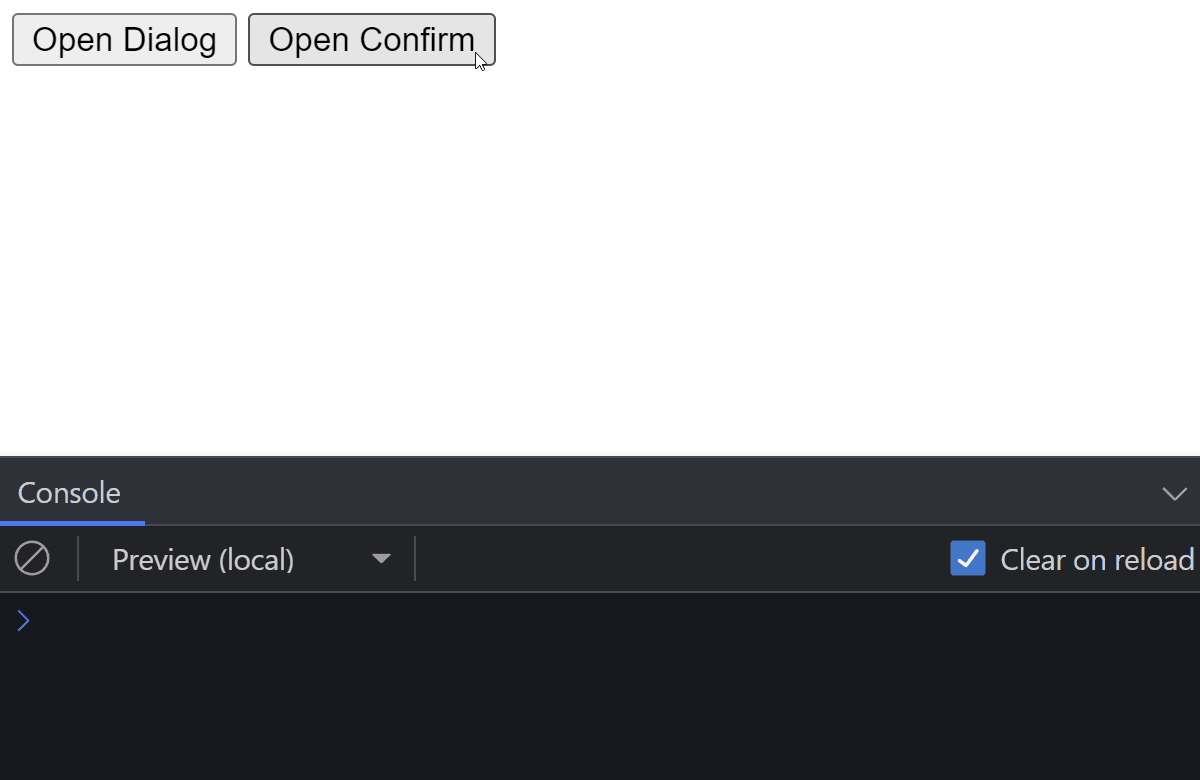
<button data-trigger="okModal">Open Dialog</button>
<button data-trigger="confirmModal">Open Confirm</button>In this example, we have introduced two new attributes that reference each other:
data-id: This should be a unique ID that can be referenced in adata-triggerattribute. The reason we don't want to use regularidattributes is to clearly communicate that this attribute is used for functionality and not necessarily for styling.data-trigger: This should reference adata-idattribute; the modal that should be opened by this button.
To connect them in JavaScript, add the following to your code:
document.addEventListener('click', event => {
    const trigger = event.target.dataset.trigger

    if (trigger) {
        document
          .querySelector(`[data-id="${trigger}"]`)
          .showModal()
    }
})
This works by adding a click event listener to the entire document using document.addEventListener. Based on which element triggered the event, we can check if it has a data-trigger attribute using event.target.dataset.trigger. If it has, we can grab the proper dialog based on its value and call showModal on the queried element.
Now we can trigger multiple modals on the same page with different buttons, and we can create as many as necessary without introducing any additional logic in JavaScript.
 Remove ads
How to Handle Multiple Modal Actions
Let's extend the example with multiple buttons. When more than one button is present on a modal, we need to be aware of which button was clicked. To achieve this, add a value attribute to the buttons that we can pick up in JavaScript:
<form method="dialog">
    <button value="cancel">Cancel</button>
    <button value="confirm">Confirm</button>
</form>When a dialog is closed, a close event is triggered on the element. We can listen to this event in JavaScript to determine which button was clicked when the dialog got closed:
Array.from(document.querySelectorAll('dialog')).forEach(dialog => {
    dialog.addEventListener('close', () => {
        console.log(dialog.returnValue)
    })
})Since we can have multiple dialogs on the same page, we need to attach an event listener to each of them. As the event is only fired on dialog elements, we cannot delegate the event from the document. Instead, we can use querySelectorAll to select all dialogs on the page and attach an event listener to each of them.
Array.from will create an array from a NodeList. This way, we can use forEach to loop through the DOM elements.
Whenever a dialog is closed, the returnValue will be populated with the value of the button that triggered the event. Based on this value, we can take different actions.
dialog.returnValue will contain the value of the actionHow To Style the Modal
We have covered everything about how to work with a modal. The only thing left to do is to style it. While we are not going to cover everything, there are key parts that need further clarification.
When it comes to displaying a modal, a backdrop is usually displayed behind it to draw attention to the popup. Luckily, we can use a pseudo-element in CSS to target this backdrop and style it according to our needs.
To add a backdrop to the modal, we can select the ::backdrop pseudo-element. In the above examples, it is set to 70% black:
dialog::backdrop {
    background: rgb(0 0 0 / 70%);
}In case a modal needs to be opened by default, we can add an open attribute to the dialog element. Styling this element differently from the rest of the modals can also be achieved using the following selector:
dialog[open] {
    ...
}Last but not least, a common practice is to create a header and footer section for a modal to style the top and bottom parts differently from the content. This can be achieved with additional div wrappers:
<dialog>
    <div class="dialog-header">
        <b>App.js</b>
        <form method="dialog">
            <button>❌</button>
        </form>
    </div>
    <p>✅ Task failed successfully.</p>
    <div class="dialog-footer">
        <form method="dialog">
            <button value="cancel">Cancel</button>
            <button value="confirm">Confirm</button>
        </form>
    </div>
</dialog>Conclusion
With everything in place, now you have a fully functioning natively created modal that you can start using in your application. Is there anything missing from this tutorial? Let us know in the comments below! Thank you for reading this tutorial, happy coding! 👨💻
If you are looking to learn more about frontend development, make sure you take a look at our JavaScript roadmap to learn everything you need to know about one of the core parts of the web: JavaScript.

Rocket Launch Your Career
Speed up your learning progress with our mentorship program. Join as a mentee to unlock the full potential of Webtips and get a personalized learning experience by experts to master the following frontend technologies:
Courses

Recommended
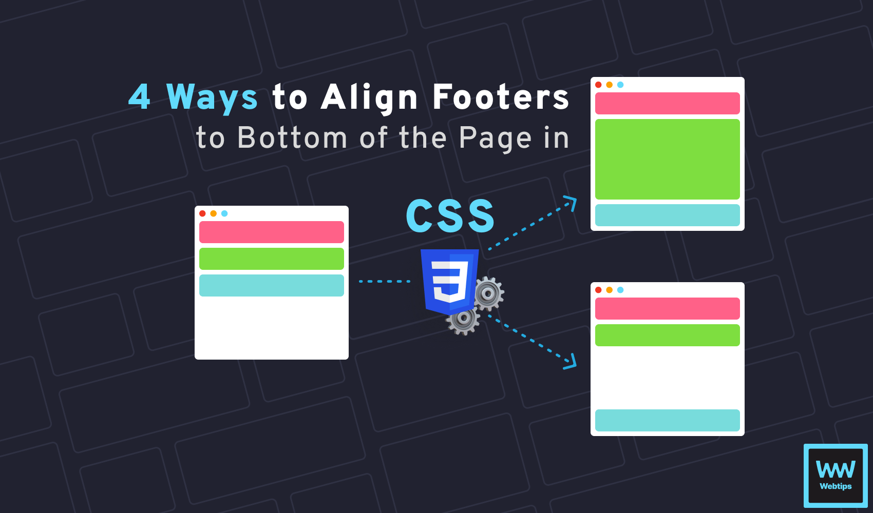
4 Different Ways to Align Footer to Bottom of Page in CSS
4 min read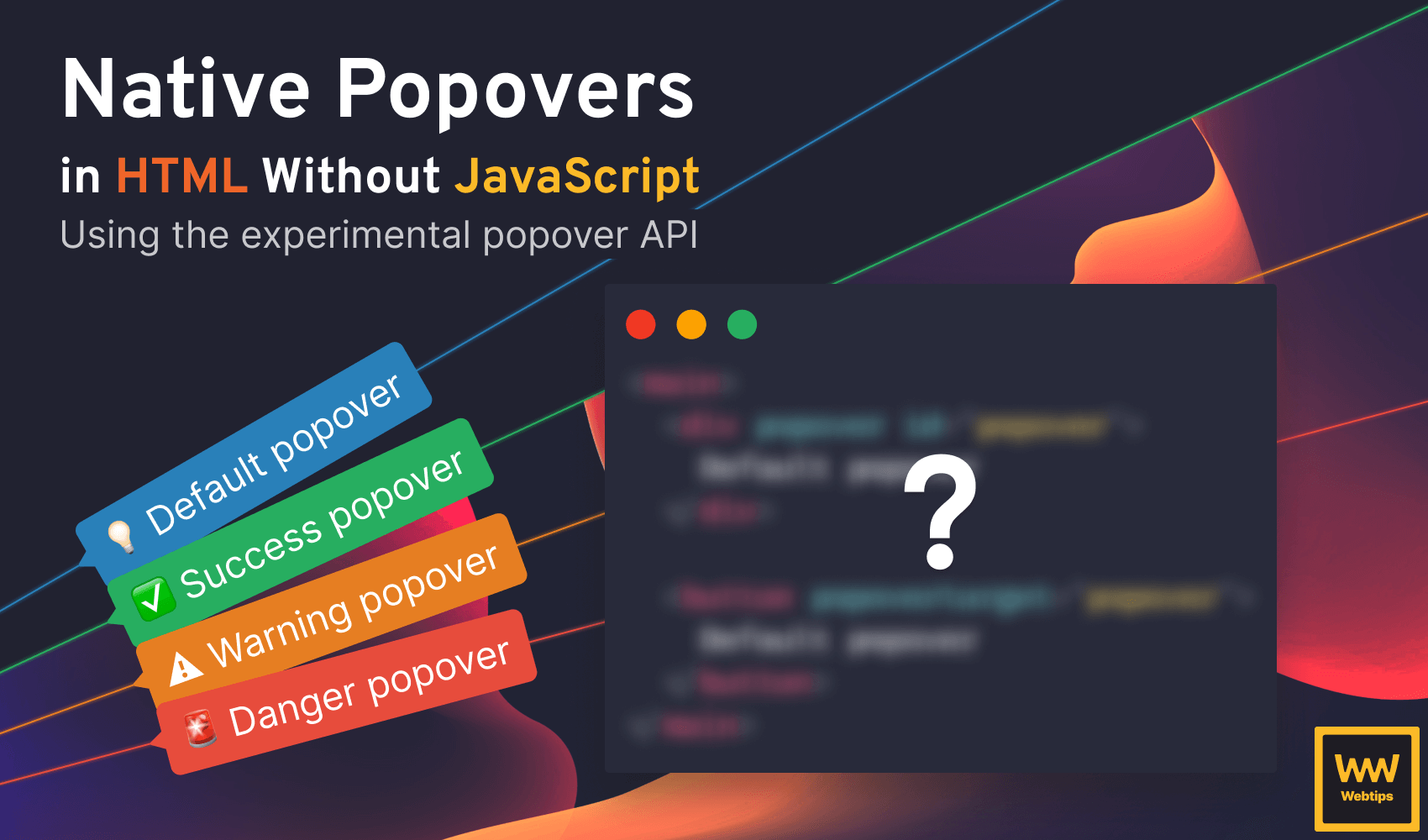
How to Create Native Popovers in HTML Without JavaScript
6 min read
How to Render Anchors Without Href in React
4 min read