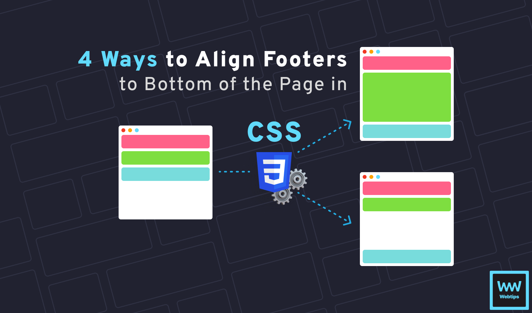
4 Different Ways to Align Footer to Bottom of Page in CSS
 4 min read
Displaying footers at the bottom of a page is a commonly used layout. However, when your site has little content, getting the footer to stick to the bottom of the page might be tricky.
In this tutorial, we will take a look at how to align a footer to the bottom of the page using CSS. But first, let's see how the layout looks in HTML that we will be working with.
<body>
    <header>Header</header>
    <main>Main</main>
    <footer>Footer</footer>
</body>
Using Grid
The first solution is to use CSS grid. To push the footer to the bottom of the page, you can add the following styles to your CSS:
body {
    display: grid;
    height: 100vh;
    grid-template-rows: auto 1fr auto;
}Using grid will expand the main element and push the footer to the bottom of the page. The height: 100vh ensures that the element takes up 100% of the height of the visible viewport.
To actually align the footer to the bottom, we need to use the grid-template-rows CSS property. This defines the size of each row. In our case, auto for the header, 1fr (fraction) for the main content, and auto for the footer. Notice how the layout changes with and without the grid-template-rows property.
grid-template-rowsgrid-template-rowsUsing Flexbox
Another possible solution is to use flexbox. In this case, we need to set the display of the document's body to flex and set the flex-direction to column:
body {
    height: 100vh;
    display: flex;
    flex-direction: column;
}

main {
    flex-grow: 1;
}We also need to set flex-grow: 1 on the main element to allow the main content to take up the remaining space and push down the footer to the bottom of the page.
Notice that we need to set the height to 100vh again, as well as set the flex-direction property to column to display the elements under each other. Take a look at how the layout is ordered with the default flex-direction:
flex-direction: column;flex-direction: row;
 Remove ads
Using Margins
There are two other solutions that are worth mentioning, and one of them is using margins with flexbox. Just as in the previous example, we need to set the same properties for the body:
body {
    height: 100vh;
    display: flex;
    flex-direction: column;
  }

  footer {
    margin-top: auto;
}However, if we set margin-top: auto on the footer, we will get the same behavior, except the main content will not take up the remaining space. Take a look at how this differs from the previous example:
flex-grow: 1;margin-top: auto;Using Positioning
Last but not least, we can also use absolute or fixed positioning. In this case, however, the footer will be removed from the default layout order and it will be visible on top of other elements.
Note that we also need to set the width to 100% to ensure the footer takes up the full width of the page.
Summary
So which one should you use? The simplest solution is using grids or flexbox as a second solution. However, in most cases, you may not want to display the entire body of the document as a grid/flexbox layout. In such cases, the second best option would be to go with margins.
If you need to keep the footer floating during scroll, then you will need to use fixed positioning to keep it in the viewport at all times.
Is there anything missing from this tutorial? Let us know in the comments below! Thank you for reading, happy styling! If you would like to learn more about CSS, make sure you check out our CSS category page where we collect all CSS tutorials available on Webtips.

Rocket Launch Your Career
Speed up your learning progress with our mentorship program. Join as a mentee to unlock the full potential of Webtips and get a personalized learning experience by experts to master the following frontend technologies:
Courses

CSS - The Complete Guide (including Flexbox, Grid and Sass)

The HTML & CSS Bootcamp

The Creative HTML5 & CSS3 Course
Recommended
Unleashing the Power of Weather APIs: A Guide for Frontend Developers
6 min read
How to Expand and Collapse Tables in HTML Using CSS
5 min read
How to Create Native Popovers in HTML Without JavaScript
6 min read