How to Make Native HTML Tooltips
Ferenc Almasi • 2021 29 April • 4 min read
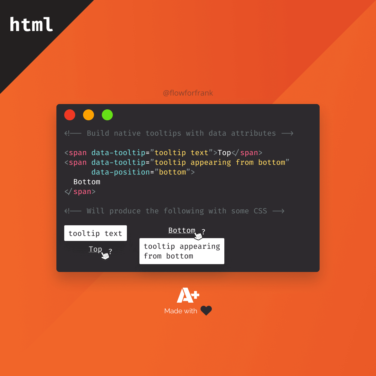
If you need to create simple tooltips, you can achieve what once was only possible with JavaScript. All you need is HTML with data attributes and some CSS:
<span data-tooltip="Showing on top">Top</span>
<span data-tooltip="Showing on right" data-position="right">Right</span>
<span data-tooltip="Showing on bottom" data-position="bottom">Bottom</span>
<span data-tooltip="Showing on left" data-position="left">Left</span>
We can use the data attributes to get the content of the tooltip, as well as use data-position to assign it a position that we can use through CSS.

Styling the Tooltip
For this to work, we will need to make use of the attr() function in CSS that is essentially supported for all major browsers. We are also going to use the ::before pseudo-element to add the tooltip through CSS. First, let's start with some default styles for the tooltip:
[data-tooltip] {
    position: relative;
    cursor: help;
    text-decoration: underline;
}
The tooltip itself will be positioned absolutely to the span. Because of this, we need to set its position to relative. The other two declarations are for decoration purposes and completely optional. Setting the cursor to help, will create a question mark next to your cursor once you hover over the element.

For the content of the tooltip, we will use the ::before pseudo-element of the span. This is the whole CSS that will be used for the default tooltip that shows above the element:
[data-tooltip]::before {
    content: attr(data-tooltip);
    position: absolute;
    width: 150px;
    display: block;
    background: #FFF;
    padding: 10px;
    top: -50px;
    box-shadow: 0px 2px 5px #0000008c;
    border-radius: 3px;
    text-align: center;
    left: 0;
    z-index: 1;
    opacity: 0;
    pointer-events: none;
    transform: translateY(20px);
    transition: all .3s cubic-bezier(.4, 0, .2, 1);
}
I've highlighted the important parts. These are:
- The
contentuses theattrfunction which takes in adataattribute. This will be used as the text of the tooltip. - We need to position it absolutely, above the original element.
- Make sure you set
z-indexto make it appear above everything else. - By default, the tooltip should be hidden. We only want to show it once the user hovers over the element. For this, set the
opacityto0.pointer-eventshelps us to make the tooltip click-through, essentially making it unable for the user to interact with. - Lastly, transforming the tooltip on the Y-axis helps to create a slide in animation. This value will be overwritten with 0 on hover.
Animating on Hover
So how do we actually show the tooltip on hover? Really simple, we need to bring back the opacity to 1, and translate the ::before element back into its original position:
[data-tooltip]:hover::before {
    transform: translate(0);
    opacity: 1;
}
But that will only do it for showing the tooltip above the text. How about other directions? For that, we can use the data-position attribute as a selector, and change up the positions and transforms a little bit for each direction:
[data-position="right"]::before {
top: -50%;
left: 105%;
transform: translateX(-20px);
}
[data-position="bottom"]::before {
top: 150%;
transform: translateY(-20px);
}
[data-position="left"]::before {
top: -50%;
right: 105%;
left: auto;
transform: translateX(20px);
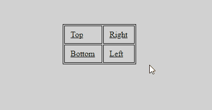
}And that should position the tooltips for the right side. With everything put together, you should have the following effect on hover:
 Remove ads
Summary
If you would like to get the full source code in one piece, I have it hosted on Codepen, you can clone it from there.

Resources:

Rocket Launch Your Career
Speed up your learning progress with our mentorship program. Join as a mentee to unlock the full potential of Webtips and get a personalized learning experience by experts to master the following frontend technologies:
Courses


Recommended
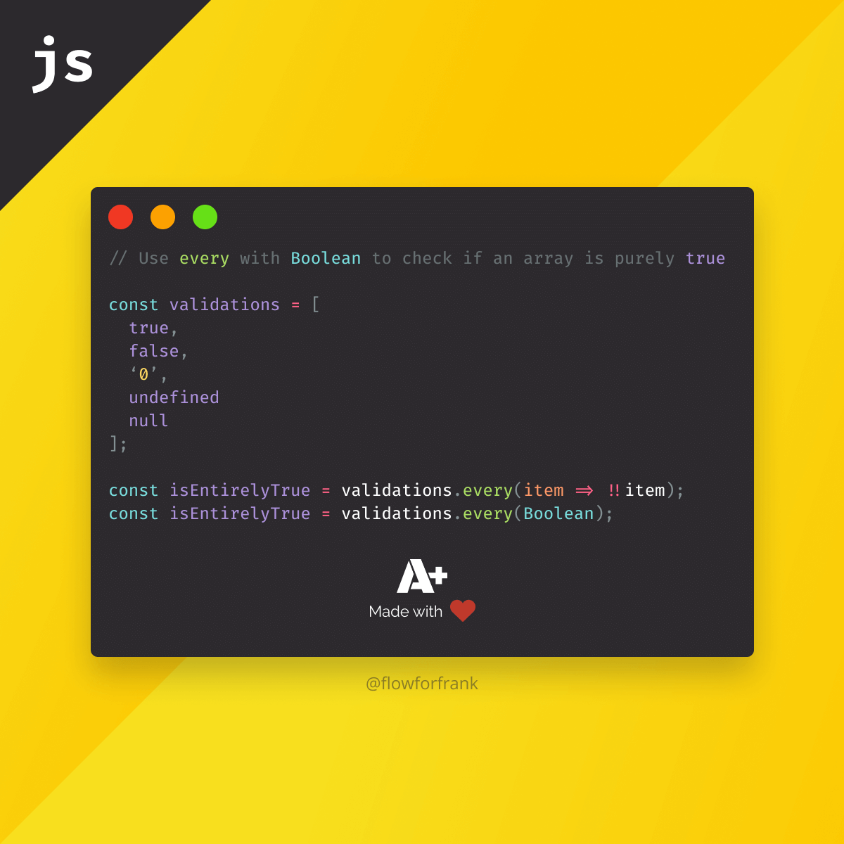
How to Check if All Values are True in a JavaScript Array
Ferenc Almasi • 2021 04 May • 1 min read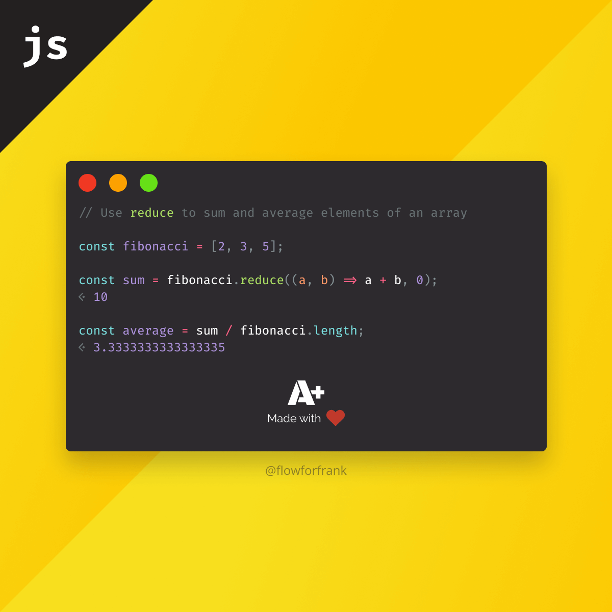
How to Find the Sum and Average of Elements in an Array in JavaScript
Ferenc Almasi • 2021 30 April • 2 min read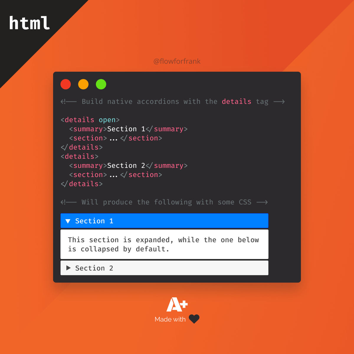
How to Create an Accordion Using Only HTML and CSS
 2022 27 June • 3 min read