How to Create an Accordion Using Only HTML and CSS
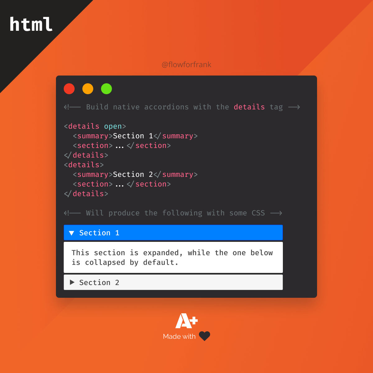
If you need to create accordions, you don't need to use hundreds of lines of JavaScript anymore, you can use the native HTML details element for that:
<details open>
    <summary>Section 1</summary>
    <section>...</section>
</details>
<details>
    <summary>Section 2</summary>
    <section>...</section>
</details>It comes with some additional HTML tags and attributes. For example, a summary must be provided inside each details element. This is the only section that is visible to the user by default. Everything else is hidden behind a toggle.
The details element also has an open attribute that defines whether the element is toggled on, or off. By default, this is how it looks when the browser's default style is applied to it. You can open each detail by clicking on the summary:
Section 1
Section 2
Section 3
Styling the Accordion
To make it more appealing, we can add some CSS styles to make it resemble the classic jQuery accordion. All we need is 30 lines of CSS:
details {
    &[open] {
        summary {
	    border: 1px solid #003eff;
    	    background: #007fff;
	    color: #FFF;
	}
    }

    summary {
        background: #f6f6f6;
	color: #454545;
	border: 1px solid #c4c5c5;
	border-radius: 3px;
	padding: 8px;
	margin-bottom: 2px;
	cursor: pointer;

	&::marker {
	    font-size: 14px;
	}
    }

    section {
	padding: 32px 16px;
	border: 1px solid #dddddd;
	border-radius: 3px;
        margin-bottom: 2px;
    }
}Note that the ::marker pseudo-element references the triangle in front of the summary.
We can use the [open] selector to style the accordion differently when it is toggled on. This will create an accordion similar to the one below:
Section 1
Section 2
Section 3
- List item one
- List item two
- List item three
Caveats
We have to note that there are some caveats when it comes to native HTML accordions. First of all, there's no built-in way to keep only a single details element open from many. The same is true for animations. There's no way to natively animate them at the time of writing. To animate the toggle, you would still need to use JavaScript.
There are also limited options to style the default ::marker. What you can do instead, is completely hide it and replace it with your own custom element.

Summary
Support-wise, it is over 90% globally, and only IE and Opera Mini are unsupported at the moment. If you would like to get the full source code in one piece, I have it hosted on Codepen, you can clone it from there.


Rocket Launch Your Career
Speed up your learning progress with our mentorship program. Join as a mentee to unlock the full potential of Webtips and get a personalized learning experience by experts to master the following frontend technologies:


