
How to Create Multiple Border in CSS with One Rule
Ferenc Almasi • 2022 07 June •
  1 min read
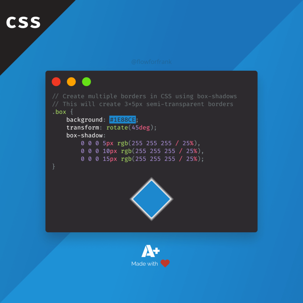
Did you know that you can create multiple borders in CSS using the box-shadow property? You need to set the blur and offsets to 0 and give it a spread value. By comma separating the different rules, you can create as many borders as you'd like to:
.borders {
    width: 100px;
    height: 100px;
    background: #1E88CE;
    transform: rotate(45deg);
    box-shadow:
        0 0 0 5px rgb(255 255 255 / 25%),
        0 0 0 10px rgb(255 255 255 / 25%),
        0 0 0 15px rgb(255 255 255 / 25%);
}The code example above, uses 3 different box shadows, each one larger by 5px from the other. The values mean offsetX, offsetY, blurRadius, spreadRadius in this order. It will create the following effect:
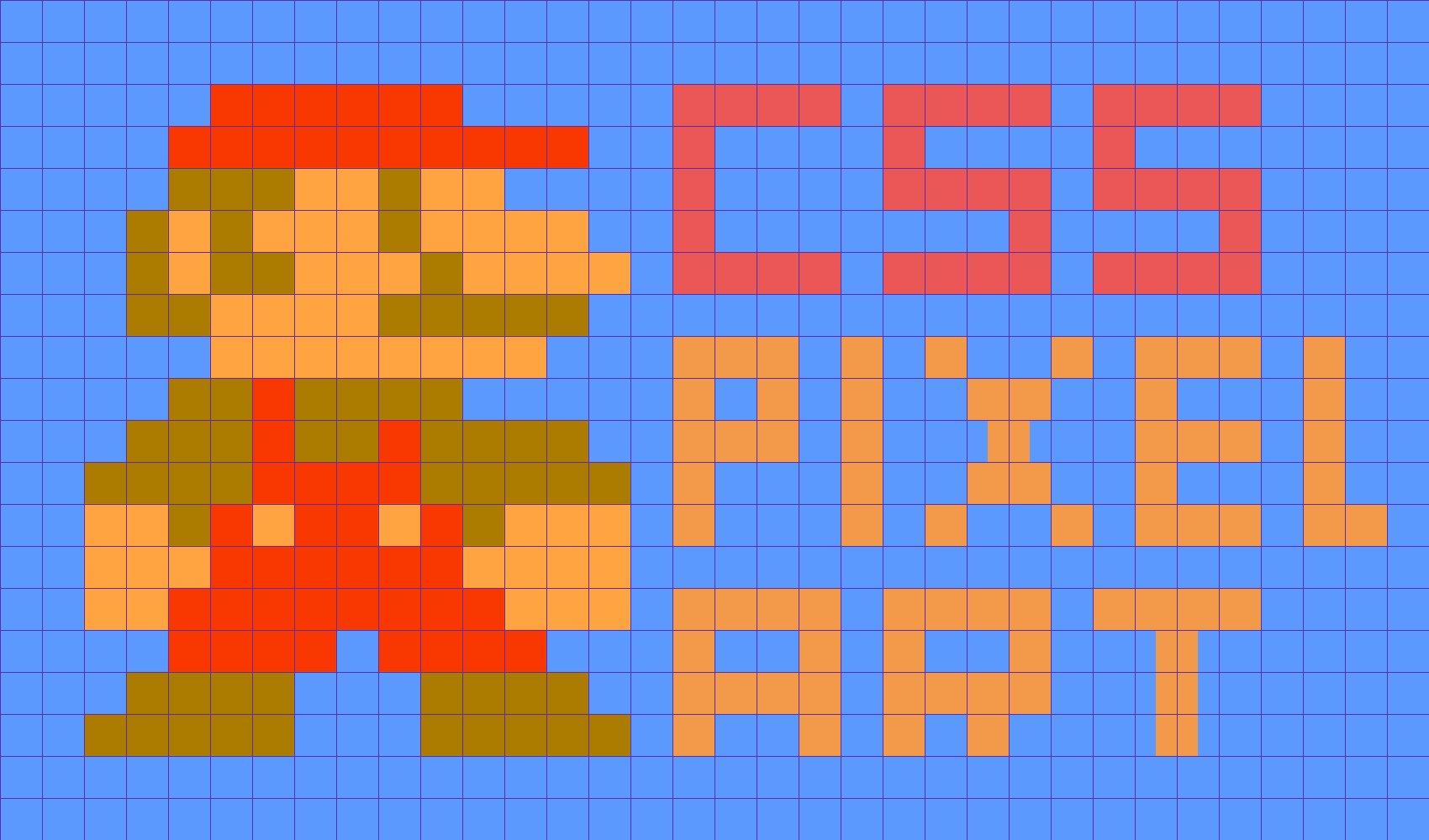
Did you know that you can also create pixel-art from box-shadows using the very same technique, and some help from Sass to simplify the process? Check out how you can do so using the below tutorial:


Rocket Launch Your Career
Speed up your learning progress with our mentorship program. Join as a mentee to unlock the full potential of Webtips and get a personalized learning experience by experts to master the following frontend technologies:
Courses

CSS - The Complete Guide (including Flexbox, Grid and Sass)

The HTML & CSS Bootcamp