How to Make Speech Bubbles in CSS
Ferenc Almasi • 2020 01 December • 1 min read
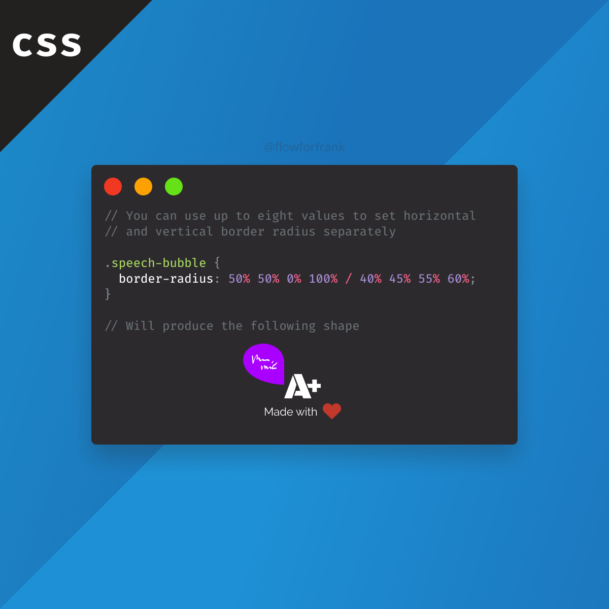
Did you know that the border-radius property in CSS can take up multiple values? This way, you can create various different effects, like speech bubbles.
Copied to clipboard!
.speech-bubble {
    border-radius: 50% 50% 0% 100% / 40% 45% 55% 60%;
}The example above, will create the following effect:
To break it down, this works by:
- Setting each border-radius value individually by the first four percentages (top-left, top-right, bottom-right, bottom-left in order)
- This is followed by a
/and four different values again for each corner to create elliptical corners.
To play around with custom border-radius values, I recommend checking out the


Resources:
📚 More Webtips

Rocket Launch Your Career
Speed up your learning progress with our mentorship program. Join as a mentee to unlock the full potential of Webtips and get a personalized learning experience by experts to master the following frontend technologies:
Courses

CSS - The Complete Guide (including Flexbox, Grid and Sass)
Including Flexbox, Grid, and Sass
Whether you're learning CSS for the first time or brushing up on your CSS skills and diving even deeper, this course is for you. Every web developer has to know CSS.

The HTML & CSS Bootcamp
From Zero to Expert!
This course covers flexbox, CSS grid, animations, responsive design, and much more! You will find tons of exercises & projects inside this course.

The Creative HTML5 & CSS3 Course
Build Awesome Websites
Learn HTML5 and CSS3 by creating three amazing, well-designed and animated websites from scratch.
 2021 18 September •