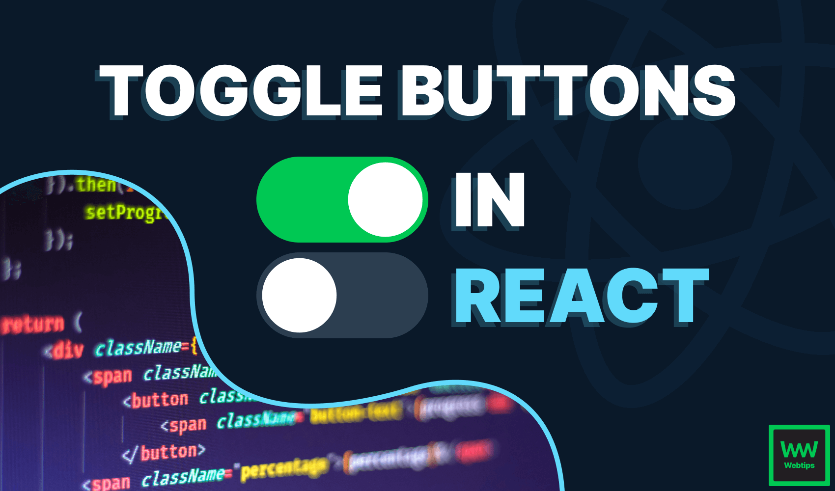
How to Create Simple Toggle Buttons in React
 6 min read
In this tutorial, we're going to take a look at how we can create simple toggle buttons with the use of the useState hook and some CSS. By the end of this tutorial, you'll have the following buttons ready for you to use in React. Without any further ado, let's jump into creating the component.

Creating the Toggle Button in React
To create a toggle button in React, we'll need to use the useState hook to keep track of the state of the toggle internally. To achieve this, we'll use a checkbox to keep the component as accessible as possible:
import { useState } from 'react'

export const Toggle = ({ label, toggled, onClick }) => {
    const [isToggled, toggle] = useState(toggled)

    const callback = () => {
        toggle(!isToggled)
        onClick(!isToggled)
    }

    return (
        <label>
            <input type="checkbox" defaultChecked={isToggled} onClick={callback} />
            <span />
            <strong>{label}</strong>
        </label>
    )
}We'll also use three different props:
label: For setting a label for the toggle button.toggled: For setting the default state. If left empty, it'll default tofalse.onClick: A click handler for handlingonClickevents outside of the component.
As you can see, we want to use the toggled prop as the default state for the useState hook. If we set it to true, then the toggle will be toggled by default.
Note that we need to set the defaultChecked property for the input when working in React, rather than using the checked property. Now is the time to also attach the callback function to the input, where we want to toggle the state, as well as call the onClick handler with the current state. We can call this component in the following way:
import { Toggle } from '@components'

export const App = () => {
    const logState = state => {
        console.log('Toggled:', state)
    }

    return (
        <Toggle
            label="Toggle me"
            toggled={true}
            onClick={logState}
        />
    )
}This will create a toggle button that is toggled by default through the toggled prop. Whenever we click on the button, the logState function will be called, with the toggled state. The state can have two values: true for toggled, and false for inactive.
Styling the Toggle Button
The toggle button is now functioning, the only thing left to do is to style it in CSS so that it actually looks like a toggle. You might have noticed that we have an empty span element inside the component.
This is what we're going to display in place of the input element to get a custom look, therefore, we first need to hide the input, and style the span:
label {
    position: relative;
    display: inline-block;
    width: 60px;
    height: 30px;
}

input {
    opacity: 0;
    width: 0;
    height: 0;
}

span {
    position: absolute;
    top: 0;
    left: 0;
    right: 0;
    bottom: 0;
    transition: 0.3s;
    cursor: pointer;
    background: #2c3e50;
    border-radius: 30px;
}
The important parts are highlighted. We want to stretch the span to the size of the label (60x30). To achieve this, we can set all four positions to 0. We can also add a transition in order to animate the toggle, and for better accessibility, set the cursor to pointer so that it's clearly visible it's an interactive element. Import this CSS to the component to apply the styles. With all this in place, we should have the following:
To add a white circle inside the toggle which will indicate the state, we want to play around with the :before pseudo-element on the span. Extend the CSS with the following rules:
span:before {
  position: absolute;
  content: "";
  height: 25px;
  width: 25px;
  left: 3px;
  bottom: 2.6px;
  background-color: #fff;
  border-radius: 50%;
  transition: 0.3s;
}

input:checked + span {
  background-color: #00c853;
}

input:checked + span:before {
  transform: translateX(29px);
}
Now we have a circle inside the toggle, defined as the :before element. Give it the same width and height, and a border-radius of 50% to make it a circle. Depending on the size of your toggle, you may want to experiment with the left and bottom positions to perfectly position it.
Make sure you don't forget to add a transition here too, as with the previous transition, we only animate the background color. Here we animate the position of the circle too. And how can we do that? We need to use the :checked selector.
If the input is checked, we want to switch the color of our span, as well as the position of the :before element. We can grab these using a sibling selector in CSS This is what we've done on lines 17-19. All that's left to do is to correctly position the label as well, which we can do with the following rules:
strong {
    position: absolute;
    left: 100%;
    width: max-content;
    line-height: 30px;
    margin-left: 10px;
    cursor: pointer;
}
 Remove ads
Final Words
Now we have a custom functioning toggle button created in React, created from a regular checkbox. This not only makes it functioning but accessible too. The code is hosted on CodeSandbox, or you can reach it below in one piece through the interactive widget:
 App.jsx
- Toggle.jsx
 toggle.css
If you are interested in more React projects, make sure to check out the roadmap below that helps you take your React skills to the next level. Thank you for reading through, happy coding!


Rocket Launch Your Career
Speed up your learning progress with our mentorship program. Join as a mentee to unlock the full potential of Webtips and get a personalized learning experience by experts to master the following frontend technologies:
Courses


Recommended
The Quick Way to Add Env Variables to Svelte using Vite
3 min read
The Easy Way to Do Routing in Svelte
5 min read
How to Quickly Set Up ESBuild
4 min read