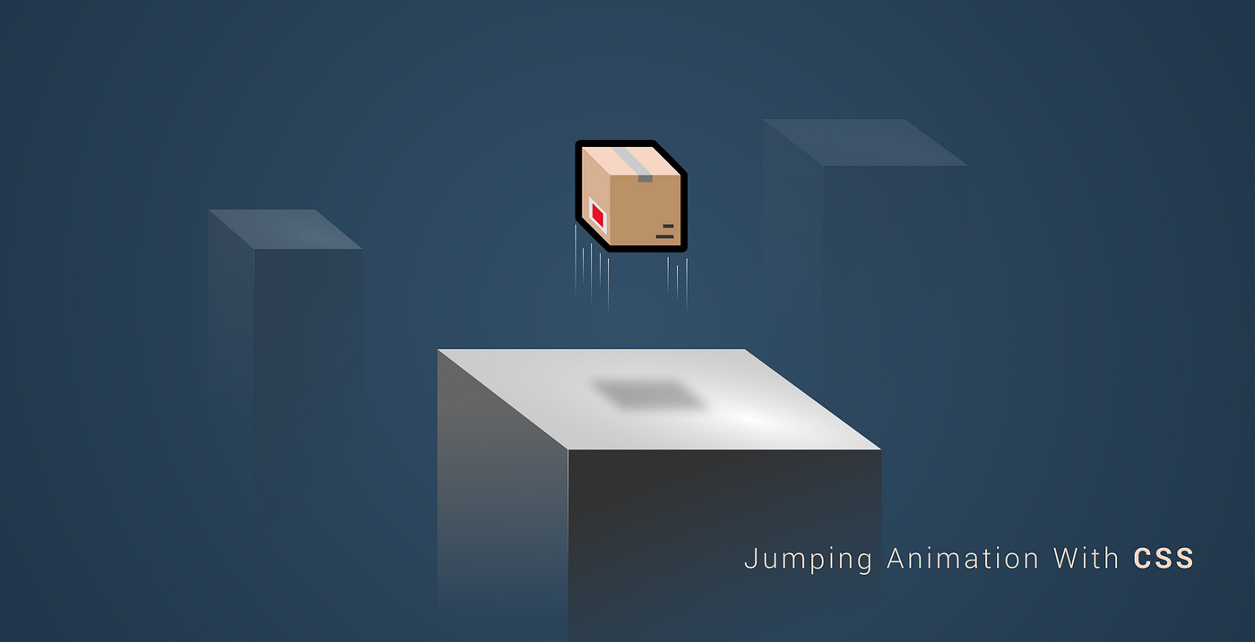
Making a Jumping Box Animation Using Only CSS
 2021 11 November •
  5 min read
With the introduction of CSS3, it became a reality to create complex animations natively, right inside the browser without having to rely on 3rd party animators.
Implementations done using such applications meant that we can only use the end result as a gif or even worse, as an embed flash file.
CSS now offers us various techniques to achieve the same with a couple of lines of code. To validate this, the final animation in this article will require less than 10 lines. Of course, it all depends on the complexity of the animation. So what will be doing?
If you’ve seen my recent article about Parcel + React, you may have come across the Parcel animation I was making. If you haven’t seen it, here it once more:
The animation is pretty simple yet effective. We can raise awareness and it can work as a call to action in the right context. Making animations your primary source for attracting user attention however should be a relic from the 90s.

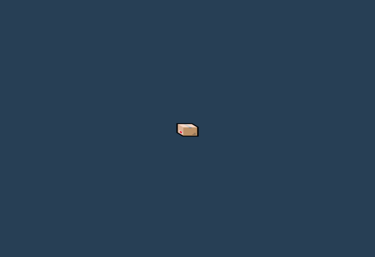
The Starting Point
The base is only made of a radial gradient with the icon positioned to the center:
body {
    background: #7db9e8;
    background: -moz-radial-gradient(center, ellipse cover, #7db9e8 0%, #21374b 100%);
    background: -webkit-radial-gradient(center, ellipse cover, #7db9e8 0%,#21374b 100%);
    background: radial-gradient(ellipse at center, #7db9e8 0%,#21374b 100%);
    filter: progid:DXImageTransform.Microsoft.gradient( startColorstr='#7db9e8', endColorstr='#21374b',GradientType=1 );
    margin: 0;
    width: 100vw;
    height: 100vh;

    #parcel {
        position: absolute;
        top: 50%;
        left: 50%;
        transform: translate(-50%, -50%);
        font-size: 32px;
        animation: jump 1.2s infinite;
    }
}Here we are defining an animation called “jump” that will play over 1.2s and will be repeated indefinitely.

Without it, it looks kind of depressing so let’s make it moving!
The Anatomy of the Animation
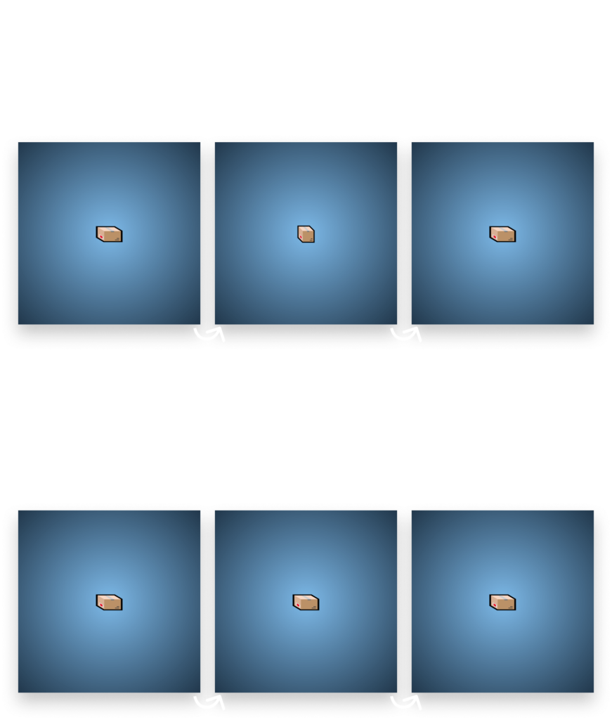
To fully understand what we are going to do and why, we want to take a look at the animation, frame by frame, and note what steps we need to take in order to achieve the end result:
- We want to start from a distorted view and move the parcel upwards.
- If it reaches the peak, we give it a shake and move it back to its original position.
All we are going to use for that are CSS transforms. We are starting with a distorted package, from a squashed position. This is what will make the impression of making momentum to jump upwards. To make it look flat, we can use scale to resize it disproportionately:
@keyframes jump {
    0% { transform: translate(-50%, -50%) scale(1.25, 0.75); }
}To keep it in its original position, we also have to pass translate to make sure it stays at the dead center. scale takes in the x-axis first then the y-axis. This means we are reducing its size on the y-axis to 75% and making it 125% of its original size horizontally. This will give us the following look:

From this position, we want to move it upwards while also removing the distorted scaling.
@keyframes jump {
    0% { transform: translate(-50%, -50%) scale(1.25, 0.75); }
    50% { transform: translate(-50%, -150%) scale(1, 1); }
}By the half of the animation, it should reach the top, so I chose 50% for the next step. We set back the scaling to 1:1 ratio and move it on the y-axis -100%, which means it will move up. Looking at the animation at this stage will seem odd as we are starting from a squashed position and end up with its original size. When the animation is repeated, it will instantly jump into the scaled position which will make the animation jagged.
We want the end of the iteration to look the same as the beginning of the next one to create a smooth animation. To fix it, we simply need to return to the initial state so we just make the same transformations for 100% we have for 0%.
@keyframes jump {
    0% { transform: translate(-50%, -50%) scale(1.25, 0.75); }
    50% { transform: translate(-50%, -150%) scale(1, 1); }
    100% { transform: translate(-50%, -50%) scale(1.25, 0.75); }
}All that’s remaining, is making the box shake at the peak of its trajectory.

 Remove ads
Creating the Shaking
When the parcel hits the top, we start rotating it back and forth, four times exactly. For that, we can use the rotate transform:
@keyframes jump {
    0% { transform: translate(-50%, -50%) scale(1.25, 0.75); }
    50% { transform: translate(-50%, -150%) scale(1, 1); }
    55% { transform: translate(-50%, -150%) rotate(15deg); }
    60% { transform: translate(-50%, -150%) rotate(-15deg); }
    65% { transform: translate(-50%, -150%) rotate(15deg); }
    70% { transform: translate(-50%, -150%) rotate(-15deg); }
    100% { transform: translate(-50%, -50%) scale(1.25, 0.75); }
}We start by rotating it 15° to the right then rotating it 30° to the left. (-15° to its original position) We repeat the two steps one more time and then return to the starting position. I used a step of 5% for each rotation. You can experiment with the timing. Increasing the interval between the steps will slow down the rotation, decreasing it will make it faster.
The end result is a happily jumping box. 📦 Feel free to play around with the end project on Codepen.

Rocket Launch Your Career
Speed up your learning progress with our mentorship program. Join as a mentee to unlock the full potential of Webtips and get a personalized learning experience by experts to master the following frontend technologies:
Courses

CSS - The Complete Guide (including Flexbox, Grid and Sass)

The HTML & CSS Bootcamp

The Creative HTML5 & CSS3 Course
Recommended
What is The Event Loop in JavaScript?
2021 11 November • 7 min readTurning Your Friend Into a Chatbot
2021 11 November • 12 min read
Zero Configure your React-Typescript App With Parcel
Ferenc Almasi • 2021 11 November • 8 min read