How to Toggle Visibility in React
 6 min read
Building toggle elements — such as show/hide components, toggle hooks, or toggle buttons — is a common feature you can likely come across when building web apps. Depending on the number of options, they can be either a simple wrapper for conditional rendering or a more robust component with customizability.
In this tutorial, we are going to take a look at how we can build a customizable show/hide component called ToggleVisibility using React hooks.

How ToggleVisibility Will Work
First, let's take a look at what we want to achieve. We want to have a component called ToggleVisibility, that wraps any number of elements, and adds a toggle button. We also want to customize it in a few ways:
<ToggleVisibility>
    <h1>With default settings</h1>
</ToggleVisibility>

<ToggleVisibility showLabel="👀"  hideLabel="🙈">
    <h1>With custom labels</h1>
</ToggleVisibility>

<ToggleVisibility visible={false}>
    <h1>With default visibility</h1>
</ToggleVisibility>

<ToggleVisibility removeButton={true} visible={false}>
    <h1>One-time toggle</h1>
</ToggleVisibility>The component will come with four different props for achieving different functionality. In order, they are:
showLabel: The button label for toggling the component ON. Defaults to "Show".hideLabel: The button label for toggling the component OFF. Defaults to "Hide".removeButton: A boolean to decide whether to remove the button after interaction for a one-time toggle. By default, this will be set tofalse.visible: A boolean to decide the default visibility of thechildren. By default, this will be set totrue, meaning the elements insideToggleVisibilitywill be visible initially.
Creating the Component with Show/Hide Functionality
To start things, let's first create the basic toggle functionality that will show/hide children elements. For this, all we need is a useState hook that conditionally renders children:
import React, { useState } from 'react'

const ToggleVisibility = ({ children }) => {
    const [show, setShow] = useState(true)

    return (
        <React.Fragment>
            {show && children}
            <button onClick={() => setShow(!show)}>
                {show ? 'Hide' : 'Show'}
            </button>
        </React.Fragment>
    )
}

export default ToggleVisibilityNote that wrapping everything into a fragment allows us to avoid polluting the DOM. If you need custom styles, they can be replaced with a div.
To use the component, simply wrap an element inside ToggleVisibility after importing it. Right now, we have static labels with visibility set to true by default. Whenever we click on the button, it will set the show state to its opposite which will toggle the children on line:8. This works perfectly for some simple use cases, but let's see how to add labels and set the default visibility.
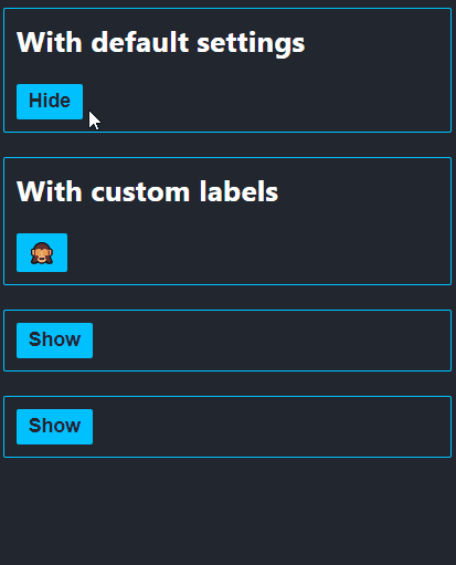
ToggleVisibility component in actionAdding customizable labels and visibility
To make the labels configurable, we need to introduce two more props: showLabel and hideLabel. Extend the ToggleVisibility component with the highlighted parts:
const ToggleVisibility = ({
    showLabel = 'Show',
    hideLabel = 'Hide',
    children
}) => {
    const [show, setShow] = useState(true)

    return (
        <React.Fragment>
            {show && children}
            <button onClick={() => setShow(!show)}>
                {show ? hideLabel : showLabel}
            </button>
        </React.Fragment>
    )
Now the component also accepts custom labels for show/hide. Using default parameters, we can tell React to treat the props as optional. In case they are not provided, the default values will be "Show" and "Hide". Don't forget to also update the label inside the button.
We also want to handle default visibility as well, so we can initially have a hidden component. To achieve this, add one more prop called visible to the component:
const ToggleVisibility = ({
    ...
+   visible = true,
    children
}) => {
-   const [show, setShow] = useState(true)
+   const [show, setShow] = useState(visible)

    return (...)
}Notice that the default value of useState for the show state has been changed from false to visible. This is how state and props can work together. Now we can also tell the component to be hidden by default. This prop also takes advantage of default parameters.
One-time toggles
There is one last thing we are missing, and that is adding the possibility for one-time toggles. This option will only let us toggle elements once, then the button gets removed from the DOM. To achieve this, we need another useState hook:
const ToggleVisibility = ({
    ...
    removeButton = false
}: ToggleVisibilityProps) => {
    const [showButton, setShowButton] = useState(true)

    const toggleVisibility = () => {
        setShow(!show)
        removeButton && setShowButton(false)
    }

    return (
        <React.Fragment>
            {show && children}
            {showButton && (
                <button onClick={toggleVisibility}>
                    {show ? hideLabel : showLabel}
                </button>
            )}
        </React.Fragment>
    )
}By default, its value needs to be true, so that the button is always visible initially. We only update this value to false (on line:9), if the removeButton prop is set to true. This way, as soon as the button is clicked, it will be removed from the DOM. To keep the code clean, we can organize the button functionality into a separate function called toggleVisibility.
 Remove ads
Conclusion
And with that said, now you have a fully customizable show/hide component ready for you to use in your project. Building toggle components in React is just a matter of using useState hooks with the right props.
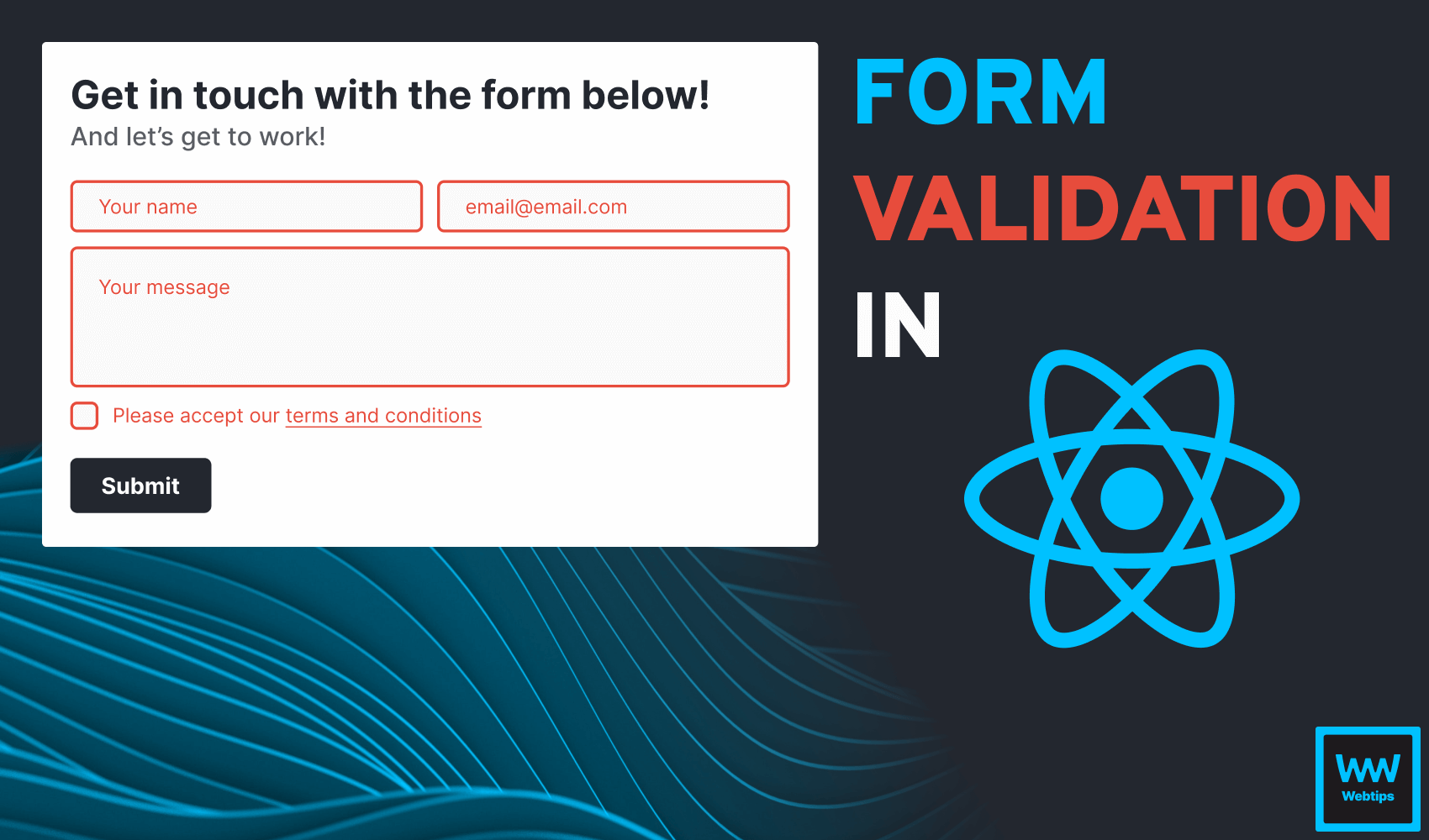
Do you have any questions about the project? Share your thoughts in the comments below! If you would like to learn more about React, check out our previous project where you can learn how to validate forms in React. Thank you for reading through, happy coding! 👨💻

Rocket Launch Your Career
Speed up your learning progress with our mentorship program. Join as a mentee to unlock the full potential of Webtips and get a personalized learning experience by experts to master the following frontend technologies:
Courses


Recommended
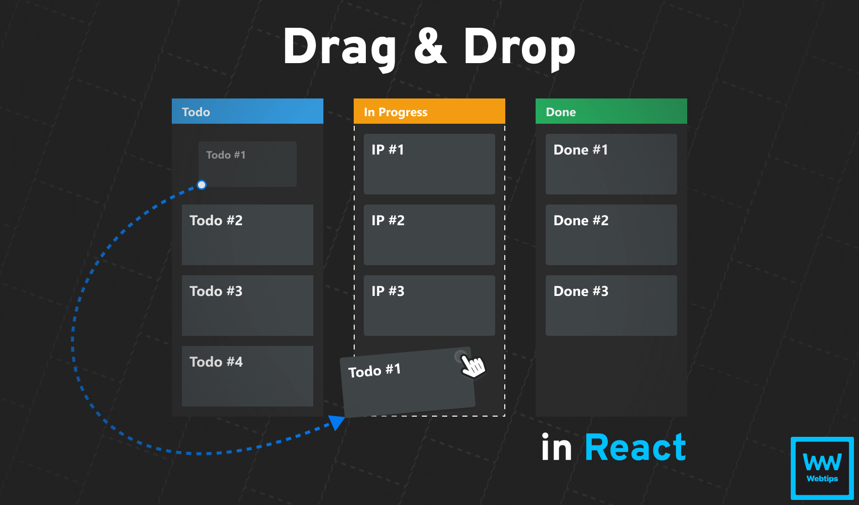
How to Drag and Drop in React Without Extra Libraries
12 min read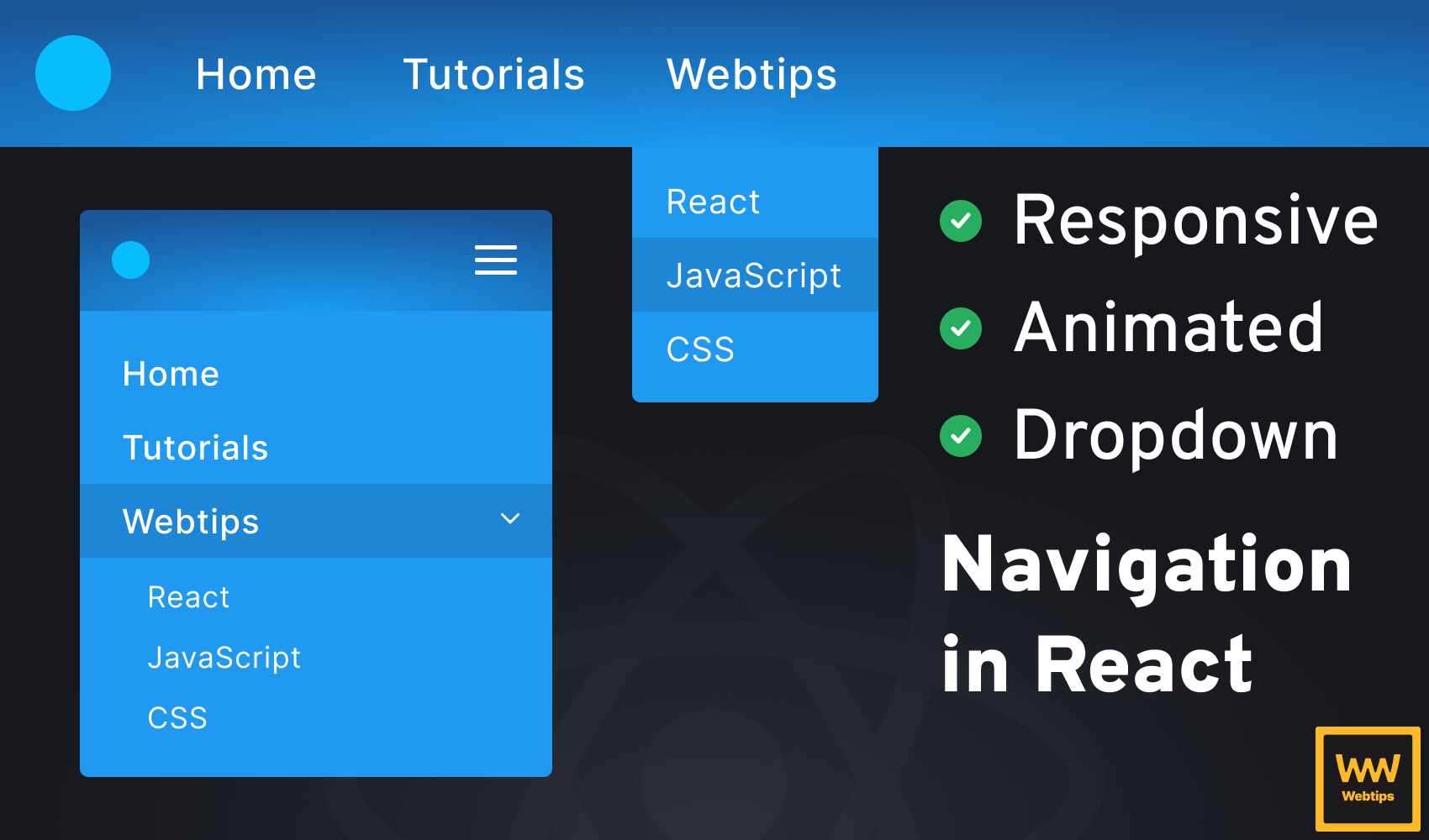
How to Make a Responsive, Animated Navbar in React
18 min read • React v18.2How to Easily Validate Forms in React
11 min read