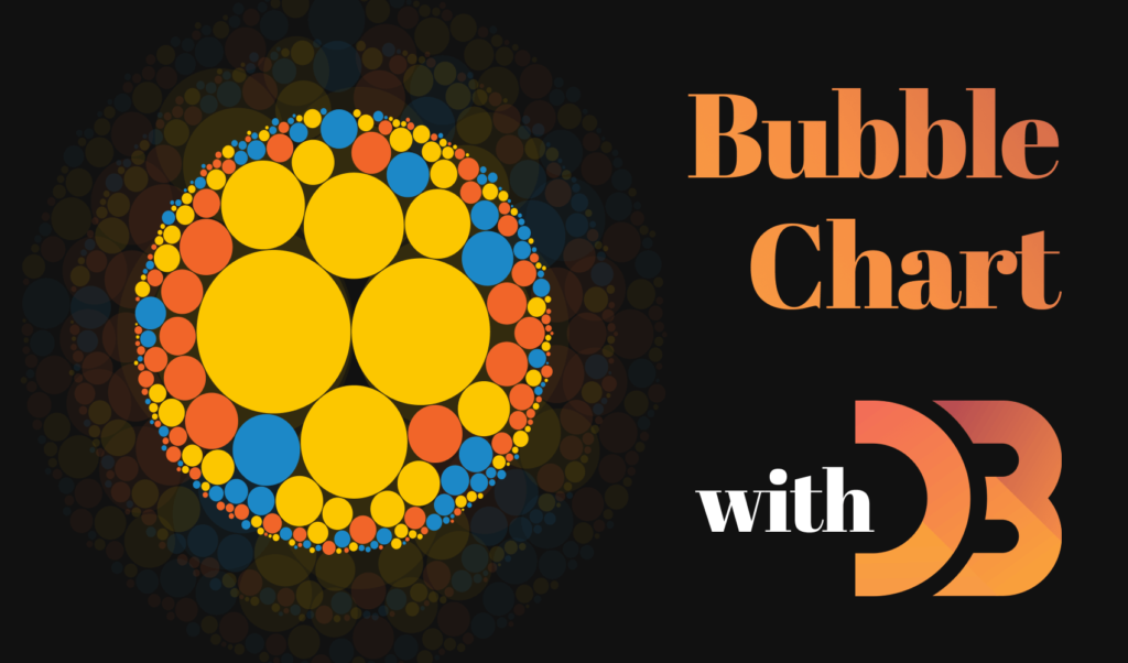
How to Make Interactive Bubble Charts in D3.js
D3.js is a popular JavaScript library for visualizing data using HTML, CSS, and SVG. In its gallery, you can find various ways to represent data, such as hierarchies, networks, or other types of charts. I’ve already covered previously, how you can use D3 to create interactive treemaps.
In this tutorial, however, we are going to look into how you can visualize your most popular articles using a bubble chart. We will also make it interactive so on hover, you can see some information about the article, as well as navigate to it.

Setting up the Project
For this project, we are going to read in the data that we’ll use from a JSON file. In order to do that, you will have to set up a webserver. I recommend using the http-server module. You can get it installed globally by running npm i -g http-server. Then run npm init -y to generate an empty npm project with the default.
{
    "name": "d3-bubble",
    "version": "1.0.0",
    "description": "",
    "main": "index.js",
    "scripts": {
        "start": "http-server -o"
    },
    "keywords": [],
    "author": "",
    "license": "ISC"
}I’ve also added a start script that will automatically spin up a web server and opens the default index.html in your project root. So as a next step, add an inedx.html file with the following markup:
<!DOCTYPE html>
<html lang="en">
    <head>
        <meta charset="UTF-8" />
        <meta name="viewport" content="width=device-width, initial-scale=1.0" />
        <title>💭 Bubble chart with D3.js</title>

        <link rel="stylesheet" href="styles.css" />
    </head>
    <body>
        <svg id="bubble-chart"></svg>
        <div class="tooltip">
            <img alt="" />
            <div>
                <a></a>
                <span></span>
            </div>
        </div>

        <script src="https://d3js.org/d3.v6.js"></script>
        <script src="bubble.js"></script>
    </body>
</html>We will let D3 populate the chart into the #bubble-chart SVG element, and we will also dynamically insert the content for the tooltip, based on the data associated with each circle. Make sure you pull in the latest version of D3 at the end of your body, and also add a bubble.js file where we will create the SVG. I’ve also added a styles.css for the project to style everything.
CSS is included in the GitHub repository
Reading the Data from D3
The next step is to read some data for D3 that we can work with. For this, I’ve created a data.json file in the project root, with the following format:
[
    {
       "name": "Savvy|Smart|Sexy People Do HTML, CSS, JAVASCRIPT :)",
       "category": "js",
       "score": 16.746987951807228,
       "link": "/js",
       "img": "https://picsum.photos/id/117/1544/1024"
    }
]It has 250 entries. You can download the JSON from the GitHub repository. I’ve used the Headline Generator to generate some random headlines, as well as some random categories (HTML | CSS | JS) with links and a random image. For the images, I’ve used Lorem Picsum. The score will determine the size of each circle. Here you could use the number of page views an article received. To read this data for D3, you can use d3.json:
const file = 'data.json';

const generateChart = data => { ... };

(async () => {
    data = await d3.json(file).then(data => data);
    generateChart(data);
})();We will pass this data to a function called generateChart, where we handle everything else.
Setting up the SVG
Next, let’s set up some config variables and selectors, so we can play around with the SVG inside the document. Add the following config at the beginning of your file:
const width = window.innerWidth;
const height = window.innerHeight;
const colors = {
    html: '#F16529',
    css: '#1C88C7',
    js: '#FCC700'
};We will use the width and height for the dimensions of the SVG, and the colors for coloring the circles. Inside your generateChart function, we will use the following variables to handle the SVG:
const bubble = data => d3.pack()
    .size([width, height])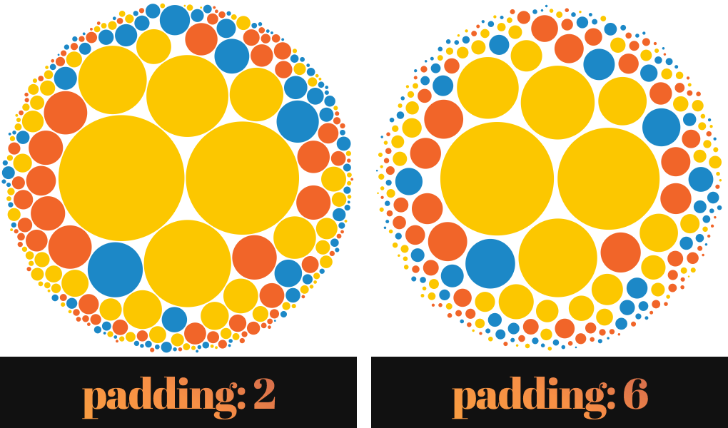
.padding(2)(d3.hierarchy({ children: data }).sum(d => d.score));First, create the bubble function which generates the data that will hold the necessary information about the SVG, such as where to place each circle on the chart, or their radius. This uses d3.pack that creates a pack layout. The size function sets the size of the SVG — in our case, it will be the size of the document. The padding sets the spacing between the circles.
This call will decorate our data with the x and y coordinates for the circles as well as an r property for the radius. It returns another function that we can further call with d3.hierarchy, as it expects a hierarchical data set, in the form of
{
    "name": "root",
    "children": [{ ... }, { ... }]
}This is what you see after setting the padding. We pass the data from the JSON file as children to d3.hierarchy. This will also add additional information to each data node, such as its children, its parent, or its depth in the hierarchy. To get the root of the bubble chart, now you can call bubble(data) passing the JSON data.
const root = bubble(data);
const svg = d3.select('#bubble-chart')
    .style('width', width)
    .style('height', height);

const tooltip = d3.select('.tooltip');I’ve also added two new variables for storing the SVG element, as well as the .tooltip. You can use d3.select just as document.querySelector, and chain .style to add inline styles for the element.
Displaying the Chart
Right now, you will still not see anything on the screen, so let’s finally display the chart. Add two new variables to the generateChart function that will display everything:
const node = svg.selectAll()
    .data(root.children)
    .enter().append('g')
    .attr('transform', d => `translate(${d.x}, ${d.y})`);

const circle = node.append('circle')
    .attr('r', d => d.r)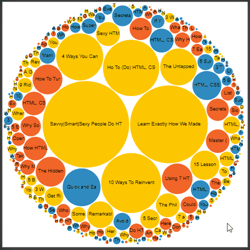
.style('fill', d => colors[d.data.category])The node variable will create a g (group) element for each child of the data, then it transforms them to the correct position using a callback function. The circle does exactly the same, it creates circle elements with the proper radius as well as a fill color based on the category node inside the data. It gets the colors from the colors variable that we defined at the beginning. This will create some empty colorful circles.
Adding labels
To make the circles more informative, let’s also add the title of the article as a label:
const label = node.append('text')
    .attr('dy', 2)
.text(d => d.data.name.substring(0, d.r / 3));This will create a text node for the circles. While dy shifts the text on the y axis a little bit to make it centered, substring(0, d.r / 3) will strip the text to fit into the radius of the circle.
Adding interactions
To make the circles interactive, you can attach on event listeners to the circle variable in the following way:
const circle = node.append('circle')
.attr('r', d => d.r)
.style('fill', d => colors[d.data.category])
.on('mouseover', function (e, d) {
tooltip.select('img').attr('src', d.data.img);
tooltip.select('a').attr('href', d.data.link).text(d.data.name);
tooltip.select('span').attr('class', d.data.category).text(d.data.category);
tooltip.style('visibility', 'visible');
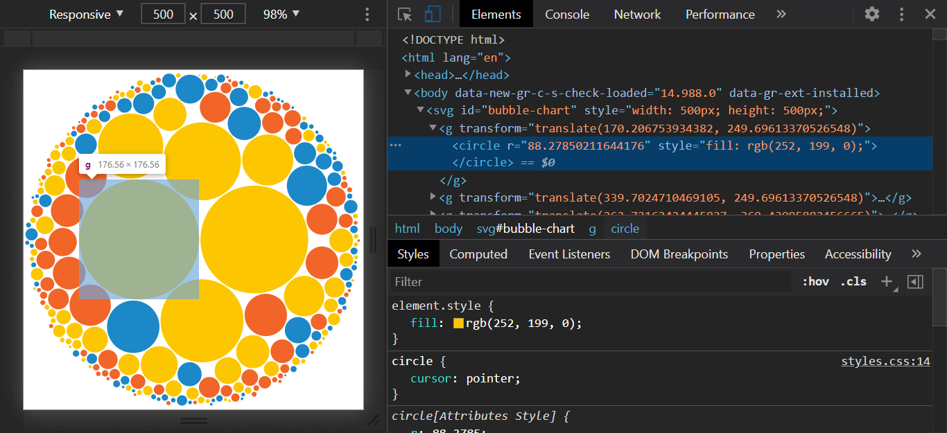
d3.select(this).style('stroke', '#222');
})
.on('click', (e, d) => window.open(d.data.link));This will populate the tooltip node with the required data, and also sets a stroke for the circle. You can get all the data set in the JSON through d.data.
Note that d (datum) is passed as a second parameter for the event listener, as the first one is the event itself. This wasn’t the case prior to V6. Also note, that you have to use a regular function, as we are referencing the this keyword inside it.

Now the tooltips are not shown as they don’t have a position. To also make them move when the mouse is moved, add another on event listener:
.on('mousemove', e => tooltip.style('top', `${e.pageY}px`)
.style('left', `${e.pageX + 10}px`))This will change the top and left position of the tooltip as you move your mouse around.

To make them disappear once you move your mouse out, you can attach another listener for mouseout:
.on('mouseout', function () {
    d3.select(this).style('stroke', 'none');
    return tooltip.style('visibility', 'hidden');
})This will set visibility back to hidden and also removes the stroke.
Lastly, you can add one more listener for the click event to open the article:
.on('click', (e, d) => window.open(d.data.link));Adding Animations
As some final touches, let’s add some enter animation for the chart. Modify your node in the following way and add a transition call after your label:
const node = svg.selectAll()
    .data(root.children)
    .enter().append('g')
-   .attr('transform', d => `translate(${d.x}, ${d.y})`);
+   .attr('transform', `translate(${width / 2}, ${height / 2})`);

+ node.transition()
+    .ease(d3.easeExpInOut)
+    .duration(1000)
+ .attr('transform', d => `translate(${d.x}, ${d.y})`);This will position the nodes to the center of the screen initially. Then, under 1 second, it will transition them to their correct position. For the easing animation, I’ve chosen to use easeExpInOut. If you want to experiment with different easings, you can have a look at the “Easing Animations” doc on Observable.

As you can see, this looks rather weird. The sizes of the circles are the same and the labels are also inside each other. To make things better, let’s also animate the radius of each circle.
circle.transition()
    .ease(d3.easeExpInOut)
    .duration(1000)
.attr('r', d => d.r);Make sure you also remove the .attr('r', d => d.r) line from where you’ve created the circles. This will make sure they start out without a radius.

This looks a little bit more promising, but the text still doesn’t look so good. Let’s make them appear, right after the animation of the circles is finished. For this, you can use a delay call:
label.transition()
    .delay(700)
    .ease(d3.easeExpInOut)
    .duration(1000)
.style('opacity', 1)Because of the easing, we don’t need to delay it exactly by 1 sec. I’ve found that 700ms works nice. Also, make sure you have opacity set to 0 in your styles.css for text elements. This results in the following effect:

Wrapping Up
And you’ve just created a fully functional bubble chart in D3.js! As a next step, you could build an API that returns the same data so it can be easily updated later down the road. If you are using Google Analytics, you can use the Reporting API to fetch information about the performance of your pages.
As always, the full project is available for you to clone from GitHub. Do you have suggestions for improvements? Let us know in the comments below! Thank you for reading through, happy coding!

Rocket Launch Your Career
Speed up your learning progress with our mentorship program. Join as a mentee to unlock the full potential of Webtips and get a personalized learning experience by experts to master the following frontend technologies:
Courses


Recommended

How to Bundle your React-Electron App by Parcel

How to Make Colorful Fireworks in Vanilla JavaScript