How to Make an Animated Progress Bar in CSS
 2021 11 November •
  10 min read
When thinking about user experience, one commonly occurring problem is not giving feedback to user input. Any action that your users take should cause a reaction. If your application has long-running tasks, it’s essential to show progress. Otherwise, users will be left confused.
Did I click the button? Did it break? Did my connection went down? Is it finished already? Why it’s taking so long? I’m leaving…
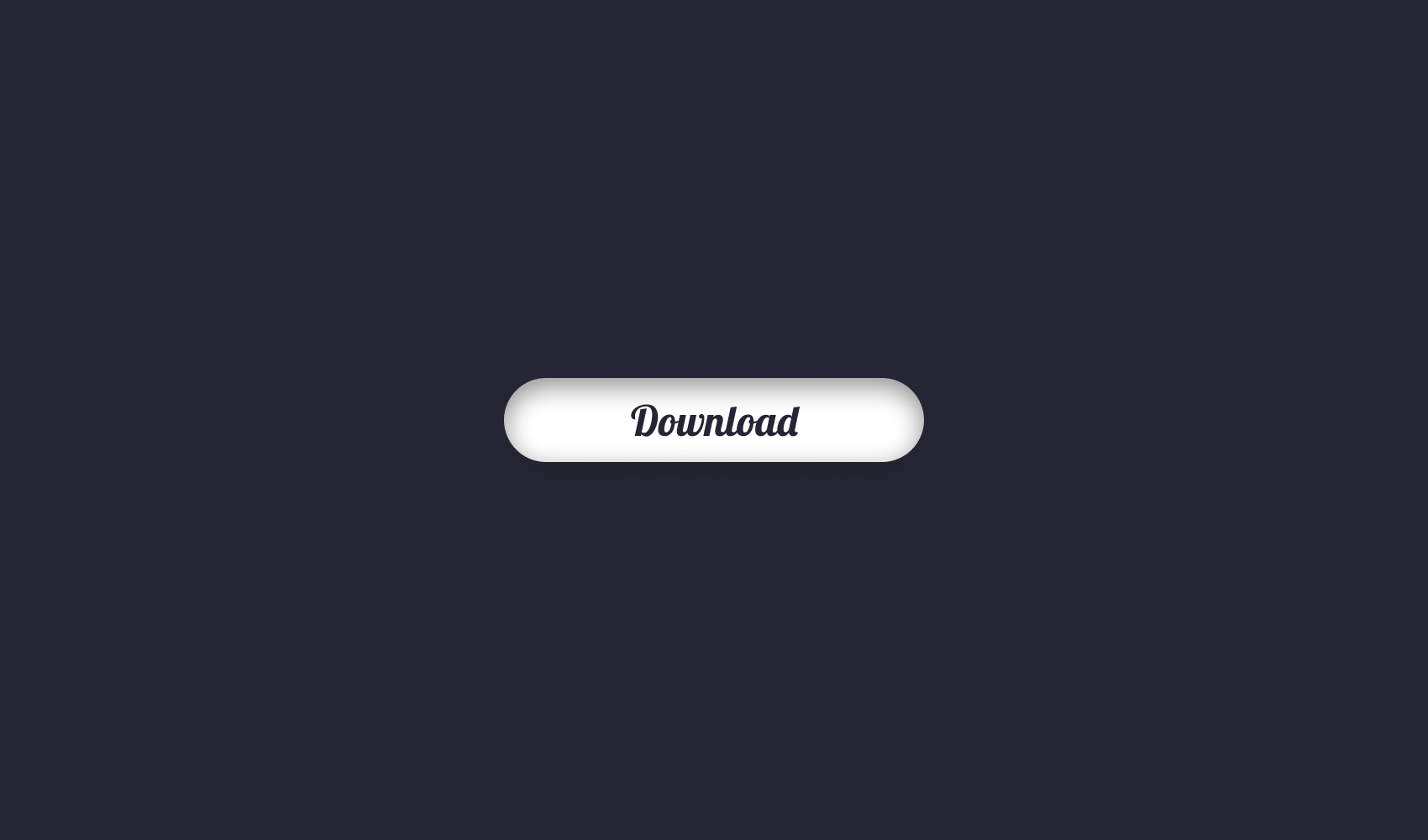
In this tutorial, we will focus on how CSS transitions can be used to create an animated progress bar. I will leave a link to the GitHub repository at the end of the article where the final project is hosted. This is how the progress bar will look like.


Creating the Markup for the Progress Bar
To start things off, create three separate files: index.html, styles.css, and app.js.
Open your index.html file and add the following elements to it:
<!DOCTYPE html>
<html lang="en">
    <head>
        <meta charset="UTF-8" />
        <meta name="viewport" content="width=device-width, initial-scale=1.0" />
        <title>📥 Animated Progress Bar With CSS</title>

        <link href="https://fonts.googleapis.com/css2?family=Lobster&display=swap" rel="stylesheet" />
        <link rel="stylesheet" href="styles.css" />
    </head>
    <body>
        <div class="progress-button">
            <span class="loading-text">Loading</span>
            <button class="download-button">
                <span class="button-text">Download</span>
            </button>
            <span class="percentage">0%</span>
        </div>

        <script src="app.js"></script>
    </body>
</html>
This is all that we are going to work with. We will have the whole thing wrapped in a .progress-button div. We will change the copy of all three elements through JavaScript. This will be the only purpose of app.js, as well as handling the click event.
Two other things to point out: I’m using Lobster from Google Fonts. The text of the button should be wrapped in a span as we will animate that as well. Now let’s jump into styling them.
Styling the Progress Bar
We will position the button dead center. To achieve this, start with these two CSS selectors:
html {
background: #252535;
font-family: 'Lobster', cursive;
}
.progress-button {
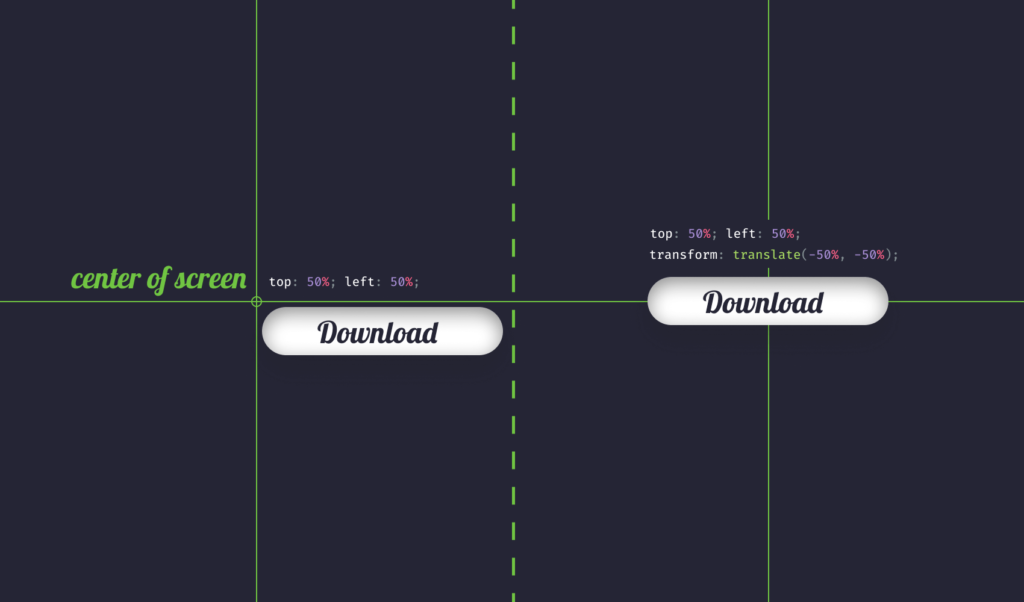
position: absolute;
top: 50%;
left: 50%;
transform: translate(-50%, -50%);
text-align: center;
}The trick here is using transform: translate(-50%, -50%). Since the anchor of the button is at the top left corner, we want to move it back half its width and height.
We also want to add some styles for the button:
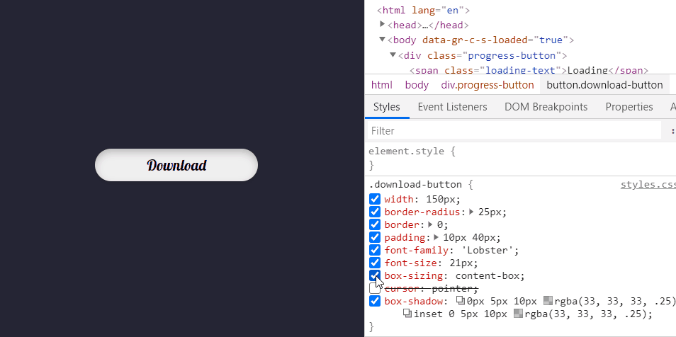
.download-button {
    width: 150px;
    border-radius: 25px;
    border: 0;
    padding: 10px 40px;
    font-family: 'Lobster';
    font-size: 21px;
    box-sizing: content-box;
    cursor: pointer;
    overflow: hidden;
    box-shadow: 0px 5px 10px rgba(33, 33, 33, .25), inset 0 5px 10px rgba(33, 33, 33, .25);
}

.button-text {
    display: inline-block;
    opacity: 1;
    color: #252535;
    transition: all .6s cubic-bezier(0.4, 0.0, 0.2, 1);
}There are five important things you should keep in mind.
- Set
box-sizingtocontent-boxso paddings are calculated the right way. - Set
cursortopointerto indicate that the element is interactive. - Set
overflowtohidden. This will prevent the text of the button to be visible once it’s outside the button’s body. - You can set multiple
box-shadowvalues by comma separating them. - The text of the button needs to be
inline-blockas we will make positional transitions on it. You also need to settransitionto create a smooth animation. I’m using 600ms to finish the transition.
Now its time to add styles for the other texts:
.loading-text,
.percentage {
display: block;
color: #70C542;
font-size: 32px;
position: absolute;
top: 50%;
left: 50%;
transform: translate(-50%, -50%);
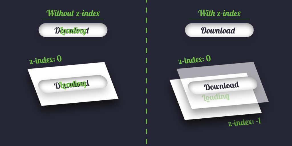
z-index: -1;
opacity: 0;
transition: all .6s cubic-bezier(0.4, 0.0, 0.2, 1);
}Just as for the button, we need to position it absolutely because we want to animate it from the middle of the button. You will also need to set z-index to -1 to bring it behind the button, otherwise, it will overlap with it.
 Remove ads
Animating the Texts
Now we have all the initial styles ready. It’s time to animate things. The animation starts by sliding out the “Loading” text and percentage indicator. Concurrently, we also want to slide out the text of the button. To do all of this, we will add a class to the container once the button is clicked.
document.querySelector('.download-button').onclick = () => {
    document.querySelector('.progress-button').classList.add('in-progress');
}Now we can attach styles to the elements if their parent has an .in-progress class. Extend your styles.css file with the following three selectors:
.in-progress .loading-text {
    opacity: 1;
    top: -55%;
}

.in-progress .percentage {
    opacity: 1;
    top: 155%;
}

.in-progress .button-text {
    transform: translateY(-35px);
    opacity: 0;
}These rules will animate the texts over 600ms.

Animating the Button
The next step is to animate the button. We want to double its width to create a feel like we turned the button into a progress bar. For this, modify your styles.css according to the following:
.download-button {
    width: 150px;
    border-radius: 25px;
    border: 0;
    padding: 10px 40px;
    font-family: 'Lobster';
    font-size: 21px;
    box-sizing: content-box;
    cursor: pointer;
    overflow: hidden;
    transition: width .9s cubic-bezier(0.4, 0.0, 0.2, 1);
    box-shadow: 0px 5px 10px rgba(33, 33, 33, .25), inset 0 5px 10px rgba(33, 33, 33, .25);
}

.in-progress .download-button {
    width: 300px;
}
It uses a slower (+300ms) transition for the width of the element.

Animating Stripes
To create the stripes, we can use the ::after pseudo-element of the button. We will use a linear-gradient as the background image to create the stripes.
.download-button:after {
    content: '';
    position: absolute;
    top: 0;
    left: 0;
    bottom: 0;
    width: 0%;
    background-image: linear-gradient(-45deg, #92CE72 25%, #70C542 25%, #70C542 50%, #92CE72 50%, #92CE72 75%, #70C542 75%, #70C542);
    background-size: 50px 50px;
    border-radius: 25px;
    transition: width .6s cubic-bezier(0.4, 0.0, 0.2, 1);
}Changing the degree to -45° and changing colors every 25% creates the desired effect. We can simply increase progress by increasing the width of the element. Don’t forget to set a fixed background-size, otherwise, the stripes will get thicker as the width increases.

You may have noticed that when it’s near 1%, the element looks squashed. This is because, for small widths, you can’t have a large border-radius. And since the element overflows the button, the distortion is visible. To fix this, add position: relative to your .download-button.

Making Progress
To see it in action, let’s create a function that simulates a download. There’s only one problem. You can’t change — at the time of writing this article — the style of a pseudo-element through JavaScript. To work around this, we will use CSS variables.
+ :root {
+    --progress: 0%;
+ }

  ...

 .download-button:after {
     ...
-    width: 0%;
+    width: var(--progress);
}Add a new variable for the :root element and use it in your ::after. We will change the value of this through JavaScript. Open your app.js file and add the following:
const simulateDownload = (progress) => {
    return new Promise((resolve, reject) => {
        setTimeout(() => {
            resolve(progress + 1);
        }, 50);
    }).then(res => res);
};

document.querySelector('.download-button').onclick = () => {
    document.querySelector('.progress-button').classList.add('in-progress');

    const documentStyles = document.documentElement.style;
    const percentage = document.querySelector('.percentage');

    (async () => {
        let progress = 0;

        while (progress < 100) {
            progress = await simulateDownload(progress);

            if (progress % 5 === 0) {
                documentStyles.setProperty('--progress', `${progress}%`);
            }

            percentage.innerText = `${progress}%`;
        }
    })();
}Only line:9–10 remained the same. The new function, defined on line:1 will resolve a new Promise every 50ms. We can then have a loop that goes from 0 to 100 and increase progress by one in each iteration.
This is where we can rewrite the CSS variable using setProperty on line:22. The if statement is for updating the property only every 5%. If we try this out now, we should have a loading animation.
 Remove ads
Finishing Up
All that’s left to do is to indicate to the user when the download has finished. To do this, let’s switch the .in-progress class to .finished. We will need two more styles for this:
.finished .download-button {
    background: #70C542;
}

.finished .download-button:after {
    opacity: 0;
}Everything else can be handled inside the click event listener:
const progressButton = document.querySelector('.progress-button');
const buttonText = document.querySelector('.button-text');

progressButton.classList.add('in-progress');

(async () => {
    let progress = 0;

    while (progress < 100) {
        ...
    }

    buttonText.innerText = '🎉 Done';
    setTimeout(() => progressButton.classList.replace('in-progress', 'finished'), 1000);
})();I’ve also outsourced the .progress-button selector into a variable as we use it multiple times. At line:14, the .in-progress class is switched to .finished. Because we remove it, we don’t have to worry about repositioning the texts. They will return to their initial positions.
If you would also like to update the “Loading” text with ellipsis, add this line to your app.js:
if (progress % 5 === 0) {
    documentStyles.setProperty('--progress', `${progress}%`);
    loadingText.innerHTML = `Loading${Array(progress % 4).fill('.').join('')}`;
}Summary
With the use of CSS transitions, you can create pretty complex animations. Apart from a few exceptions, you can transition almost any CSS property. Now your users will have no problem understanding what’s going on.
If you would like to tweak around with the finished project, you can clone it from this GitHub repository. Thank you for taking the time to read this article, happy styling! 🎨
If you would like to learn more about CSS, check out what are some steps you can take to quickly improve the architecture of your stylesheets.


Rocket Launch Your Career
Speed up your learning progress with our mentorship program. Join as a mentee to unlock the full potential of Webtips and get a personalized learning experience by experts to master the following frontend technologies:
Courses

CSS - The Complete Guide (including Flexbox, Grid and Sass)

The HTML & CSS Bootcamp

The Creative HTML5 & CSS3 Course
Recommended
7 Tips That Will Help You Get The Best Out Of Sass
2021 11 November • 7 min read
How to Make a Download Progress Bar in React
2021 11 November • 10 min read
How to Make a Real-Time Chat App With Socket.io
2021 11 November • 17 min read