How to Make a Responsive, Animated Navbar in React
 18 min read • React v18.2
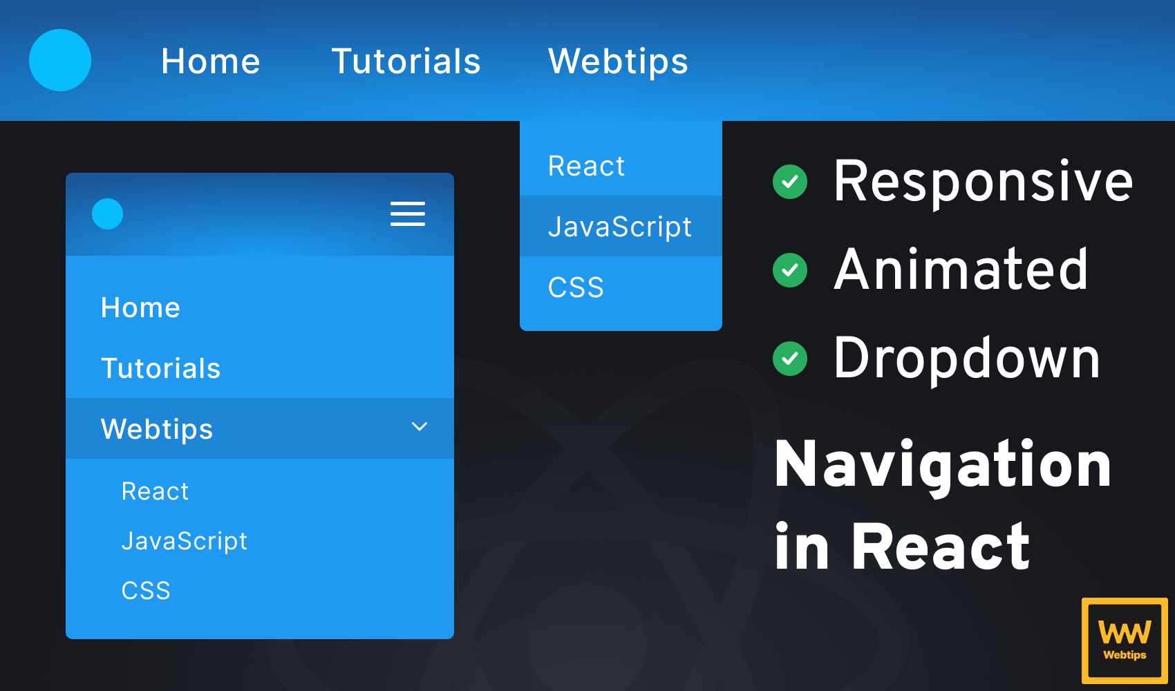
Creating a responsive, animated navigation bar with dropdown functionality in React can be a tricky task. There are many subtle elements involved, starting from how to semantically generate the HTML to how to style and animate elements in CSS.
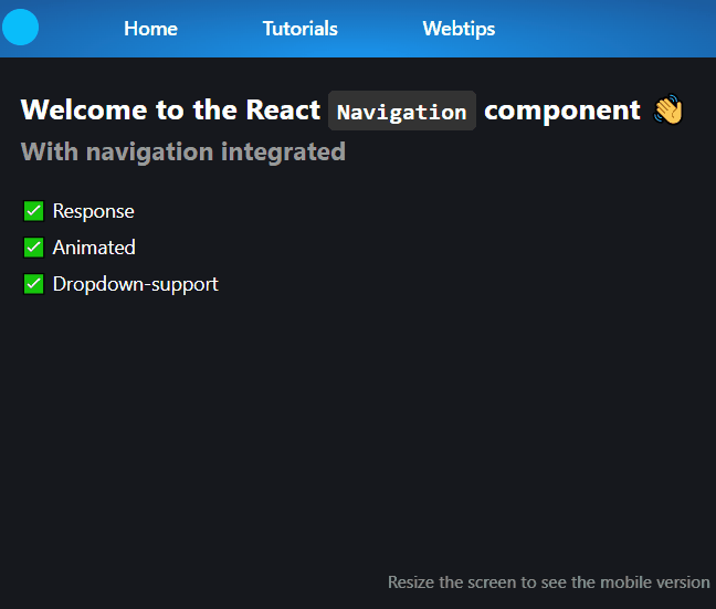
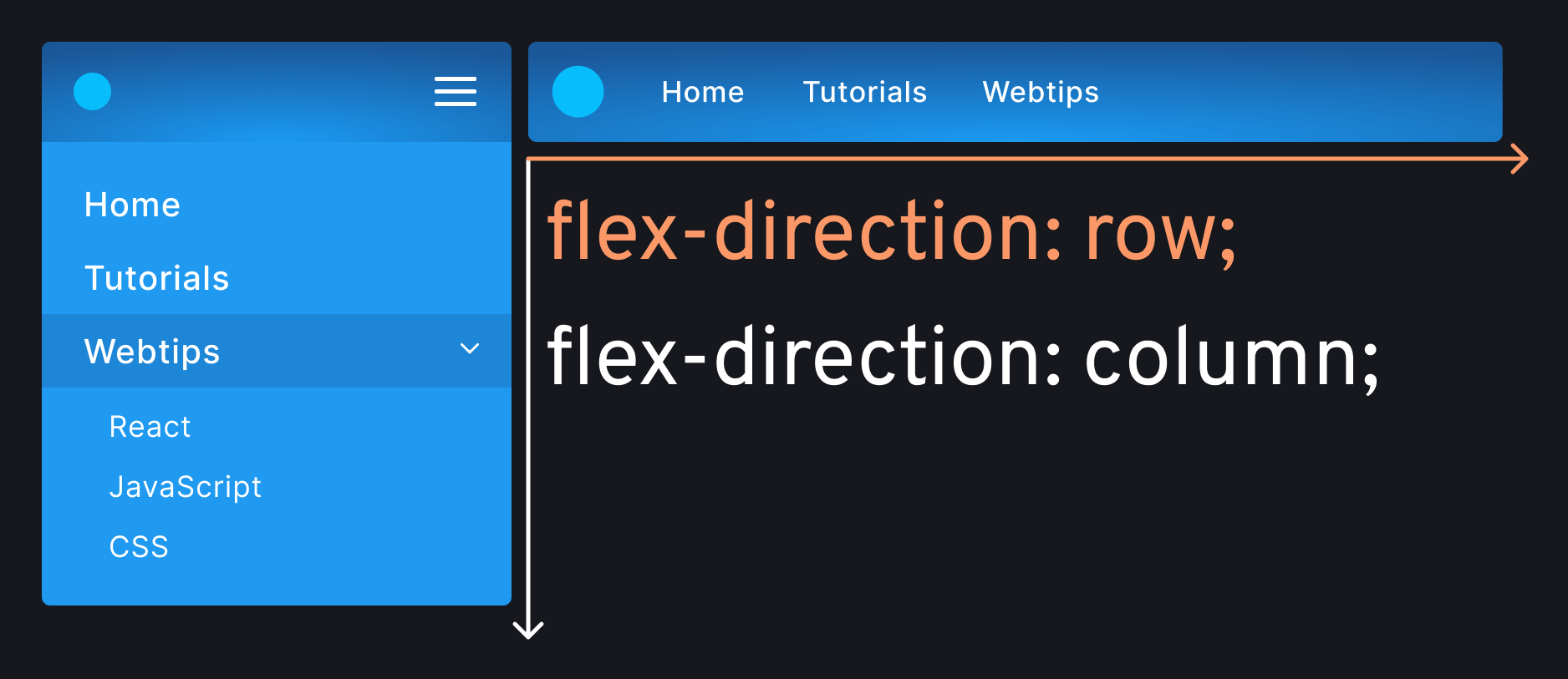
In this tutorial, we are going to go through step-by-step how to create a Navigation component, as well as how to animate each part. At the end of this tutorial, we are going to have the above navbar ready.

Setting Up the Component
Starting off, we want to define the data structure of our navbar. In a real-world scenario, we would likely get the data from a CMS. In this tutorial, we are going to define it as a variable. Inside the App/Layout component, add the following array of objects:
const items = [
    { name: 'Home', url: '/' },
    {
        name: 'Tutorials',
        children: [
            { name: 'Beginner', url: '/tutorials/beginner' },
            { name: 'Intermediate', url: '/tutorials/intermediate' },
            { name: 'Advanced', url: '/tutorials/advanced' }
        ]
    },
    { ... },
    { ... }
]Each item comes with the following properties:
name: The name of the menu.url: The URL where the menu is pointing to. If this is not set, it means the menu item is a dropdown.children: If the menu item is a dropdown, it will have a list of child elements, each with anameandurlproperty.
We can pass this data to a new component called Navigation. Create an empty file for the component and reference it inside App.jsx:
<Navigation items={items} />Generating the Menu
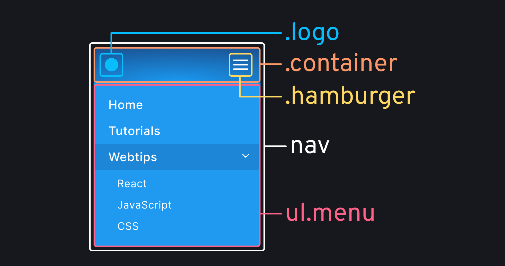
Inside the component, the following elements will be necessary to handle the functionality on both mobile and desktop:
const Navigation = ({ items }) => {
    return (
        <nav>
            <div className="container">
                <div className="logo" />
                <div className="hamburger">
                    <span className="meat"></span>
                    <span className="meat"></span>
                    <span className="meat"></span>
                    <span className="meat"></span>
                </div>
            </div>
            <ul className="menu">{renderItems()}</ul>
        </nav>
    )
}nav: Everything will go inside anavelement, which is going to be displayed asflex. To have the correct alignment, we need to wrap the.logoand.hamburgerelements into a.container..hamburger: This will be responsible for toggling the menu on mobile. Based on its design, it is often called a "hamburger" menu.ul: This is where the navigation element will go. To keep indentation low, we can outsource the rendering into a function calledrenderItems.
Rendering navigation items
const renderItems = () => items.map((item, index) => (
    <li key={index}>
        {item.url
            ? <Link to={item.url}>{item.name}</Link>
            : <span>
                  {item.name}
                  <img src="/arrow.svg" />
              </span>
        }
        {item.children && renderChildren(item.children)}
    </li>
))Based on whether the item has a url, we want to either render a Link pointing to item.url, or a span without a link, and an arrow pointing down. This arrow will only be visible on mobile, indicating that the menu item is collapsible.
This tutorial uses react-router for navigation.
Again, to keep the indentation flat, we can outsource the rendering of the dropdown to another function. Define renderChildren next to renderItems based on the code below:
const renderChildren = (children) => (
    <ul className="sub-menu">
        {children.map((child, index) => (
            <li key={index}>
                <Link to={child.url}>
                    {child.name}
                </Link>
            </li>
        ))}
    </ul>
)The logic roughly remains the same, but this time, every item is a link. Notice that we also want to wrap everything inside a ul, and don't forget to add the key attributes to the li elements.
 Remove ads
Styling the Mobile Navigation
So far, we have generated the navbar with navigation functionality. However, we are missing the biggest piece from the component: the styles. Create a new CSS file for the navigation and import it into the component.
First, we want to reset some styles and give a proper background to our navigation. To do this, add the following styles to the empty CSS file:
nav {
    background: rgb(27,149,237);
    background: radial-gradient(ellipse at center bottom, rgba(27,149,237,1) 0%, rgba(27,87,153,1) 100%);
    display: flex;
    flex-direction: column;
}

a {
    color: #FFF;
    text-decoration: none;
}

ul {
    list-style-type: none;
    margin: 0;
    padding: 0;
}This tutorial uses Sass for nesting styles. If you are using Vite, run npm i sass in the terminal to add it.
We can position radial gradients in CSS by defining the position after the ellipse keyword. It also accepts percentages, such as: ellipse at 50% 50%. To use the mobile-first approach, we are using flex-direction: column for the nav. This will be row for the desktop version.
Styling the hamburger menu
Next up, we want to style the hamburger menu. Visually, we have three bars, however, we have four .meat elements in the DOM. This is because the fourth is hidden behind the middle bar.

This will be animated into a cross with rotation, while also hiding the top and bottom bars simultaneously. To align the bars correctly, add the following rules to the CSS:
.hamburger {
    position: relative;
    width: 30px;
    height: 20px;
    cursor: pointer;
    user-select: none;

    .meat {
        border-radius: 2px;
        width: 100%;
        position: absolute;
        height: 3px;
        background: #FFF;
        display: block;
        transition: all .3s cubic-bezier(0.4, 0.0, 0.2, 1);

        &:first-child {
            top: 0;
        }

        &:nth-child(2),
        &:nth-child(3) {
            top: 50%;
            transform: translateY(-50%);
        }

        &:last-child {
            bottom: 0;
        }
    }
}The important parts here are the highlighted lines. We can use absolute positioning to align the elements at the top (first-child), middle, and bottom (last-child). Notice that the second and third children are in the same position. These elements will be turned into a cross. We can animate them with an additional class:
.close {
    .meat:first-child,
    .meat:last-child {
        opacity: 0;
    }

    .meat:first-child {
        transform: translateY(20px) scale(0);
    }

    .meat:last-child {
        transform: translateY(-20px) scale(0);
    }

    .meat:nth-child(2) {
        transform: rotate(45deg);
    }

    .meat:nth-child(3) {
        transform: rotate(-45deg);
    }
}- The first and last children are animated into the middle, while also making it invisible with scaling and opacity.
- The second and third children are rotated by (+/-)45° to form a cross.
This class can be toggled through an onClick event listener inside our Navigation component. Add a new useState hook, and toggle the class in the following way:
const [toggled, setToggled] = useState(false)

...

<div
    className={toggled ? 'hamburger close' : 'hamburger'}
    onClick={() => setToggled(!toggled)}
>
    <span className="meat"></span>
    <span className="meat"></span>
    <span className="meat"></span>
    <span className="meat"></span>
</div>Now the animation works, but it is still not aligned properly, due to some missing styles on our container. To adjust alignments, add the following rules to the CSS:
.container {
    display: flex;
    justify-content: space-between;
    align-items: center;
    padding: 10px;
}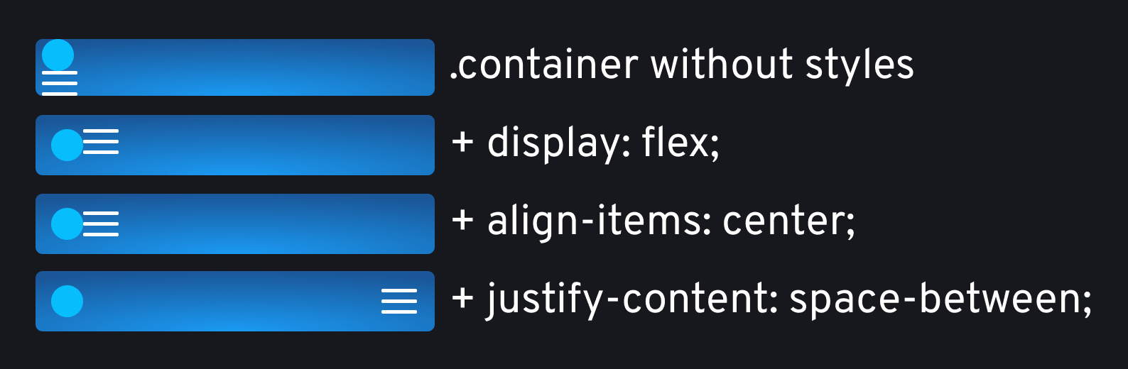
.containerStyling the menu
To create the dropdown effect, we are going to animate max-height properties. As height cannot be animated from 0 to auto, we are going to set max-height to 0 initially, and animate it to a higher value than our element can ever be. This can be done using the following rules:
.menu {
    display: flex;
    flex-direction: column;
    gap: 10px;
    max-height: 0px;
    overflow: hidden;
    transition: max-height .6s ease-in-out;

    &.active {
        max-height: 500px;
    }
}To toggle the class from React, we need to edit the class of our ul inside the Navigation component. We can use the same toggled state that we have created for the hamburger menu:
return (
    <nav>
        ...
        <ul
            className={[
                'menu',
                toggled && 'active'
            ].filter(Boolean).join(' ')}
        >
            {renderItems()}
        </ul>
    </nav>
)By using filter(Boolean).join(' '), we can ensure that no undefined or empty classes are added to the DOM. Alternatively, classnames is a popular package that is used for this purpose.
This sorts out the toggle functionality for the entire navigation, but we also have a toggle functionality for dropdown menus. To toggle dropdowns, extend the CSS for .menu with the following:
.menu li {
    font-weight: 500;
    cursor: pointer;
    position: relative;

    a:hover {
        background: #1E86D7;
    }

    a,
    span {
        display: flex;
        align-items: center;
        height: 100%;
        padding: 10px 20px;
        justify-content: space-between;
    }

    span img {
        transition: transform .3s ease-in-out;
    }

    span.toggled {
        img {
            transform: rotate(180deg);
        }

        + .sub-menu {
            max-height: 500px;
        }
    }
}To toggle dropdowns, we can add a .toggled class on the span elements. In this case, we want to rotate the arrow icons 180° and animate the max-height property of the .sub-menu next to it. We need to use the adjacent sibling selector (+) to select the dropdowns.
To toggle this class, we need to go back to our Navigation component and attach an onClick event listener to our span. Every time we click on the button, this will toggle the .toggled class:
const toggleSubMenu = event => {
    event.currentTarget.classList.toggle('toggled')
}

{/* Inside `renderItems`, attach the function to an onClick listener */}
<span onClick={toggleSubMenu}>
    {item.name}
    <img src="/arrow.svg" />
</span>There is only one thing missing to finish everything on mobile, and that is the styles for the .sub-menu elements. Extend the CSS with the following rules:
.sub-menu {
    max-height: 0;
    overflow: hidden;
    transition: max-height .5s ease-in-out;
    z-index: 1;

    li a {
        padding: 10px 40px;
        font-weight: 400;
    }
}Adding overflow: hidden, and max-height: 0 will ensure the dropdown is closed initially, and only expanded upon click (handled through the .toggled class).
Styling the Desktop Navigation
To add the desktop styles, we need to introduce a media query. This is the time when we want to switch the layout from column to row, and also hide the hamburger menu:
@media (min-width: 600px) {
    nav {
        flex-direction: row;
        gap: 50px;
    }

    .hamburger {
        display: none;
    }
}We also need to switch the layout from column to row for the .menu, and reset the overflow to visible. Here, we also want to animate max-height on hover (instead of click):
.menu {
    max-height: none;
    flex-direction: row;
    overflow: visible;
    gap: 50px;

    li {
        a,
        span {
            padding: 0 10px;
        }

        span img {
            display: none; // 💡 Also hide the arrows on desktop
        }

        span.toggled + .sub-menu {
            max-height: 0px;
        }

        &:hover .sub-menu,
        &:hover span.toggled + .sub-menu {
            max-height: 300px;
        }
    }
}The last styles that we are missing are for the dropdown on desktop. To create the dropdown effect, we want to position them absolutely:
.sub-menu {
    position: absolute;
    left: -10px;
    background: #209AF1;
    border-bottom-left-radius: 5px;
    border-bottom-right-radius: 5px;

    li a {
        padding: 10px 20px;
    }

    li:last-child a {
        border-bottom-left-radius: 5px;
        border-bottom-right-radius: 5px;
    }
}We also want a negative value for the left property, equal to the padding-left of the span above it. This will ensure that the text is aligned properly with the menu item.
Closing Menu on Click
At this stage, the menu is working and animating properly. However, we can add some extra changes to make the navbar more user-friendly. Whenever the user clicks on one of the menu items, we want to close the entire menu.
For this, we are going to need a new function invoked whenever a Link is clicked. Add the following to both renderChildren and renderItems:
const renderChildren = children => (
    <ul className="sub-menu">
        {children.map((child, index) => (
            <li key={index}>
-               <Link to={child.url}>
+               <Link to={child.url} onClick={() => closeMenu(true)}>
                    {child.name}
                </Link>
            </li>
        ))}
    </ul>
)

const renderItems = () => items.map((item, index) => (
    <li key={index}>
        {item.url
-           ? <Link to={item.url}>{item.name}</Link>
+           ? <Link to={item.url} onClick={() => closeMenu()}>{item.name}</Link>
            : <span onClick={toggleSubMenu}>
                {item.name}
                <img src="/arrow.svg" />
                </span>
        }
        {item.children && renderChildren(item.children)}
    </li>
))The onClick on the dropdown is called with a true parameter, while on line:18 it is not. This will decide whether the click happens on the main navigation or on one of the dropdown elements. Let's see how the closeMenu function works:
const [closeSubMenu, setCloseSubMenu] = useState(false)

const screenSizes = {
    small: 600
}

const closeMenu = (closeSubMenu = false) => {
    setToggled(false)

    if (closeSubMenu && window.innerWidth > screenSizes.small) {
        setCloseSubMenu(true)
        setTimeout(() => setCloseSubMenu(false), 0)
    }
}

...

return (
    <nav>
        ...
        <ul
            className={[
                'menu',
                toggled && 'active',
                closeSubMenu && 'closed'
            ].filter(Boolean).join(' ')}
        >
            {renderItems()}
        </ul>
    </nav>
)Note that we can also call the setToggled updater function to toggle the menu off. This means the function will work for both mobile and desktop.
We need a new useState hook for the new function. This will be responsible for handling another class on the ul (on line:25). This class will only be applied on desktop as we check the screen size in the closeMenu function.
To make the if statement more meaningful, we can define screen sizes in an object. The class only hides the dropdown after clicking and removes the class at the end of the call stack using a setTimeout.
.menu.close .sub-menu {
    display: none;
}Summary
If you have reached this far, congratulations! Now you have a working responsive, animated navbar in React, ready to be used in any project. Do you have experience with building navbars? Let us know your thoughts in the comments below! Thank you for reading through, happy coding! 👨💻


Rocket Launch Your Career
Speed up your learning progress with our mentorship program. Join as a mentee to unlock the full potential of Webtips and get a personalized learning experience by experts to master the following frontend technologies:
Courses


Recommended

How to Make an Easter Egg Hunt Game in JavaScript
7 min read
How to Drag and Drop in React Without Extra Libraries
12 min read
How to Toggle Visibility in React
6 min read