
How to Create an Autocomplete Search Component in React
 2021 13 July •
  13 min read
Autocomplete searching is a common feature for websites with a search bar, whose main purpose is to help users finish their search terms by providing relevant matches. It works in simple terms; When a user begins typing, a request is made to the server with the user’s input. This request returns a set of matches which is then displayed for the user to choose from.
When working with smaller datasets, it’s more optimal to request all available data in one go, and filter the result in memory, without the need for additional requests. This is the route we are going to take in this tutorial.
If you want to jump straight to the code, you can clone the whole component in one piece from the provided GitHub repository at the end of this article. Without any further ado, let’s code the component.

Fetching Search Results
The first thing we want to do is request some data from a server. For this tutorial, I’ve created a mock function that returns an array of objects in the form of posts.
const getSearchResults = () => [
    {
        image: 'url/to/img.jpg',
        link: 'webtips.dev/how-to-improve-data-fetching-in-react-with-suspense',
        title: 'How to Improve Data Fetching in React With Suspense'
    },
    { ... },
    { ... }
];We will make use of this function later down the road. To get the results in React, create a new component with the following useEffect hook:
import React, { useState, useEffect } from 'react'

const AutoCompleteSearch = () => {
    const [searchTerm, updateSearchTerm] = useState('');
    const [searchResults, updateSearchResults] = useState([]);

    useEffect(() => {
        const getSearchResults = async () => {
            const searchResultsResponse = await getSearchResults();
            console.log(searchResultsResponse);

            updateSearchResults(searchResultsResponse);
        };

        getSearchResults();
    }, []);

    return (
        <section className="search">
            <h1>Search {searchTerm.length ? `results for: ${searchTerm}` : null}</h1>
        </section>
    );
}

export default AutoCompleteSearch;This component calls the mock function on line:9, and then logs it out. Now you should see the response showing up in your console.
Note that useEffect can’t be an async function itself, so you have to define another function inside it. If you would like to learn more about hooks, head over to the tutorial below:

Displaying results
As a next step, let’s display the results returned by the hook. For this, I’ve created a separate component that also handles cases when data is unavailable. Add the following after your useEffect and call it inside the return:
const SearchResults = () => {
const Message = ({ text }) => (
<div className="message">
<h2>{text}</h2>
<hr />
</div>
);
if (!searchResults.length) {
return <Message text="Loading search results" />
}
if (!searchTerm) {
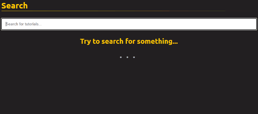
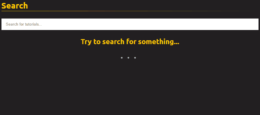
return <Message text="Try to search for something..." />
}
return (
<ul className="search-results">
{searchResults.map((article, index) => (
<li key={index}>
<Card model={article} />
</li>
))}
</ul>
);
};
return (
<section className="search">
<h1>Search {searchTerm.length ? `results for: ${searchTerm}` : null}</h1>
<SearchResults />
</section>
);This will loop through the results, and display a card for each article. Here you can define a separate component and pass the needed details to simplify your autocomplete search component.
In case there are no searchResults, it will also display a loading message. For now, this will display all results if the user defines a searchTerm, so let’s add filtering.
Filtering Results
To filter the results, add an input to the component with a new state for the filtered resultset:
const AutoCompleteSearch = () => {
    // Add a new state for the filtered results
    const [filteredResults, updateFilteredResults] = useState([]);

    ...

    const updateSearch = e => {
        updateSearchTerm(e.target.value);
        updateFilteredResults(searchResults.filter(result => result.title.match(new RegExp(e.target.value, 'gi'))))
    };

    const SearchResults = () => {
        ...

        if (!filteredResults.length) {
            return <Message text="We couldn't find anything for your search term." />
        }

        // ⚠️ Don't forget to also change `searchResults` to `filteredResults.map` inside the return
        return (...);
    }

    return (
        <section className="search">
            <h1>Search {searchTerm.length ? `results for: ${searchTerm}` : null}</h1>
            <input type="text" placeholder="Search for tutorials..." onKeyUp={updateSearch} />
            <SearchResults />
        </section>
    );
}I’ve created an updateSearch function, which updates both the searchTerm (the value of the input), and the filteredResults. To filter the set, I’ve used a simple — global and case insensitive — regex which matches whether the title of the article contains the search term, or not. Pass this function to the onKeyUp event of your input.
Here is where you can define more complex search algorithms to further refine your results.
I’ve also added another if clause inside the SearchResults to check if there are no matches for a given search. Also, don’t forget to change map from searchResults.map to filteredResults.map in the return, as we only want to display the filtered results.

 Remove ads
Displaying Autosuggest
The next step is to display an autosuggest based on the search term from which the user can choose. Add a new list between the input and the SearchResults and two new states:
const AutoCompleteSearch = () => {
    const [displayResults, updateDisplayResults] = useState(false);
    const [focusIndex, updateFocusIndex] = useState(-1);

    ...

    return (
       <input />
       <ul className="search-suggestions">
            {(!displayResults && searchTerm) && <li key="-1" className={focusIndex === -1 ? 'active' : null}>{`Search for ${searchTerm}`}</li>}
            {!displayResults && filteredResults.map((article, index) => (
                 <li key={index} className={focusIndex === index ? 'active' : null}>
                     <a href={article.link} target="_blank" className="autosuggest-link">{article.title}</a>
                 </li>
            ))}
        </ul>
        <SearchResults />
    );
};This will do two things:
- If the
displayResultsstate isfalse, we display the filtered results in an autosuggest. - I’ve also created a
focusIndexwhich holds theindexof the currently selected item in the autosuggest. This adds anactiveclass for the item which is in focus.
To show and hide the autosuggest, create two new functions, and attach them to your input’s onBlur and onFocus events:
const hideAutoSuggest = e => {
    e.persist();

    if (e.relatedTarget && e.relatedTarget.className === 'autosuggest-link') {
        return;
    }

    updateDisplayResults(true);
    updateFocusIndex(-1);
};

const showAutoSuggest = () => updateDisplayResults(false);

return (
    <section className="search">
        <h1>...</h1>
        <input type="text"
                placeholder="Search for tutorials..."
                onKeyUp={updateSearch}
                onBlur={hideAutoSuggest}
                onFocus={showAutoSuggest} />
        <ul className="search-suggestions">...</ul>
        <SearchResults />
    </section>
);Note that the hideAutoSuggest function needs to persist the event to check if the onBlur event was caused by clicking on one of the autosuggest’s links. In this case, we don’t want to close the autosuggest (by setting displayResults to false).
Also for SearchResults, add the following line to force it to not display the results, in case the autosuggest is open.
const SearchResults = () => {
    const Message = ({ text }) => ( ... );

    if (!displayResults) {
        return null;
    }

    ...
};Adding Keyboard Navigation
Now if you start typing into the search bar, you will be presented with a list of results:
Currently, only the first item can be active at all times, so let’s also add keyboard navigation so users can navigate up and down and also trigger a search by hitting the enter key.
First, add a new object and an array for mapping keycodes and storing references to the links. Then add a new function that you attach to the onKeyDown event of the input. Lastly, create a reference for each anchor in the autosuggest list.
const linkRefs = [];
const keys = {
    ENTER: 13,
    UP: 38,
    DOWN: 40
};

const handleNavigation = e => {
    switch (e.keyCode) {
        case keys.ENTER:
            if (focusIndex !== -1)  {
                window.open(linkRefs[focusIndex].href);
            }

            hideAutoSuggest(e);
        break;
        case keys.UP:
            if (focusIndex > -1) {
                updateFocusIndex(focusIndex - 1);
            }
        break;
        case keys.DOWN:
            if (focusIndex < filteredResults.length - 1) {
                updateFocusIndex(focusIndex + 1);
            }
        break;
    }
};

return (
    <section className="search">
        <h1>...</h1>
        <input type="text"
            placeholder="Search for tutorials..."
            onKeyUp={updateSearch}
            onKeyDown={handleNavigation}
            onBlur={hideAutoSuggest}
            onFocus={showAutoSuggest}
        />
        <ul className="search-suggestions">
            {!displayResults && filteredResults.map((article, index) => (
                <li key={index} className={focusIndex === index ? 'active' : null}>
                    {/* Add refs to the anchors */}
                    <a href={article.link} target="_blank" className="autosuggest-link" ref={link => {linkRefs[index] = link}}>{article.title}</a>
                </li>
            ))}
        </ul>
        <SearchResults />
    </section>
);This will change the focus for the active item in the autosuggest if the user presses the up or down arrows, and opens the article in a new window if they press enter. If the focus is set to -1 (meaning that no autosuggest item is selected), then it will only hide the list and show the matched results.
Summary
And now you have a working autocomplete search component in React. If you would like to tweak around with the component, you can get the full source code in one piece from its GitHub repository.
If you have any questions about the implementation, do not hesitate to ask in the comments section below! Thank you for reading through, happy coding!

Rocket Launch Your Career
Speed up your learning progress with our mentorship program. Join as a mentee to unlock the full potential of Webtips and get a personalized learning experience by experts to master the following frontend technologies:
Courses


Recommended

All You Need to Know About React Hooks
2021 28 June • 19 min read
How to Add Custom JSON Endpoints to Your WordPress
2021 18 September • 5 min read
How to Master Using Flexbox in CSS
2021 13 July • 9 min read