How to Build an IMDB Clone Using Sapper
Sapper, the application framework by Svelte is built to provide a great developer experience and flexible filesystem-based routing, without compromising on SEO or performance, all with a small footprint.
It provides server-side rendering for fast initial page loads, but with the help of client-side JavaScript, navigation is just as fast as the initial load time.
The Goal of This Tutorial
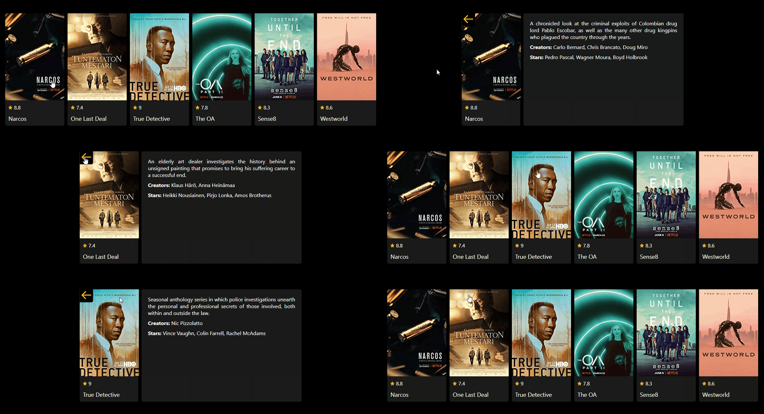
The goal of this tutorial is to get you up and running with Sapper. We will recreate the top picks section on IMDB, and we will also let users find out more about a movie, by clicking on the cards.
We will go over the structure of Sapper, then we will see how navigation works between routes and how you can create endpoints to fetch data. This tutorial assumes that you already have a basic knowledge about Svelte. If you don’t, make sure you have a quick read from the article below for introduction, and you can continue here, where you left off.
The Structure of Sapper
To start working with Sapper, you can run the following commands from their official site, depending on whether you want to go with Rollup or Webpack:
npx degit "sveltejs/sapper-template#rollup" imdb-sapper
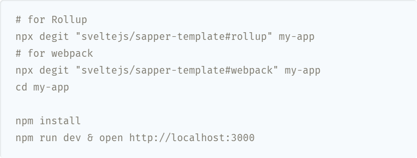
In this tutorial, I will be using Rollup. Once installed, you can run npm i to install the dependencies, and then run npm run dev to start your dev server. You’ll see that Sapper will create the following folder structure, from which three of them is important to us:
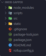
The scripts folder serves only one purpose, to set up TypeScript. To integrate TypeScript into the project, run:
node scripts/setupTypeScript.js
The src folder contains the entry point for your application. You will see three important files at the root of the folder:
client.js:
The entry point for the client-side of the application. This must call the start function from your Sapper module, with a target property, referencing a DOM element, like so:
import * as sapper from '@sapper/app';

sapper.start({
    target: document.querySelector('#sapper')
});Usually, you will have nothing more, except the above. Although you are free to add any configuration you may like. This code example references the #sapper div element, that is found in your template.html.
template.html:
<!doctype html>
<html lang="en">
    <head>
        <meta charset="utf-8" />
        <meta name="viewport" content="width=device-width,initial-scale=1.0" />
        <meta name="theme-color" content="#333333" />

        %sapper.base%

        <link rel="stylesheet" href="global.css" />
        <link rel="manifest" href="manifest.json" crossorigin="use-credentials" />
        <link rel="icon" type="image/png" href="favicon.png" />

        %sapper.scripts%
        %sapper.styles%
        %sapper.head%
    </head>
    <body>
        <div id="sapper">%sapper.html%</div>
    </body>
</html>You will notice that this file uses some special placeholders, where Sapper will inject the necessary content. In order they are:
%sapper.base%: Adds abasetag for the default URL. If you want to change it’s value, you can do so, by setting a string as the first parameter ofuse, in yourserver.jsfile. (More on this later)%sapper.scripts%: Addsclient.js, and any other necessary scripts to your page. As you navigate among your components, you can see in your network tab as Sapper requests the necessary scripts.%sapper.styles%: This will generate astyletag holding critical CSS, as well as any other CSS needed for the currently mounted component. Again, this will inject additional CSS as required by the user.%sapper.head%: The contents of thesvelte:headtag will be injected here.%sapper.html%: The whole layout of your application will be injected inside of thisdiv.
All of this will be served from your server.js file, which uses polka:
server.js:
import sirv from 'sirv';
import polka from 'polka';
import compression from 'compression';
import * as sapper from '@sapper/server';

const { PORT, NODE_ENV } = process.env;
const dev = NODE_ENV === 'development';

polka()
    .use(
        compression({ threshold: 0 }),
	sirv('static', { dev }),
	sapper.middleware()
    ).listen(PORT, err => {
        if (err) console.log('error', err);
});Polka is a lightweight alternative to Express. Of course, you are free to use anything else, if you want to change the behavior of your server. Again, if you want to change your base URL, you can add it as the first parameter inside the use function:
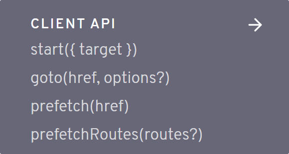
Apart from these core files, you will also see three folders: components, node_modules, and routes. The first question is: Why is there a node_modules folder inside the source folder? And the answer is that Sapper generates a package for your app before bundling, that you can access by importing from @sapper/app. Putting this package inside the source folder means it won’t be deleted if you add new dependencies. You can access these four core function from Sapper:
You also have the usual components folder for storing components, and a routes folder for the different routes your application will have. This is where we will mostly work.
routes
Inside your routes folder, you will see a blog folder with a couple of svelte files next to it. The way you name your components will correspond to a route. For example, index.svelte will be used for the root path, while about.svelte will be used for /about, and so on. You can also organize these routes into folders. For example, the same route will be served for the following:
about.svelte        -> /about
about/index.svelte  -> /about

search.svelte       -> /search
search/index.svelte -> /search
You will also see files with an underscore in front of their names. In Sapper, these files will not create routes. Instead, you can use them to create modules or components for the routes that depend on them. With the starter code, there are two special files in the routes folder. These are:
_error.svelte: This will be shown when an error occurs, for example, a page is not found._layout.svelte: This will apply a layout to every other route. For example, this is where you would import yourHeaderorFootercomponents, or any other part of your application that should be visible, and should be the same on every page.
And lastly, you will also have a static folder, for holding static assets, such as your icon or fonts. That’s is all you need to know about the structure of your Sapper app. Enough talk, let’s get into coding stuff.

Setting Up the List View
You can get rid of almost anything from your src folder, only keep the folder structure. The index.svelte will be the list view. We want to request the movies here with a special preload function:
<script context="module">
    export async function preload() {
        const res = await this.fetch('movies.json');
        const data = await res.json();

        return {
            movies: data
        };
    }
</script>

<script>
    export let movies;
</script>This function runs before a component is created. It is called both on the client and the server-side as well, so you want to avoid referencing any browser API inside this function. Make sure you set the context to module on your script tag, as this runs before the component is created. To fetch data, you want to use this.fetch inside the function.
You can expose the return value to your component through an export. So where is this data coming from? It references movies.json. To make this endpoint available to Sapper, you want to create a movies.json.js file next to your index.svelte.
Fetching data
This file needs to export a get function, where you can send your JSON response. For now, this is all it does:
import movies from '../data/movies';

const movieList = movies.map(movie => ({
    title: movie.title,
    slug: movie.slug,
    image: movie.image,
    score: movie.score
}));

export function get(request, response) {
    response.writeHead(200, {
        'Content-Type': 'application/json'
    });

    response.end(JSON.stringify(movieList));
}This is where you would fetch data from your database, but to keep things simple for this tutorial, it uses mock data that is imported from a movies.js file in a data folder.
export default [
    {
        title: 'Narcos',
        slug: 'narcos',
        image: 'src-path',
        score: 8.8,
        description: 'A short description',
        creators: 'The creators',
        stars: 'The stars'
    },
    { ... },
    { ... }
];Since we are only interested in part of the data, we can use a map to get rid of the unnecessary stuff. Then this data gets stringified and sent down to the client as JSON. If you go over to your localhost and hit /movies.json, you should be able to see the data returned from the server.
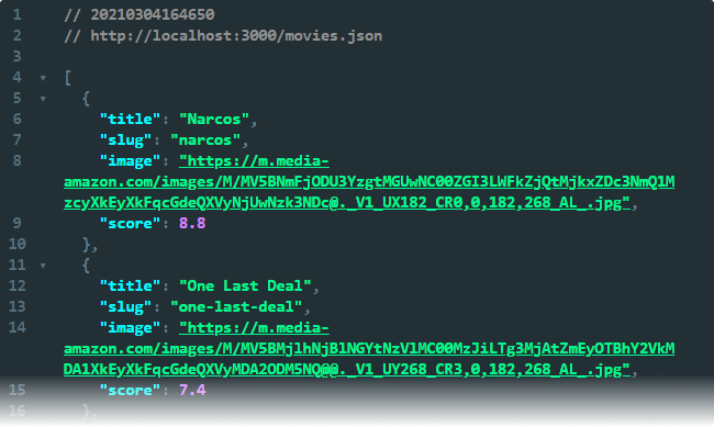
To display a card for each entry, you want to create an #each loop in your component:
<script>
    import Card from '../components/Card.svelte';
</script>

<svelte:head>
    <title>Top picks</title>
</svelte:head>

<ul>
    {#each movies as movie}
        <li>
            <a rel="prefetch" href="movie/{movie.slug}">
                <Card
                    title={movie.title}
                    image={movie.image}
                    score={movie.score} />
            </a>
        </li>
    {/each}
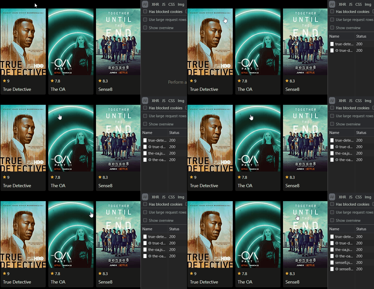
</ul>Note that the anchor uses rel="prefetch". This tells Sapper to load the necessary data for the URL as soon as the user hovers over it.
Adding Sass support
To style the cards I’m using Sass to enhance the readability of the rules by nesting them. To add Sass support, you want to npm i svelte-preprocess-ass. To add it to your bundler, open your rollip.config.js, and inside your svelte plugin call, add this object both for the client and the server as well:
// Import the preprocessor
import { sass } from 'svelte-preprocess-sass';

export default {
    client: {
        svelte({
            ...
            preprocess: {
                style: sass()
            }
        })
    },
    server: {
        svelte({
            ...
            preprocess: {
                style: sass()
            }
        })
    }
}Now inside your components, you can define a type for the style tags, and that way, you can use Sass:
<style type="text/scss">

</style>The Card component
Inside the link, we have a Card component, that I’ve created inside the components folder. This way, we can later reuse this layout. It accepts the properties of a movie. Create the component and add the following:
<script>
    import Rating from './Rating.svelte';

    export let image;
    export let score;
    export let title;
</script>

<style type="text/scss">
    ...
</style>

<article>
    <img src={image} alt={`${title} poster`} />
    <div>
        <Rating score={score} />
        <h3>{title}</h3>
    </div>
</article>Once again, I’ve created a component for the rating, that is made up of a star icon and a score. It may seem overkill for this small application, but if you were to build a full clone of IMDB, you want to keep the UX consistent across different pages. And one way to achieve this is to use common components. It also lets you maintain your app more easily. As mentioned, it is only made up of an SVG and a score, with a couple of styles:
<script>
    export let score
</script>

<style type="text/scss">
   div {
      ...

        svg {
            ...
        }

        span {
            ...
        }
    }
</style>

<div>
    <svg width="24" height="24" xmlns="http://www.w3.org/2000/svg" class="ipc-icon ipc-icon--star-inline" viewBox="0 0 24 24" fill="currentColor" role="presentation"><path d="M12 20.1l5.82 3.682c1.066.675 2.37-.322 2.09-1.584l-1.543-6.926 5.146-4.667c.94-.85.435-2.465-.799-2.567l-6.773-.602L13.29.89a1.38 1.38 0 0 0-2.581 0l-2.65 6.53-6.774.602C.052 8.126-.453 9.74.486 10.59l5.147 4.666-1.542 6.926c-.28 1.262 1.023 2.26 2.09 1.585L12 20.099z"></path></svg>
    <span>{score}</span>
</div>Note that since Svelte automatically scopes CSS, we can simply use tag selectors. And with that, you should have a list of top picks displayed for you to choose from.

Setting Up the Details View
Let’s turn our attention to the details of the movie. You may noticed in index.svelte that the href of the link is pointing to:
"movie/{movie.slug}"This means we will need a movie folder inside the routes, and to create a dynamic route, we want to use regex in the file name. If we name our file as [slug].svelte, a parameter called slug will be available in our preload function:
<script context="module">
    export async function preload({ params }) {
        const result = await this.fetch(`movie/${params.slug}.json`);
        const data = await result.json();

        return result.status === 200
            ? { movie: data }
            : this.error(result.status, data.message);
    }
</script>You can see, this time we want to fetch the JSON data from movie/[slug].json. The params object will be populated based on the URL we want to request:
/movie/narcos    -> params.slug === 'narcos'
/movie/westworld -> params.slug === 'westworld'
To create the necessary JSON endpoints, we will need to create a [slug].json.js file next to our component. Just like for all movies, we will need to use the get function to fetch a single movie. To get the one we are looking for, we can use Array.find:
import movies from '../../data/movies';

export function get(request, response, next) {
    const { slug } = request.params;
    const movie = movies.find(movie => movie.slug === slug);

    if (movie) {
        response.writeHead(200, {
	   'Content-Type': 'application/json'
	});

	response.end(JSON.stringify(movie));
    } else {
        response.writeHead(404, {
	    'Content-Type': 'application/json'
	});

	response.end(JSON.stringify({
           message: 'Movie not found',
	}));
    }
}To display the additional information, let’s go back to [slug].svelte, and add the layout. Here we can reuse the Card component we’ve created earlier, with an additional param:
<script>
    import Card from '../../components/Card.svelte';

    export let movie;
</script>

<svelte:head>
    <title>{movie.title}</title>
</svelte:head>

<main>
    <Card
        showBackButton={true}
        title={movie.title}
        image={movie.image}
        score={movie.score} />
</main>We have a showBackButton prop, that we didn’t have before, so let’s enhance the Card component with that. Open your Card.svelte file and extend the component with the following code:
<script>
    import Rating from './Rating.svelte';
    import BackButton from './BackButton.svelte';

    export let image;
    export let score;
    export let title;
    export let showBackButton;
</script>

<article>
    {#if showBackButton}
        <BackButton />
    {/if}
    <img src={image} alt={`${title} poster`} />
    <div>
        <Rating score={score} />
        <h3>{title}</h3>
    </div>
</article>This will add a BackButton to the card, given that we have the flag set to true. And again, the back button only includes an SVG with an anchor that points back to the top picks page:
<a href="/">
    <svg xmlns="http://www.w3.org/2000/svg" width="31" height="26" viewBox="0 0 31 26" fill="none">
        <path fill-rule="evenodd" clip-rule="evenodd" d="M11.5948 24.6485L0.988154 14.0419C0.337283 13.391 0.337283 12.3357 0.988154 11.6848L11.5948 1.07824C12.2456 0.427371 13.3009 0.427371 13.9518 1.07824C14.6027 1.72912 14.6027 2.78439 13.9518 3.43527L6.19036 11.1967L28.8333 11.1967C29.7538 11.1967 30.5 11.9429 30.5 12.8634C30.5 13.7838 29.7538 14.53 28.8333 14.53L6.19036 14.53L13.9518 22.2914C14.6027 22.9423 14.6027 23.9976 13.9518 24.6485C13.3009 25.2993 12.2456 25.2993 11.5948 24.6485Z" fill="#F5C518"/>
    </svg>
</a>Now if you click on one of your cards, you will get redirected to a details page. The only difference so far, is that you have a back button, and a single card in the middle of the screen, so let’s go ahead and add the rest of the properties. Remember, inside movies.js, we also had a description, a creators and stars node, so add them below your Card inside [slug].svelte:
<main>
    <Card
        showBackButton={true}
        title={movie.title}
        image={movie.image}
        score={movie.score} />
    <div>
        {movie.description}

        <div class="list">
            <b>Creators:</b> {movie.creators}
        </div>

        <div class="list">
            <b>Stars:</b> {movie.stars}
        </div>
    </div>
</main>And now you should see every detail about each movie, as you navigate between them.

Showing the Error Page
So what happens if we try to hit a page that doesn’t exist? We want to indicate somehow to the user that the page they are looking for doesn’t exist. Sapper has a special _error.svelte page just for this purpose. It should be located at the root of your routes folder. to display a 404 message, add the following code to the file:
<script>
    import errorGif from 'images/error.gif';

    export let status;
    export let error;

    const dev = process.env.NODE_ENV === 'development';
</script>

<svelte:head>
    <title>{status} - Movie not found</title>
</svelte:head>

<main>
    <h1>{status}</h1>
    <p>{error.message}</p>

    {#if dev && error.stack}
        <pre>{error.stack}</pre>
    {/if}

    <img src={errorGif} alt="error" />
</main>A couple of things to note; We only want to print the stack trace if we view the app through a dev server. We don’t want it to show in production. Secondly, an image is imported from images/error.gif. This is coming from:
src/node_modules/images/error.gif
Also, note that we have two props: status and error. These are coming from a this.error call from the movie directory. Essentially, we’ve set the message for the error inside [slug].json.js. If you try to hit an invalid page, you should get the following rendered:

Summary
And now you have the foundation to build apps in Sapper. So what are the next steps? All that’s left to do now is to build and deploy your app by running npm run build.
And what about the future of Sapper? The team is currently working on a successor of Sapper, called SvelteKit. It’s still in development, and things will likely change, but migration from Sapper to SvelteKit should be relatively simple. This also means Sapper will not reach v1.0, and once SvelteKit is finalized, you should adopt it, rather than starting a project in Sapper. For now, since SvelteKit is still early in development, it is recommended to start new projects with Sapper. If you’re interested in the future of Svelte and Sapper, make sure to check out the video below.
If you would like to play around with the whole project in one piece, you can clone it from GitHub. Have you used Sapper before? Let us know your thoughts in the comments below! Thank you for reading through, happy coding!

Rocket Launch Your Career
Speed up your learning progress with our mentorship program. Join as a mentee to unlock the full potential of Webtips and get a personalized learning experience by experts to master the following frontend technologies:
