How to Format Pages for Print in CSS
While optimizing for print on the web is rarely a requested change, several cases can arise where you'd need to print a website. Consider printing travel and concert tickets, saving pages for offline reading, or printing pages for students for an offline lecture.
In this tutorial, we'll examine how you can format pages for print in CSS using two different solutions. We'll also explore key considerations when working with print formats.
How to Target Print in CSS
To target print in CSS, we have two solutions: either we can use an external stylesheet with a media attribute set to print (preferred), or we can use the @media print CSS at-rule:
<!-- Target via media="print" -->
<link rel="stylesheet" media="print" href="./print.css" />

<!-- Target via @media print at-rule -->
<style>
    @media print { ... }
</style>For better separation of print-specific styles from the rest of your CSS, it's advisable to use the first option and define it in a completely separate stylesheet. Within this stylesheet, you don't need to use the @media print at-rule, as the stylesheet will only be applied for print formats.
How to Test Print Layout
The most reliable way to test print layouts is to check the print preview using the "Print..." option. Right-click on the page that you'd like to test, and select the "Print..." option. This will show you a print preview, allowing you to verify your changes.
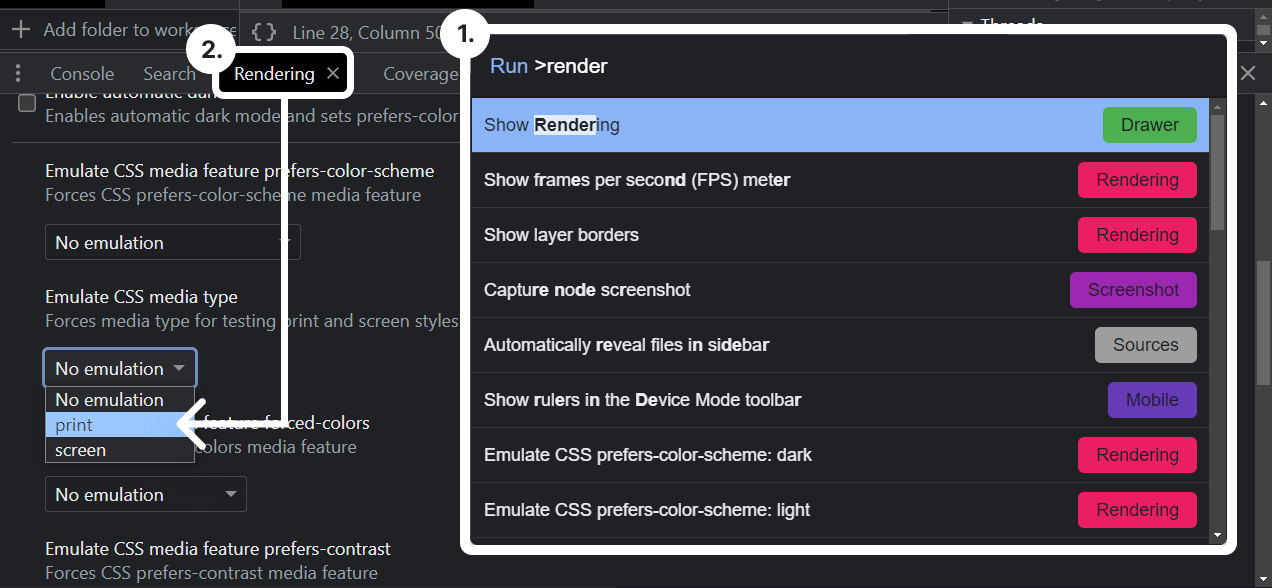
An alternative option is to emulate the CSS media type using DevTools. With your DevTools open, press ctrl + shift + p, and search for "Render" to open the "Rendering" panel.
Alternatively, click on the three dots and find the "Rendering" panel under "More tools".
Within the panel, locate the "Emulate CSS media type" option, and change the setting from "No emulation" to "print". This will enforce the page to use your print CSS. You can use this option to make quick changes and then confirm them in the print preview using the first option.

How to Style the Page
To style entire printed pages collectively, we can use the @page at-rule. This can be used to target and modify the size and orientation of pages, as well as adjust the layout of individual pages.
For instance, to define the size and add extra margins on both sides, you can use the following set of rules:
This code will set the page size as A4 with a landscape orientation, and apply a 4cm margin to both sides.
We can also specifically target the first page using the :first pseudo-selector. Additionally, we can individually target left (even-numbered) or right (odd-numbered) pages using the :left and :right pseudo-selectors:
@page :first {
   margin-top: 4cm;
}

@page :left { ... }
@page :right { ... }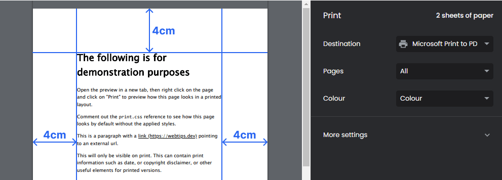
Remove Visuals
When dealing with prints, there are a couple of best practices to keep in mind. Firstly, it's recommended to remove visual elements that contribute unnecessary clutter to printed pages.
Elements like navigation menus, footers, and sidebars tend to clutter printed media. Remove them using a display: none rule:
header, footer, aside, nav, form, iframe, .ad {
    display: none;
}Include any elements here that you want to exclude from the printed version of the page. For example, forms or iframes. Ads are also common elements to exclude when printing a page.
If stronger CSS rules override your print CSS, it's okay to use !important.
Improve Readability
You also want to ensure that the document is legible. Always use a font size of 12pt or larger. To save resources, turn dark themes into light, and light text to dark. This can be achieved with simple reset rules:
You can also introduce page breaks as needed. CSS provides the following three rules for handling page breaks:
page-break-before: Specifies a page break before the element.page-break-after: Specifies a page break after the element.page-break-inside: Specifies a page break inside the element.
Generally, avoid page breaks immediately after headings and avoid breaking up elements like tables or images. To ensure proper printing, you can add the following rules to your print.css:
h1, h2, h3, h4, h5, h6 {
    page-break-after: avoid;
}

table, figure, img, svg {
    page-break-inside: avoid;
}
Optionally, you might want to introduce page breaks before any h1 heading to start new sections on new pages. To achieve this, simply add a page-break-before: always rule to h1 elements.
To improve the readability of tables, make sure to reset their styles and add a 1px border around the cells. Don't forget to set border-collapse to collapse to avoid double borders:
table, th, td {
    border: 1px solid;
    border-collapse: collapse;
    text-align: left;
    padding: 5px 10px;;
}How to Handle Links
Links are another critical part of printed media. To prevent readers from wondering where specific links lead, ensure you display the URL after a link. This can be achieved using the ::after selector combined with the attr function:
a::after {
    content: " (" attr(href) ")";
}This will grab the href attribute from anchors, and display the full URL in parentheses after the link, making it accessible to offline readers.

Print-only Content
Optionally, you might want to define print-specific content on your site that should only be visible on printed pages. You can do this with a custom CSS class, such as .print, which is set to display: none by default, and then set to display: block in your print.css file:
/* In your default CSS: */
.print {
    display: none;
}

/* In your print.css: */
.print {
    display: block;
}Simply apply the .print class to any element you want to show exclusively on your printed pages. This can include print-specific information like dates, copyright disclaimers, or other useful elements for printed versions.
Depending on your scenario, you might also want to hide non-essential images. If applicable, you can convert dark images to light using filter: invert(1) to save ink.
Conclusion
In conclusion, there are several ways you can improve the printed layout of your pages. Use @page at-rules to style pages in one go. Make sure you keep the following in mind when applying styles:
- Remove visual clutter like navigation and footers.
- Reset styles for legible typography (black on white).
- Increase font size for improved readability.
- Prevent element breaks across pages with
page-breakrules. - Include URLs after links.
- Use print-only content if necessary.
Is there anything missing from this tutorial? Let us know in the comments below! If you would like to learn more about CSS, make sure you check out our other CSS tutorials below. Thank you for reading, happy styling!

Rocket Launch Your Career
Speed up your learning progress with our mentorship program. Join as a mentee to unlock the full potential of Webtips and get a personalized learning experience by experts to master the following frontend technologies:
Courses

CSS - The Complete Guide (including Flexbox, Grid and Sass)

The HTML & CSS Bootcamp

