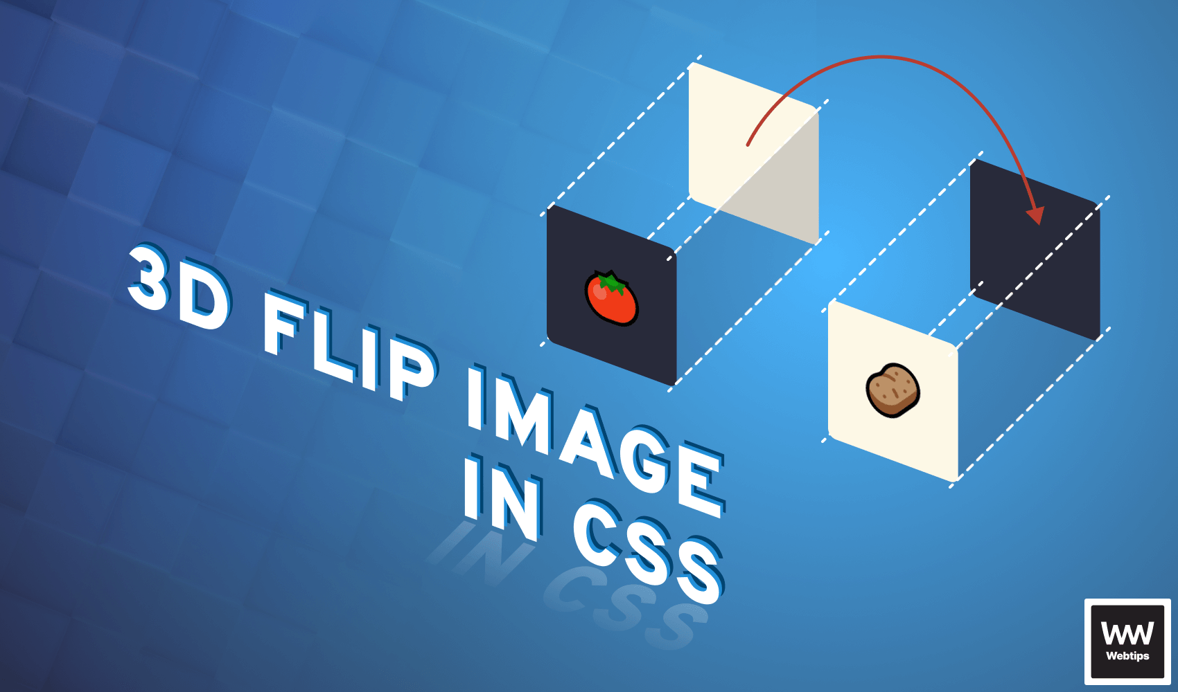
How to 3D Flip Images With CSS
 3 min read
Flipping images with CSS can be achieved by using transform rules. In order to flip an image with CSS, we need to have two separate containers. One for the front, and one for the back.
<div class="card">
    <div class="card-front"><img src="front.png" /></div>
    <div class="card-back"><img src="back.png" /></div>
</div>
The 3 div elements have the following purpose:
card: We need a container so that we can position everything to it relativelycard-front: The front of the image — this will be facing us initiallycard-back: The back of the image — this will be facing away from us
To flip the images around, we will be using the transform property. For the .card itself, we need to add the dimensions we need (in this example, we are using 100x100px), and set its position to relative.
.card {
    position: relative;
    width: 100px;
    height: 100px;
    cursor: pointer;
}
Although optional, adding cursor: pointer is a nice touch to indicate that the element is interactive. For the front and back of the cards, we will need them to be absolutely positioned, with a 100% width and height:
.card-front,
.card-back {
position: absolute;
width: 100%;
height: 100%;
transition: transform .6s cubic-bezier(0.4, 0.0, 0.2, 1);
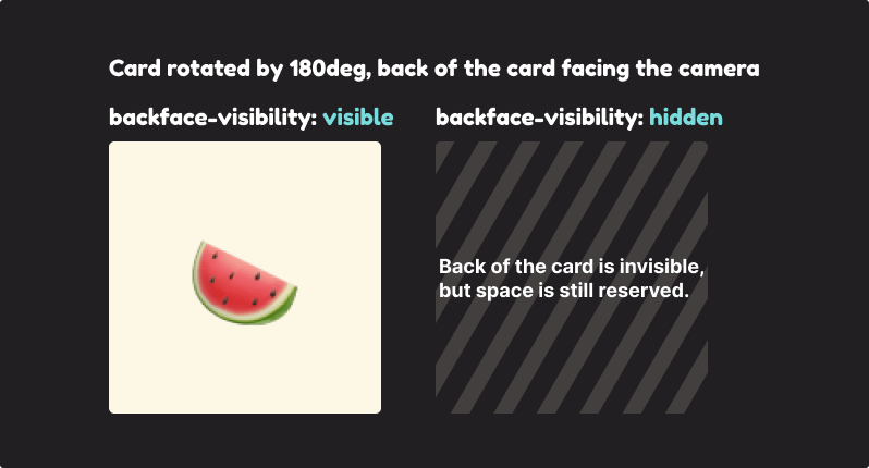
backface-visibility: hidden;
}The most important part, however, is the last two rules. We need to use a transition on the transform property to create an animation once we begin flipping the images. We are using a cubic bezier here for easing.
I recommend checking out easings.net and cubic-bezier.com if you want to experiment with different easing functions.
The other important rule is backface-visibility. This is used for telling CSS that the back of an element should not be visible to us. This means we won’t see the image if the card is flipped.

Flipping Images in CSS With Transform
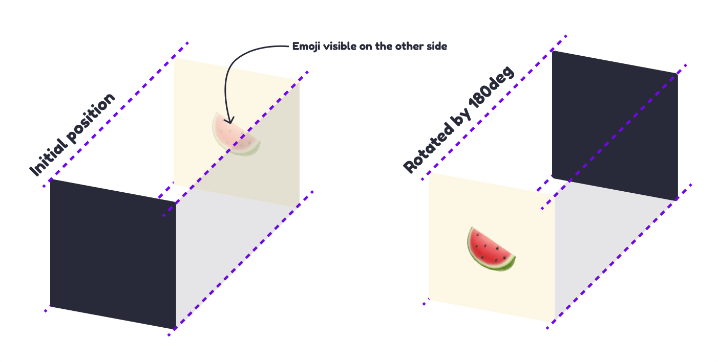
To rotate the back of the card into the correct position, we need to add a transform rule that rotates it 180 degrees on the Y axis. This will rotate the back of the card 180 degrees away from us.
.card-back {
    transform: rotateY(180deg);
}

.card:hover .card-front {
    transform: rotateY(180deg);
}

.card:hover .card-back {
    transform: rotateY(0);
}When we hover over the container, we want to do the same for the front of the card, and do the opposite for the back: remove the rotateY and set it back to 0. With everything added, we should now have flipping images. Hover over the example below to see what the effect looks like.
Adding Rotation to the Flip
However, the flip looks rather flat this way. We can easily get around this by also rotating the element on the Z axis. Change the transform rules to the following:
.card-back {
-   transform: rotateY(180deg);
+   transform: rotateY(180deg) rotateZ(50deg);
}

.card:hover .card-front {
-   transform: rotateY(180deg);
+   transform: rotateY(180deg) rotateZ(50deg);
}

.card:hover .card-back {
-   transform: rotateY(0);
+   transform: rotateY(0) rotateZ(0);
}Here we now also introduced a 50-degree rotation for the Z axis. Just like for the Y, we want to replicate the same logic. Whenever the image is flipped, we want to remove the rotation from the Z axis for the back of the card and add it for the front. This will create the following effect:

Rocket Launch Your Career
Speed up your learning progress with our mentorship program. Join as a mentee to unlock the full potential of Webtips and get a personalized learning experience by experts to master the following frontend technologies:
Courses

CSS - The Complete Guide (including Flexbox, Grid and Sass)

The HTML & CSS Bootcamp

The Creative HTML5 & CSS3 Course
Recommended
How to Type Functions in TypeScript
3 min read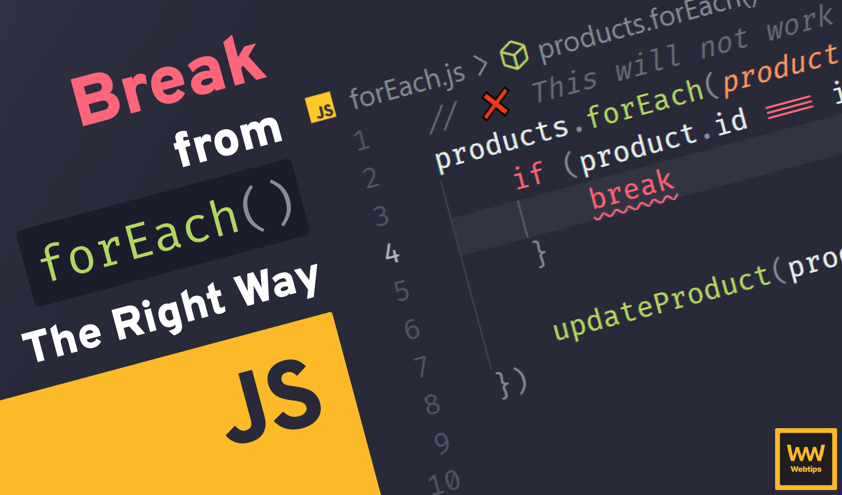
The Right Way to Break from forEach in JavaScript
4 min read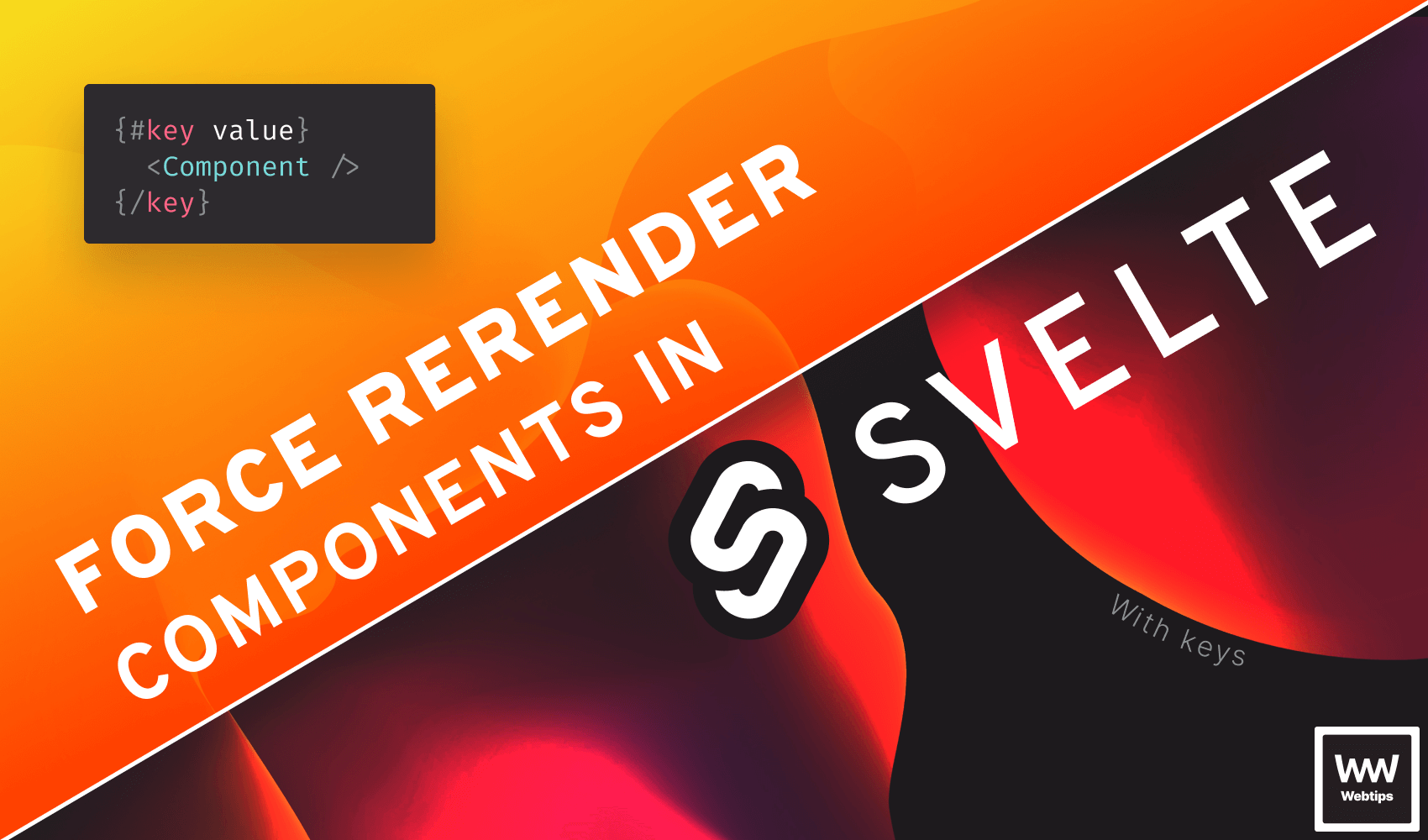
How to Force Rerender Components in Svelte
2 min read