How to Master Using Flexbox in CSS
 2021 13 July •
  9 min read
You are sitting at your job and you need to deliver a feature where all elements must be distributed evenly. So you know the easiest way to go about is to set your container’s display property to flex. And then you stop. You go to Google and search for how to align the items both horizontally and vertically.
If this happens to you every time you have to use flexbox, welcome to the club. In this tutorial, I’ll try to make you remember how to use flexbox thoroughly with confidence once and for all. I’ve also tried to provide interactive examples for some of the items where appropriate.
At the end of the tutorial, I will also leave a Codepen example where you can play around with flexbox properties and see their effects in real-time.
Before diving into examples, let’s talk about the terminology of the flex layout.

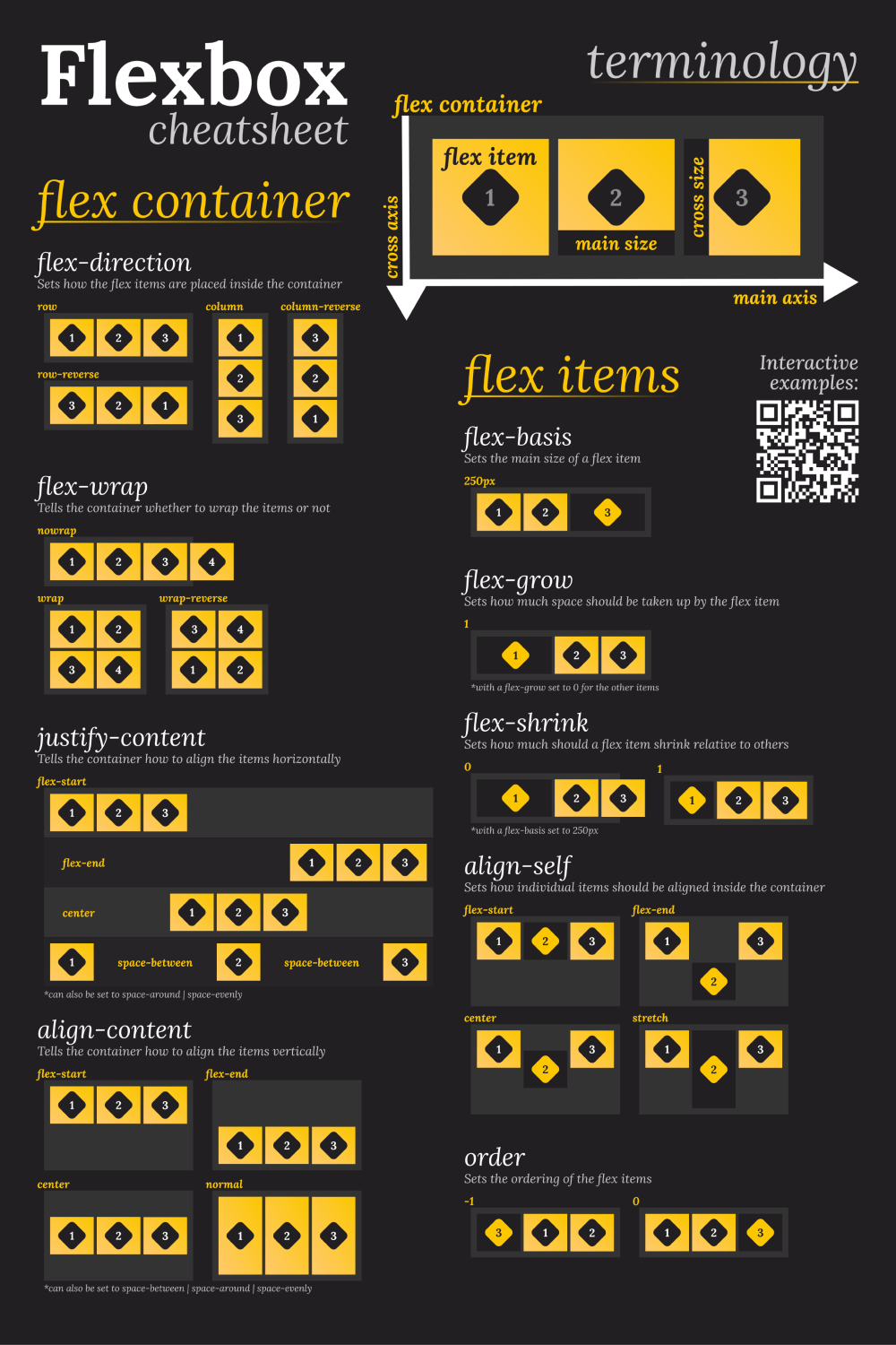
The Flexbox Terminology
When we are talking about flexbox, we are talking about a layout module, rather than a single property, as we usually do in the context of CSS. This also means we have more than one property related to flexbox. They can be set either on:
- The container element, called flex container.
- The children elements, called flex items.
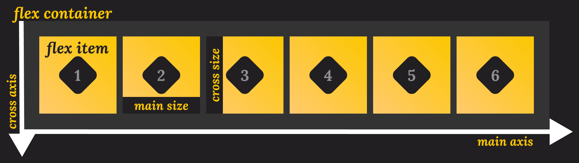
As you can see from the image above, we also have a couple of more namings. You can lay out elements in two directions: horizontally or vertically. In the context of flexbox, these are called main and cross axis respectively.
You also have starting and end points for both the main and cross axis. We also have sizes that refer to the width and height of the flex items. And that’s all you need to know before starting to work with flexbox. Now let’s see first how you can customize your container, then we will move onto child elements.
Customizing the Flex Container
The flex container has six different properties you need to know of. They are:
flex-directionflex-wrapflex-flowjustify-contentalign-contentalign-items
Each of these properties define how elements behave inside the flex container. Let’s take a look at each one in more detail.
Flex direction
This is where you can define how do you want your flex items to be placed inside the container. You can have them displayed in rows, columns, and in reverse order, both for columns and rows. This is set to row by default.
.flex-container {
    flex-direction: row;
    flex-direction: row-reverse;
    flex-direction: column;
    flex-direction: column-reverse;
}Set flex direction 👇
Note that you can also change the direction of the items by adding a direction attribute. For example:
.flex-container {
    flex-direction: row-reverse;
    direction: rtl;
}By having flex-direction set to row-reverse and also having direction set to rtl (right to left), you essentially negate the effect of flex-direction and end up with the same effect you would have with flex-direction: row.
Flex wrap
The flex wrap property tells the container, whether to wrap the items or not. By default, this is set to nowrap, which means, if there’s not enough space for the children, the elements will overflow their container. To fix it, simply set it to wrap. You can also reverse the order of the children, by using the wrap-reverse value.
.flex-container {
    flex-wrap: nowrap;
    flex-wrap: wrap;
    flex-wrap: wrap-reverse;
}Set flex wrap 👇
Flex flow
Flex flow is really just a shorthand for using both flex-direction and flex-wrap together. The first parameter it takes is for flex-direction, the second is for flex-wrap.
.flex-container {
    flex-flow: row wrap;
    flex-flow: row-reverse nowrap;
    flex-flow: row-reverse wrap-reverse;
    flex-flow: column wrap;
    flex-flow: column-reverse nowrap;
    flex-flow: column-reverse wrap-reverse;
    // and so on...
}Set flex flow 👇
Justify content
And now we have arrived at customizing how the flex items should be aligned along the main axis of the container. You can place them at the start, center, or end of your container. You also have the ability to distribute them evenly with space between or around them.
.flex-container {
    justify-content: normal; // Initial value
    justify-content: start;
    justify-content: flex-start;
    justify-content: center;
    justify-content: end;
    justify-content: flex-end;
    justify-content: left;
    justify-content: right;
    justify-content: space-between;
    justify-content: space-around;
    justify-content: space-evenly;
}Set justify content 👇
Align content
While justify-content sets, how the flex items should be aligned on the main axis, align-content sets how they should be aligned on the cross axis. Just like for justify-content this also accepts values for start, center, or end, along with some other values.
.flex-container {
    align-content: normal; // Initial value
    align-content: start;
    align-content: flex-start;
    align-content: center;
    align-content: end;
    align-content: flex-end;
    align-content: space-between;
    align-content: space-around;
    align-content: space-evenly;
}Set align content 👇
Align items
Lastly, you have align-items. You can use it to set the align-self property on each child of the flex container and control it as a group.
.flex-container {
    align-items: normal; // Initial value
    align-items: start;
    align-items: flex-start;
    align-items: center;
    align-items: end;
    align-items: flex-end;
    align-items: baseline;
    align-items: first baseline;
    align-items: last baseline;
    align-items: safe center;
    align-items: unsafe center;
    align-items: stretch;
}Set align items 👇

 Remove ads
Customizing the Flex Items
The flex items also have six different properties you need to know of. They are:
flex-basisflex-growflex-shrinkflexalign-selforder
These properties define how individual children elements should behave inside the flex container. Let’s have a look at them in more detail.
Flex basis
You can use flex-basis to set the main size of a flex item. This is like specifying a width for the element.
.flex-items {
    flex-basis: auto;
    flex-basis: max-content; // Only supported in Firefox as of writing
    flex-basis: min-content; // Only supported in Firefox as of writing
    flex-basis: content;     // Only supported in Firefox as of writing
    flex-basis: 0;
    flex-basis: 250px;
}Set flex basis for the inverted item 👇
Flex grow
This property sets how much of the space should be taken up by the item that receives the value.
.flex-items {
    flex-grow: 0; // Initial value
    flex-grow: 1;
    flex-grow: 2;
    flex-grow: 3;
}Set flex grow for the inverted item 👇
(With flex-grow set to 1, for the first and second element)
You can think of flex-grow as percentage values. In the example above, you have three columns, each with a flex-grow of 1. This means each child takes up one unit of space. Since we have 3 elements, this means each will take up 33%. If you set flex-grow to 2 for one of them, it will mean the item should take twice the size of the other elements.
Flex shrink
The flex-shrink property defines how much should a flex item shrink relative to other items if there’s not enough space inside the container. By default, this is set to 1.
.flex-items {
    flex-shrink: 0;
    flex-shrink: 1;
    flex-shrink: 2;
}Flex
Just as for the flex container, you also have a shorthand for flex items. This sets the following properties for a child element, in the following order:
flex-growflex-shrinkflex-basis
.flex-items {
    flex: 1;
    flex: 1 50px;
    flex: 1 1 100px;
}Align self
And of course, you also have properties to customize alignment. This property sets how individual items should be aligned inside their flex container. The default value is set to auto.
.flex-items {
    align-self: start;
    align-self: self-start;
    align-self: flex-start;
    align-self: center;
    align-self: end;
    align-self: self-end;
    align-self: flex-end;
    align-self: baseline;
    align-self: first baseline;
    align-self: last baseline;
    align-self: stretch;
}Set align self for the inverted item 👇
(With align-items set to `start` for the container)
Order
Lastly, you have the order attribute, used for the ordering the flex items. The items are sorted by ascending order. First by their order value, then by the one you set through your CSS. This means, that if you have three items, and you set the order property to be also 3 for the last element. It will be placed after the last item.
.flex-items {
    order: -1;
    order: 0;
    order: 1;
    order: 2;
    order: 3;
}Set order for the inverted item 👇
(With each flex item with an ascending order)
Common Use-Cases
Now that you know everything you should about the properties of flexbox, let’s also see what are some common use cases where you can use it to easily solve commonly occurring problems in CSS.
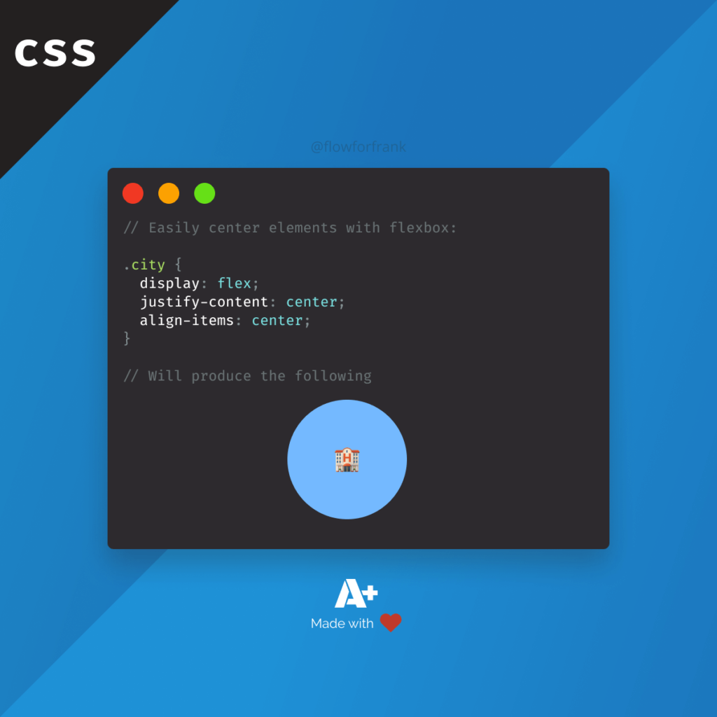
Dead center elements
One of the most common uses of flexbox is to simply dead center an element. You can do this, by setting both justify-content and align-items to center.
.dead-center {
    display: flex;
    justify-content: center;
    align-items: center;
}
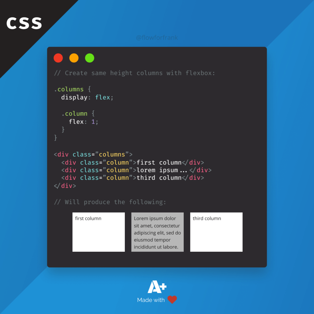
Equal height columns
Another common use-case is to create equal height columns, regardless of the content inside them. Simply set flex to 1 for each flex item in a flex layout.
.columns {
    display: flex;

    .column {
        flex: 1;
    }
}This will make the rest of the columns to adapt to the size of the highest column, as seen in the example below.
Different order based on screen sizes
Lastly, flexbox can come really handy, if you have to reorder content on your page based on screen size. For example, if you have a main content and a sidebar on the right-side for desktop-sized screens, this layout would push the sidebar below the main content. If you want it to be above it, you can reorder them using flexbox.
.app {
    display: flex;
}

@media (max-width: 600px) {
    .app .sidebar {
         order: -1;
    }
}Summary
And now you know everything you need to know about flexbox to start using it. If you’ve reached this far, you should now have a pretty solid understanding of how flexbox works, and how you can solve common problems with it.
As promised at the beginning of this tutorial, I’ve created a Codepen where you can play around with the different flexbox properties. You can reach it below:
Do you have additional thoughts for flexbox? Let us know in the comments below! Thank you for reading through, happy styling! 🎨
🖼️ Get yourself the flexbox cheatsheet poster 👇
If you would like to learn more about CSS, check are what are some steps you can use to quickly improve the architecture of your stylesheets.


Rocket Launch Your Career
Speed up your learning progress with our mentorship program. Join as a mentee to unlock the full potential of Webtips and get a personalized learning experience by experts to master the following frontend technologies:
Courses

CSS - The Complete Guide (including Flexbox, Grid and Sass)

The HTML & CSS Bootcamp

The Creative HTML5 & CSS3 Course
Recommended
How to Add Custom JSON Endpoints to Your WordPress
2021 18 September • 5 min read
How to Create an Autocomplete Search Component in React
2021 13 July • 13 min read
Core Web Vitals: What Are They and Why You Need to Know About Them?
2021 11 November • 9 min read