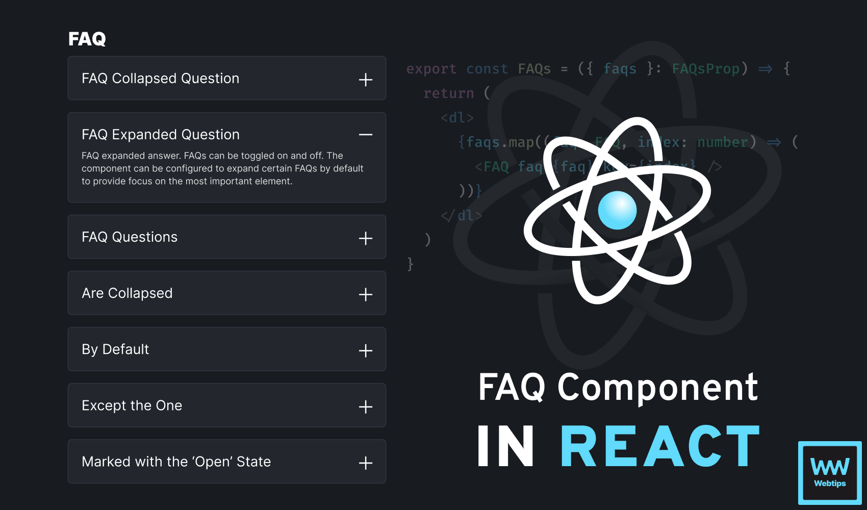
How To Create a Toggleable FAQ Component in React
 7 min read
FAQs (Frequently Asked Questions) can serve as crucial elements of content-heavy websites, providing a concise and accessible repository of essential information and addressing common queries and concerns.
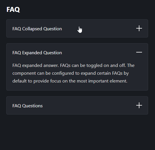
In this tutorial, we'll take a look at how to create a toggleable FAQ component in React. At the end of this tutorial, we'll have the following component:

Creating the Component
To get started, let's create what we would call the component, then we'll look at the component itself. We want to call the FAQs component with a list of FAQs that can take the following form:
import { FAQs } from './FAQ'

const App = () => {
    const faqs = [
        {
            question: 'FAQ question',
            answer: 'FAQ answer'
        },
        {
            question: 'FAQ question',
            answer: 'FAQ answer',
            open: true
        }
    ]

    return (
        <React.Fragment>
            <h2>FAQ</h2>
            <FAQs faqs={faqs} />
        </React.Fragment>
    )
}Each FAQ can have the following three properties: a question, an answer, and an optional open property. If open is set to true, the FAQ will be displayed with the expanded state by default.
The FAQs component accepts an faqs prop that, in return, renders a list of FAQs. To improve semantics, we can use the dl tag in HTML to render the FAQs. Create a new file called FAQ.tsx and add the following code:
const FAQ = ({ faq }) => { ... }

export const FAQs = ({ faqs }) => {
    return (
        <dl>
            {faqs.map((faq, index) => (
                <FAQ faq={faq} key={index} />
            ))}
        </dl>
    )
}Rendering FAQs
A description list comes with dt and dd tags, where each dt can be used to define a term and each dd can be used to describe the term. To render the list of FAQs, add the following code to the FAQ component:
import React from 'react'

const FAQ = ({ faq }) => {
    return (
        <React.Fragment>
            <dt aria-expanded={faq.open ? 'true' : 'false'}>
                {faq.question}
                <img
                    src={`/${faq.open ? 'minus' : 'plus'}.svg`}
                    alt={faq.open ? 'Collapse' : 'Expand'}
                    width="20"
                    height="20"
                />
            </dt>
            <dd className={!faq.open ? 'hidden' : undefined}>{faq.answer}</dd>
        </React.Fragment>
    )
}To better understand what is going on, let's break down this code line by line:
- Line 6: To also improve accessibility, we can attach an
aria-expandedattribute on eachdtto signal whether the FAQ is expanded or collapsed. - Line 9: We also want to display an icon based on the
openstate to visually convey the state of the FAQ. Using a ternary, we can display theminus.svgimage orplus.svgdepending on theopenstate. - Line 10: Likewise, we can change the
altto either read "Collapse" or "Expand". - Line 11-12: Make sure you define the dimensions of the image to avoid layout shifts.
- Line 15: We only want to display the
ddif the FAQ is open. We can achieve this using a simple.hiddenclass that setsdisplay:none;on the element.
 Remove ads
Adding Toggle Functionality
So far, we have the FAQs rendered, but we're missing the functionality. To add the ability to toggle FAQs, we need to encapsulate the faq.open state inside a useState hook. Change the above code to the following to also allow FAQs to be toggled on and off:
import React, { useState } from 'react'

const FAQ = ({ faq }) => {
    const [isOpen, setIsOpen] = useState(faq.open || false)

    const toggle = () => {
        setIsOpen(!isOpen)
    }

    return (
        <React.Fragment>
            <dt aria-expanded={isOpen ? 'true' : 'false'} onClick={toggle}>
                {faq.question}
                <img
                    src={`/${isOpen ? 'minus' : 'plus'}.svg`}
                    alt={isOpen ? 'Collapse' : 'Expand'}
                    width="20"
                    height="20"
                />
            </dt>
            <dd className={!isOpen ? 'hidden' : undefined}>{faq.answer}</dd>
        </React.Fragment>
    )
}We introduced a new useState hook with a default value of faq.open. If faq.open is not defined, we set the hook to false, meaning the default state of the FAQ will be collapsed.
Inside the component, we essentially need to replace faq.open with the isOpen state everywhere. One addition we need to make is adding an onClick event listener on the dt to listen for click events. This will trigger the toggle function, which in turn, always sets the value of isOpen to its opposite.
Summary
In summary, to build toggleable FAQ components in React, we only need to use the useState hook combined with some CSS classes to show and hide answers. To keep the component accessible, make sure you write semantic HTML and decorate any necessary elements with aria- attributes.
If you would like to learn more about building projects in React, make sure you check out our roadmap below. Thank you for reading, happy coding! 👨💻


Rocket Launch Your Career
Speed up your learning progress with our mentorship program. Join as a mentee to unlock the full potential of Webtips and get a personalized learning experience by experts to master the following frontend technologies:
Courses


Recommended
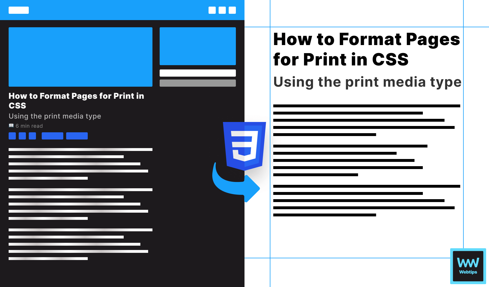
How to Format Pages for Print in CSS
6 min read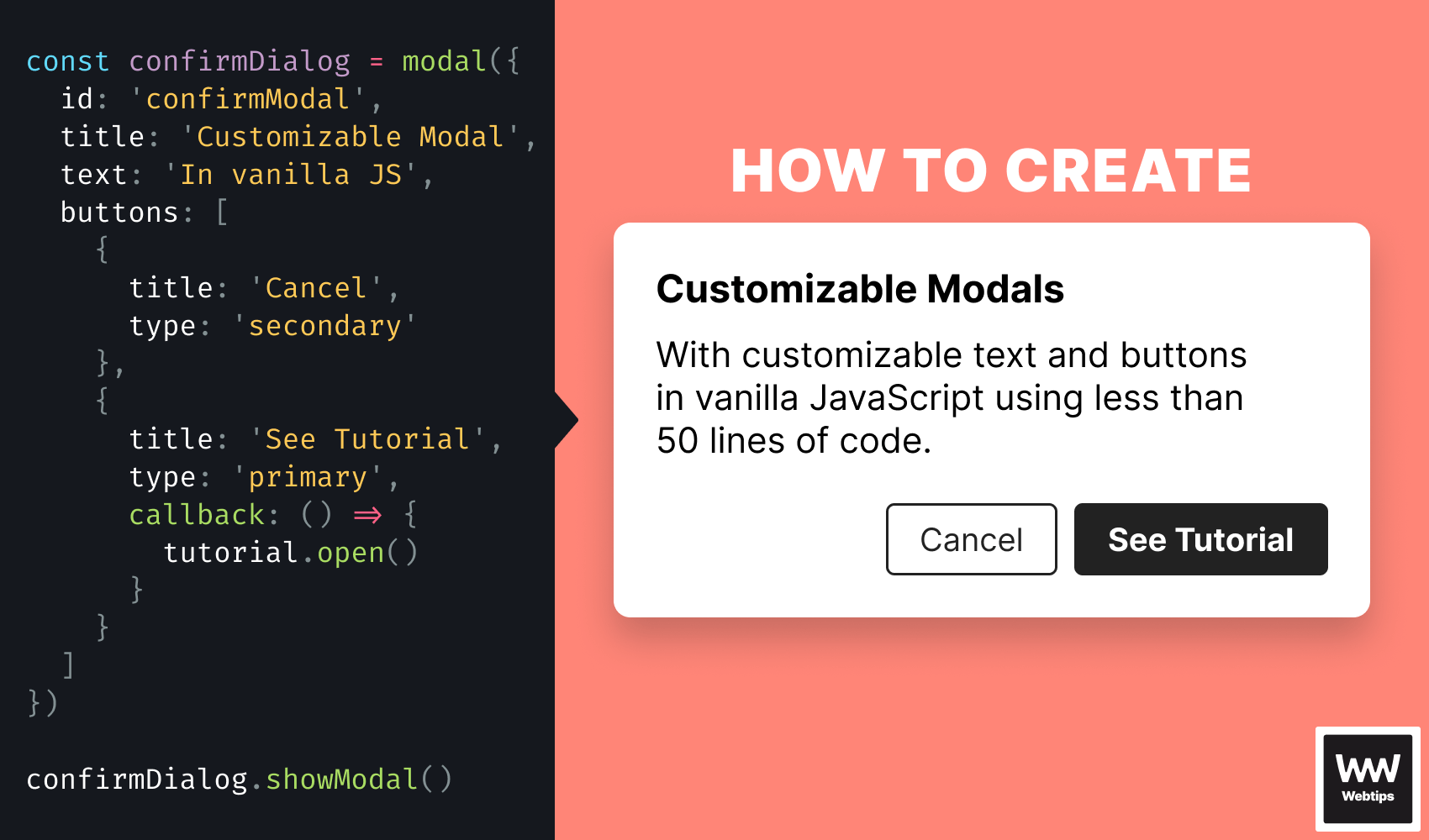
How To Create a Customizable Modal in Vanilla JavaScript
7 min read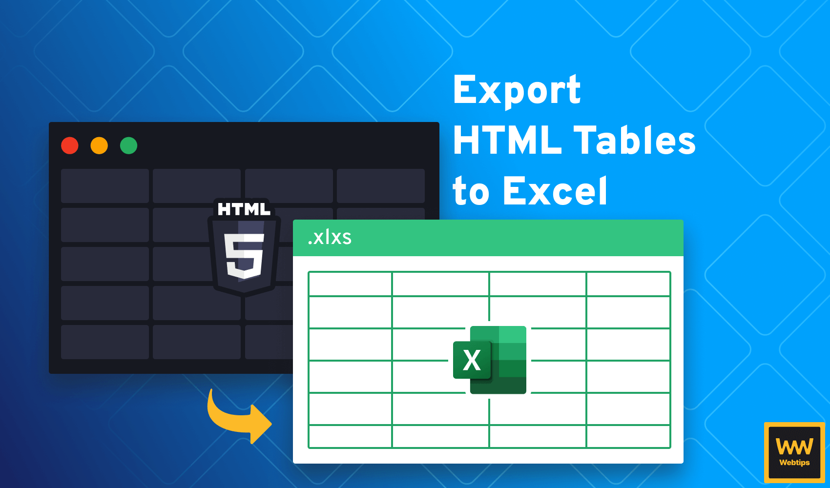
2 Easy Ways to Export HTML Tables to Excel
4 min read