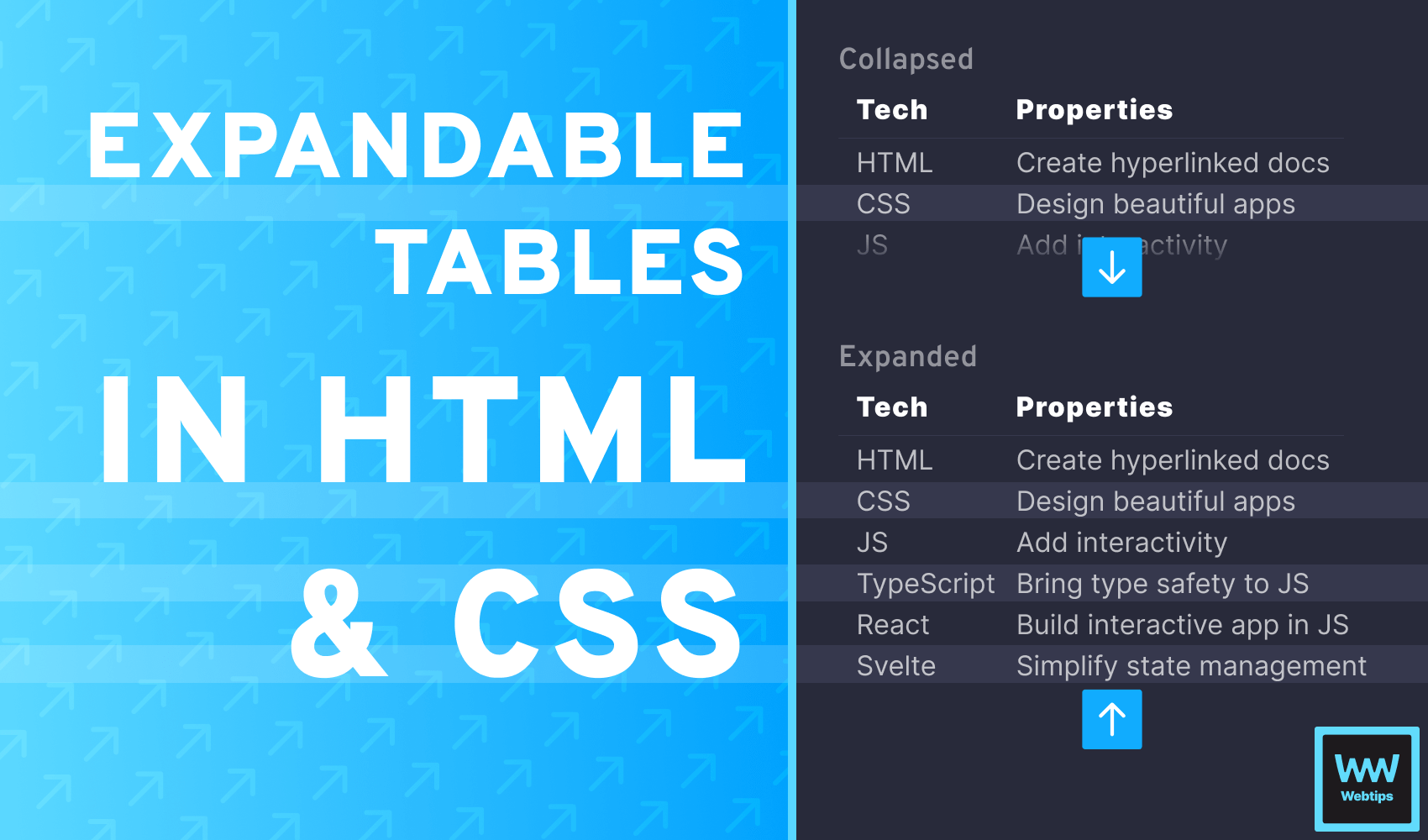
How to Expand and Collapse Tables in HTML Using CSS
 5 min read
Expandable tables are a common way to present large tables within limited space. These tables can be expanded or collapsed using a button located at the bottom of the table.
In this tutorial, we will learn how to create expandable tables in HTML using only CSS. No JavaScript is required for this component, making it a lightweight solution. By the end of this tutorial, we will have a ready-to-use expandable table.
| Tech | Properties |
|---|---|
| HTML | Create hyperlinked documents |
| CSS | Design beautiful websites |
| JS | Add interactivity to your apps |
| TypeScript | Bring type safety to JavaScript |
| React | Build interactive applications entirely in JavaScript |
| Svelte | Simplify your state management |

Creating Expandable Tables in HTML
First, let's create the HTML layout for the component. Besides the table itself, we will need three additional elements:
- Checkbox: A
checkboxthat we can use to toggle between the expanded and collapsed states of the table. - Wrapper: A wrapper
divthat can be used to hide parts of the table. - Label: A
labelconnected to the checkbox that will act as a button to trigger the checkbox and toggle between the two states.
Combining all of these elements, we will have the following code:
<input type="checkbox" id="toggle" />
<div>
    <table>
        <thead>
            ...
        </thead>
        <tbody>
            ...
        </tbody>
    </table>
</div>
<label for="toggle">⬇️</label>Collapsing Tables With CSS
Now that we have the table ready, it's time to add the expand functionality. The toggle will work by toggling the checkbox, but we will hide the checkbox with CSS as it is not needed.
We can utilize the :checked pseudo-selector in CSS to style the container of the table differently whenever the checkbox is toggled. This way, the entire table will be visible when the checkbox is checked, and it will be partially hidden when the checkbox is unchecked. Let's take a look at what we need in CSS for the input:
input {
    display: none;
}

input:checked + div {
    height: auto;
}

input:checked ~ label {
    transform: rotate(180deg);
    margin-top: 0;
}

label {
    display: block;
    text-align: center;
    user-select: none;
    cursor: pointer;
    margin-top: -38px;
    height: 38px;
    background: linear-gradient(to bottom,  rgba(255,255,255,0) 0%,rgba(255,255,255,1) 100%);
}CSS explained
To better understand what's happening, let's go through the styles step by step. First, we hide the input using display: none since it doesn't need to be visible to users. Users will interact with it through the label. Then we have two sibling selectors:
input:checked + div: When the checkbox is checked, we reset the height of the container that wraps the table. Later on, we will give it a fixed height to make it collapsed by default. This class will take effect when the table is expanded.input:checked ~ label: Unlike the previous selector (adjacent sibling selector), this is a general sibling selector that can match any siblings. When the table is expanded, we want to rotate thelabel180 degrees to change the chevron from pointing down to pointing up. We also want to remove the top margin that we assigned on line:19.
Finally, we can style the label to appear under the table. The important parts are highlighted in the example above. Here they are again:
/* Collapsed state */
label {
    margin-top: -38px;
    height: 38px;
}

/* Expanded state */
input:checked ~ label {
    transform: rotate(180deg);
    margin-top: 0;
}We want to give it the same height as the rows. In the initial state, we can position the label on top of the last visible row using a negative margin. We can also add a gradient to fade out the table, indicating that there are more rows that are not currently visible.

 Remove ads
Setting the Number of Visible Rows
Currently, the entire table is shown with no restrictions on visibility. To collapse the table by default, we also need to add the following styles to our CSS:
div {
    height: calc(38px * (3 + 1));
    overflow: hidden;
}
This will give the container a fixed height. To make the number of visible rows more configurable, we can use the CSS calc function, which can calculate values using arithmetic operations, even with different measurements.
In this example, we want three rows to be visible by default. We can inspect the height of a row using DevTools, and multiply that value by the number of rows that we want to show.
Since we don't want to include the table header in the calculation, we add +1 to the number. If we need to show four or five rows by default, we can change the value of 3 in the calculation to 4 or 5 accordingly.
Summary
And with that, you now have a lightweight, configurable expandable table in HTML. If there is anything missing from this tutorial, please let us know in the comments below!
Thank you for reading, happy coding! If you would like to learn more about CSS, be sure to check out our CSS category page where we collect all available CSS tutorials on Webtips.

Rocket Launch Your Career
Speed up your learning progress with our mentorship program. Join as a mentee to unlock the full potential of Webtips and get a personalized learning experience by experts to master the following frontend technologies:
Courses

CSS - The Complete Guide (including Flexbox, Grid and Sass)

The HTML & CSS Bootcamp

The Creative HTML5 & CSS3 Course
Recommended
Using React Router for Navigation: Best Practices and Examples
14 min read
Unleashing the Power of Weather APIs: A Guide for Frontend Developers
6 min read
4 Different Ways to Align Footer to Bottom of Page in CSS
4 min read