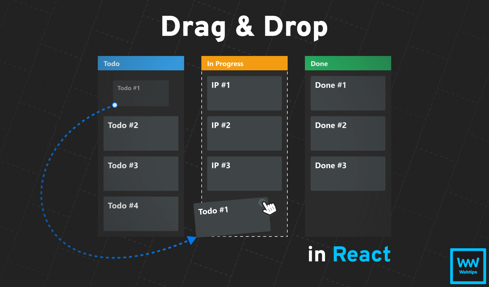
How to Drag and Drop in React Without Extra Libraries
 12 min read
Drag and drop functionality is a common feature that creates a more intuitive user flow by letting users grab and drop objects to places where they want them to be. There are countless JavaScript libraries out there just for this purpose, including one for every possible framework; however, this can be done quite simply with the native Drag and Drop API.
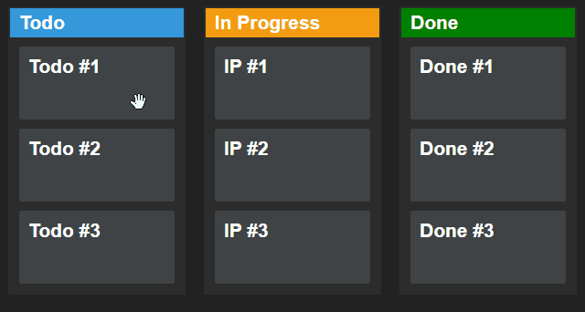
At the end of this tutorial, you will learn how to create the above drag-and-drop functionality for a Kanban board in React using the native HTML Drag and Drop API.

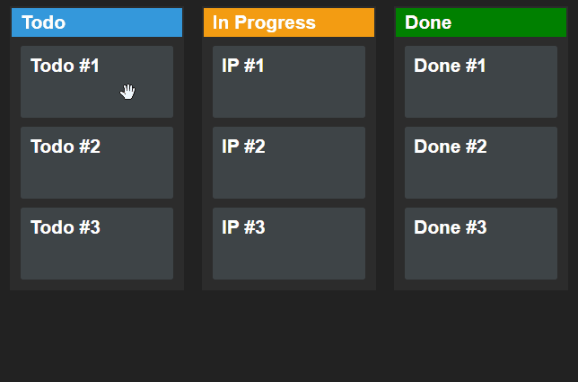
Setting Up the Component
Let’s start by setting up the component. We are going to store the cards in a useState hook. In a real-world application, you would fetch this data from an API. For the sake of simplicity, however, we are going to mock the initial state. Create a new component and add the following:
import { useState } from 'react'

const initialState = [
    { id: 1, name: 'Todo #1', state: 'todo' },
    { id: 2, name: 'Todo #2', state: 'todo' },
    { id: 3, name: 'Todo #3', state: 'todo' },
    { id: 4, name: 'IP #1', state: 'ip' },
    { id: 5, name: 'IP #2', state: 'ip' },
    { id: 6, name: 'IP #3', state: 'ip' },
    { id: 7, name: 'Done #1', state: 'done' },
    { id: 8, name: 'Done #2', state: 'done' },
    { id: 9, name: 'Done #3', state: 'done' }
]

const DragAndDrop = () => {
    const [cards, setCards] = useState(initialState)

    return (
        <main className="board">
            <div className="column column-todo">
                <h2>Todo</h2>
                {cards.filter(card => card.state === 'todo').map(todo => (
                    <article key={todo.id} className="card">
                        <h3>{todo.name}</h3>
                    </article>
                ))}
            </div>
            <div className="column column-ip">...</div>
            <div className="column column-done">...</div>
        </main>
    )
}

export default DragAndDropThe cards will be stored in the cards state. Each card comes with three properties:
id: The ID of the card. This needs to be unique as we are going to identify which card is being dragged based on its ID.name: The name of the card that will be displayed on the screen.state: The state of the card that defines which column it belongs to. In this example, it can be one oftodo,ip, ordone.
To display the correct cards inside each column, we can filter them based on their state before looping through them using a map. The same structure applies to the other two columns.
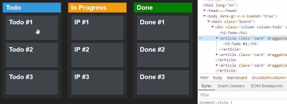
Adding drag-and-drop event listeners
In order to work with Drag & Drop, we will need some additional event listeners on our columns and cards. Extend each column and card with the following props:
const DragAndDrop = () => {
    const [cards, setCards] = useState(initialState)

    const dragEnter = event => { ... }
    const dragLeave = event => { ... }
    const drag = event => { ... }
    const drop = event => { ... }
    const allowDrop = event => { ... }

    return (
        <main className="board">
            <div
                className="column column-todo"
                data-column="todo"
                onDragEnter={dragEnter}
                onDragLeave={dragLeave}
                onDragOver={allowDrop}
                onDrop={drop}
            >
                <h2>Todo</h2>
                {cards.filter(card => card.state === 'todo').map(todo => (
                    <article key={todo.id} className="card" draggable="true" onDragStart={drag} data-id={todo.id}>
                        <h3>{todo.name}</h3>
                    </article>
                ))}
            </div>
            ...
        </main>
    )
}

export default DragAndDrop
You can leave the referenced functions empty for now.
The other two columns will get the exact same attributes. There is a lot going on, so let's break down the purpose of each prop in order:
- Line 4: The
dragEnterfunction will be called when theonDragEnterevent listener is triggered on line:15. This event will be fired when a draggable element enters a valid drop area. - Line 5: The
dragLeavefunction will be called when theonDragLeaveevent listener is triggered on line:16. This event will be fired when a draggable element leaves a valid drop area. - Line 6: The
dragfunction will be called when theonDragStartevent listener is triggered on line:22. This event will be fired when a user starts to drag an element. This event listener needs to be on the article as it will be the draggable element. On the other hand,dragEnteranddragLeaveneed to be on the drop area which will be the.column. - Line 7: The
dropfunction will be called when theonDropevent listener is triggered on line:18. This event will be fired when we drop an element on a valid drop target. This is where we will handle dropping functionality. - Line 8: The
allowDropfunction will be called when theonDragOverevent listener is triggered on lin:17. Whenever we drag an item over a drop area, this will be fired every few hundred milliseconds. Since this is called a lot, it’s important that we avoid placing calculation-heavy functions here. We can also debounce the function to further reduce the number of calls.
We also have data-column and data-id attributes present on the .column and article elements. These will be used for carrying important data during dragging. Lastly, don't forget to set draggable to true on the element that you need to drag. This sets whether an element will be draggable.
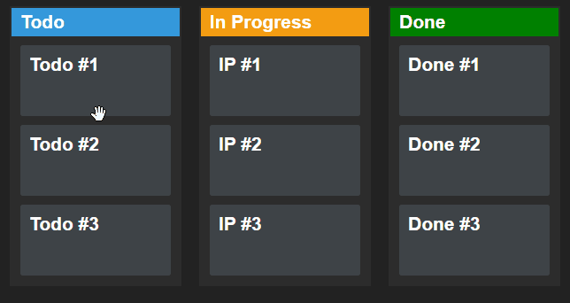
At this stage, the elements are now draggable. With the help of some CSS, we can set up different cursor icons to indicate when we grab an item.
Dragging Elements
Now that we have everything set up, we can start writing the functionality for dragging elements. First, you should always provide visual feedback to the user about an action. When the user drags an item, we want to indicate that.
We can do this by adding an extra class to the element when we move it. We can achieve this with an additional CSS class. To translate this into React, add the following useEffect hook to the component that will attach the dragstart and dragend events to the document:
useEffect(() => {
    document.addEventListener('dragstart', dragStart)
    document.addEventListener('dragend', dragEnd)

    return () => {
        document.removeEventListener('dragstart', dragStart)
        document.removeEventListener('dragend', dragEnd)
    }
}, [])To recap:
dragstart: This event will be fired when the user starts dragging an item.dragend: This event will be fired when the user stops dragging the item.
So what goes inside the dragStart and dragEnd functions? We simply want to toggle the .dragging class shown in the previous GIF. Extend the dragStart and dragEnd functions according to the following:
const dragStart = event => {
    if (event.target.className.includes('card')) {
        event.target.classList.add('dragging')
    }
}

const dragEnd = event => {
    if (event.target.className.includes('card')) {
        event.target.classList.remove('dragging')
    }
}
To achieve this effect in CSS, we need to apply a transition and set the opacity to 50% and reduce the scale to 80%:
.card {
    transition: all 0.3s cubic-bezier(0.4, 0.0, 0.2, 1);
}

.card.dragging {
    opacity: .5;
    transform: scale(.8);
}What makes drag and drop work?
While here, it is time to set up the drag function which will be fired on every onDragStart event. The sole responsibility of this function is to set up some data that we can later use when the item is dropped. Add the following to the drag function:
const drag = event => {
    event.dataTransfer.setData('text/plain', event.currentTarget.dataset.id)
}The dataTransfer object can hold data about the dragged object. The setData method takes two parameters: a mime type and a payload. Here we want to store the data-id attribute of the dragged element.
 Remove ads
Dropping Elements
Now we can move onto dropping the items. Again, let’s start by providing visual feedback to the user when they drag the card over a column:
const dragEnter = event => {
    event.currentTarget.classList.add('drop')
}

const dragLeave = event => {
    event.currentTarget.classList.remove('drop')
}This time, we want to use the onDragEnter and onDragLeave events. Very similar to dragstart and dragend, but they have different purposes:
onDragEnter: This event will be fired when a draggable element enters a valid drop area.onDragLeave: This event will be fired when a draggable element leaves a valid drop area.
Make sure you remove the pointer-events from the cards in CSS. This will ensure that the column receives all events and get the dashed border, even if we drag the card over another card.
All that’s left to do is to actually add the items to the new column. For this, we will need to implement the drop and allowDrop functions:
const allowDrop = event => {
    event.preventDefault()
}The allowDrop function is used for preventing the default behavior of the browser so we can actually drop the item into the column. This can be achieved with a simple event.preventDefault call. As for the drop function, we need to update the cards state with the help of the dataTransfer object:
const drop = event => {
    const column = event.currentTarget.dataset.column
    const id = Number(event.dataTransfer.getData('text/plain'))

    event.currentTarget.classList.remove('drop')

    event.preventDefault()

    const updatedState = cards.map(card => {
        if (card.id === id) {
            card.state = column
        }

        return card
    })

    setCards(updatedState)
}In the drop function, we need to grab the column type using dataset.column. This will be either todo, ip, or done.
Make sure that the data-column attributes match one of the values of card.state.
Here we can also retrieve the data-id attribute from the dataTransfer object using the getData method. We are going to use these values to update the state of the cards in our useState hook. But before doing so, there are two additional things we want to sort out with our event:
- Remove any default browser actions using
event.preventDefault. - Remove the
.dropclass which is responsible for adding a dashed border.
The last step is to update the state by using a map. We can use the id from the dataTransfer object to update the proper card.state to the column variable, essentially telling React in which column should the card be in. To recap the purpose of each variable:
| Variable | Attribute | Purpose |
|---|---|---|
id | data-id on .card | The ID of the card that is being dragged |
column | data-column on .column | The column where the card is dragged to |
Summary
And that’s it. You’ve just created your very first Kanban board with drag-and-drop functionality In React! If you would like to learn more about the native drag-and-drop API, make sure to check out the official docs of MDN web docs. It includes all available drag events that you can use in different phases of the drag and drop lifecycle.
And if you would like learn more about React, check out our previous tutorial below on how to make a responsive, animated navbar. Have you used the Drag and Drop API before? Let us know your thoughts in the comments down below! Thank you for taking the time to read this article, happy coding! 👨💻

Rocket Launch Your Career
Speed up your learning progress with our mentorship program. Join as a mentee to unlock the full potential of Webtips and get a personalized learning experience by experts to master the following frontend technologies:
Courses


Recommended

How to Use Gitignore to Its Full Potential
5 min read
How to Make an Easter Egg Hunt Game in JavaScript
7 min readHow to Make a Responsive, Animated Navbar in React
18 min read • React v18.2