Get the Most out of CSS Grids with Chrome 87
With the release of version 87, Chrome is catching up with Firefox and finally got a debugger for CSS grid as well. In your Elements panel, you should see a grid badge, next to those elements, whose display is set to grid. Clicking on the badge will toggle the debugger on and off.

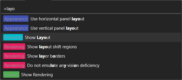
This will show you various grid settings, such as the grid lines, the name of the areas, or track sizes. To tweak around with the settings, you can reach the debugger through your Layout panel. If you don’t see the Layout panel in your DevTools, you can reach it by hitting crtl + shift + p on your keyboard and type in “Layout”, then choose the “Show Layout” option.

How the Debugger Enhances Grid Debugging
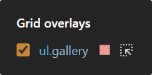
You can also see how many grids are created on your page and enable the overlay through the Layout panel directly. This makes it easier to quickly see and inspect, which elements’ display is set to grid on the page.

You can also set the color of the grid itself, and apart from accessing grid elements directly, you have a couple of more customization options.

Such as:
- Extending grid lines: Makes the grid lines extend outside of the grid itself
- Showing track sizes: Shows the size of each track, eg.:
1fr•70px - Showing area names: If you use
grid-template-areaswith named areas, you can set the debugger to show them in your overlay - Showing line number or names: Shows the number of lines or names associated with it

And that is all you need to know about the grid debugger. It lets you see how your grid behaves and makes it easier to debug and resolve issues. If you would like to learn more about the grid layout, check out how you can create a fake masonry using nothing more but CSS. Thank you for reading through, happy styling! 🎨


Rocket Launch Your Career
Speed up your learning progress with our mentorship program. Join as a mentee to unlock the full potential of Webtips and get a personalized learning experience by experts to master the following frontend technologies:
Courses

CSS - The Complete Guide (including Flexbox, Grid and Sass)

The HTML & CSS Bootcamp


