How To Create a Customizable Modal in Vanilla JavaScript
 7 min read
Modals are often a core part of interactive web applications. They appear on top of the existing page after a user action, often accompanied by a backdrop to draw attention to the popup and ask for further actions from the user, such as confirmation, like deleting information.
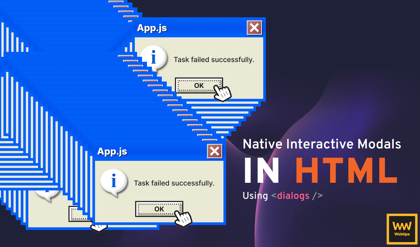
In this tutorial, we'll take a look at how to create a customizable modal in vanilla JavaScript using the dialog element introduced in HTML5.

Modal Options
To make the modal customizable, we want to be able to set a couple of different options when creating one. To create a modal, we need to call a function with a set of parameters that will customize the appearance and behavior of the modal:
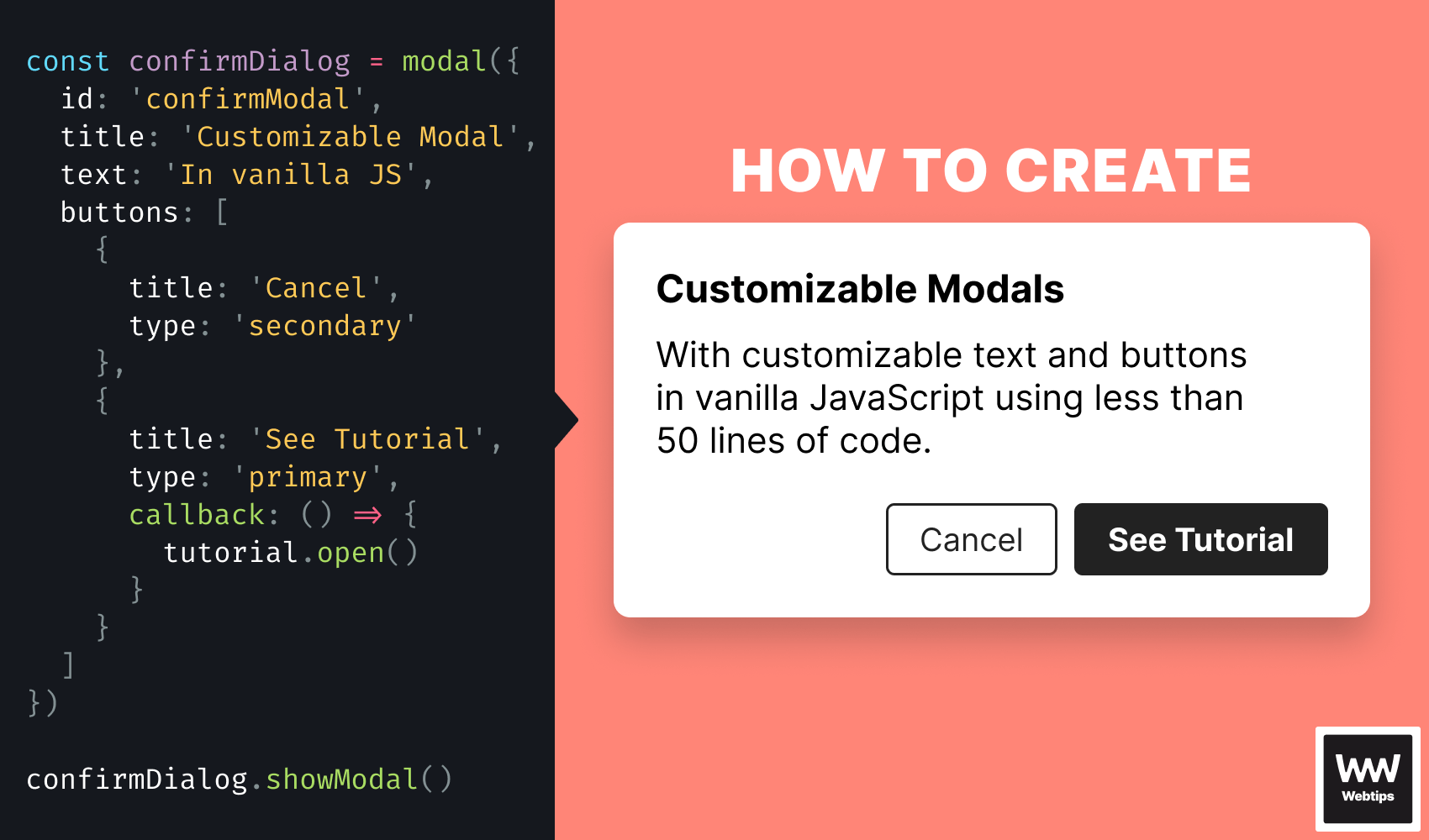
const confirmDialog = modal({
    id: 'confirmModal',
    title: 'Are you sure?',
    text: 'All your changes will be deleted...',
    buttons: [
        {
            title: 'Cancel',
            type: 'secondary'
        },
        {
            title: 'Yes, I\'m sure',
            type: 'primary',
            callback: () => {
                console.log('Delete confirmed...')
            }
        }
    ]
})

// Then later in the application, call whenever we need it
confirmDialog.showModal()We'll accept four different parameters for various purposes:
id: A unique ID that we can use to identify the modal. It'll be used as theidof the element that will be created by themodalfunction.title: The title of the modal, displayed in bold using abtag.text: The content of the modal displayed in a paragraph.buttons: An array of objects that define the buttons of the modal from left to right.
Each button can have three different properties: a title for the button text, a type that can be either primary or secondary, and a callback function that will be executed on click. If no callback property is present, the button will function as a close button.
Creating the Modal's HTML
Now that we know how we want the modal to behave, let's take a look at the actual function. Create a new function called modal and add the following code to create the HTML that will be rendered:
const modal = config => {
    const {
        id,
        title,
        text,
        buttons
    } = config

    const html = `
        <dialog id="${id}">
            <b>${title}</b>
            <p>${text}</p>
            <div>
                ${buttons.map(button => `
                    <button class="${button.type}">
                        ${button.title}
                    </button>
                `).join('')}
            </div>
        </dialog>
    `
}Using destructuring assignment, we can extract the values from the config parameters to use them individually where necessary. With a template literal, we can build the HTML layout for the modal.
Note that we've utilized a dialog element, which adds native modal functionality to our function.
Inside the dialog, we display the title and text, along with the buttons. To generate a button for each entry, we use the map method to loop through the array. When using map, remember to join the generated array into a single string using the join method. To add this HTML to the document when the function is called, append the following code after the html variable:
const parser = new DOMParser().parseFromString(html, 'text/html')
const dialog = parser.querySelector('dialog')

document.body.appendChild(dialog)

return dialogUsing a DOMParser, we can convert the string into a set of DOM elements, which can be appended to the end of the body.
Alternatively, you can also call appendChild only when the modal is shown. This way, you'll add the modal's HTML to the page only when the user interacts with the page to trigger a modal, thus improving the initial page load.
 Remove ads
Adding Event Listeners
Last but not least, we need to attach event listeners to the buttons inside the modal. Add the following lines of code before appending the dialog to the document:
const buttonElements = dialog.querySelectorAll('button')

buttonElements.forEach((button, index) => {
    button.addEventListener('click', () => {
        buttons[index].callback?.()
        dialog.close()
    })
})

document.body.appendChild(dialog)

return dialogThis code will loop through each button inside the dialog and attach an event listener using addEventListener. Inside click event callback, we can reference the passed callback function using buttons[index].callback.
Make sure to use optional chaining to avoid errors for buttons without a callback.
After the callback has been executed, we can call dialog.close to close the dialog with all actions. By combining this with the optional chaining from the previous line, we can allow developers to omit the callback property on a button to make it act as a close functionality.
Triggering the Modal
To trigger the modal, we can call the showModal method on the return value of the modal function. This is because the function returns the dialog element at the end.
// Available methods on the returned dialog:
const dialog = modal({ ... })

dialog.show()      // Opens the modal (allow interaction outside the modal)
dialog.showModal() // Opens the modal (prevents interaction outside the modal)
dialog.close()     // Closes the modal
dialog.open // Returns a boolean whether the modal is open or notThe dialog elements come with native modal functionality that we can use to show and hide the modal. It has two types of show functionality:
show: Opens the modal while allowing interaction with content outside the modal.showModal: Opens the modal while preventing interaction with content outside the modal.
It also has an open property that can be used to verify if the modal is currently open or not. It returns a boolean false if the modal is closed; otherwise, it returns true.
Summary
In summary, creating a customizable modal in vanilla JavaScript can be broken down into three main steps:
- Creating the HTML for the modal using a
dialogelement - Attaching event listeners to buttons and forwarding functions as a callback
- Appending the
dialogto the document, and returning the element from the function
If you would like to learn more about dialogs in HTML, be sure to check out the following tutorial, where we also take a look at how you can create simple dialogs without the use of any JavaScript.

Rocket Launch Your Career
Speed up your learning progress with our mentorship program. Join as a mentee to unlock the full potential of Webtips and get a personalized learning experience by experts to master the following frontend technologies:
Courses


Recommended
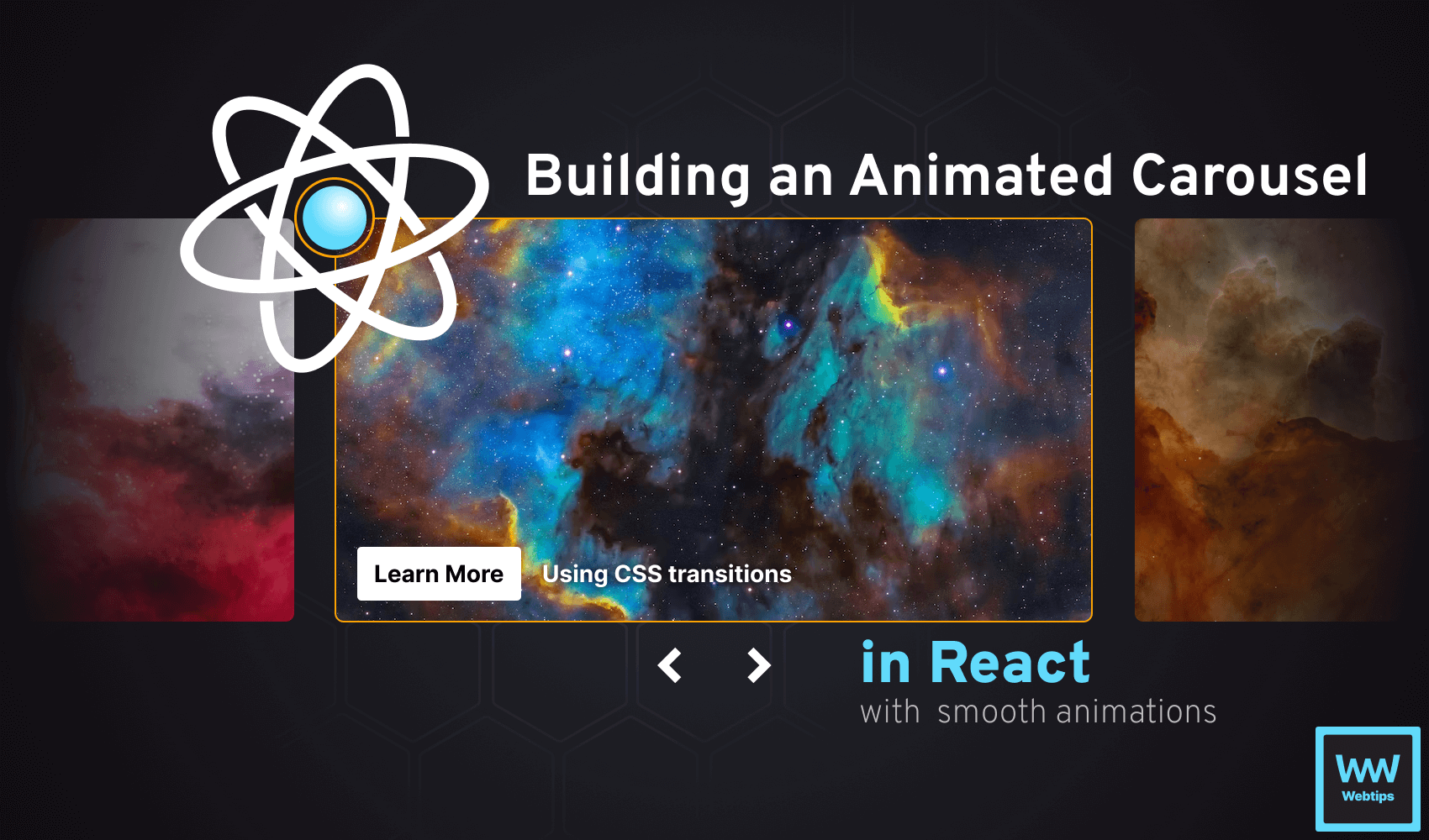
How to Create an Animated Carousel in React
 2024 01 March • 17 min read • React v18.2
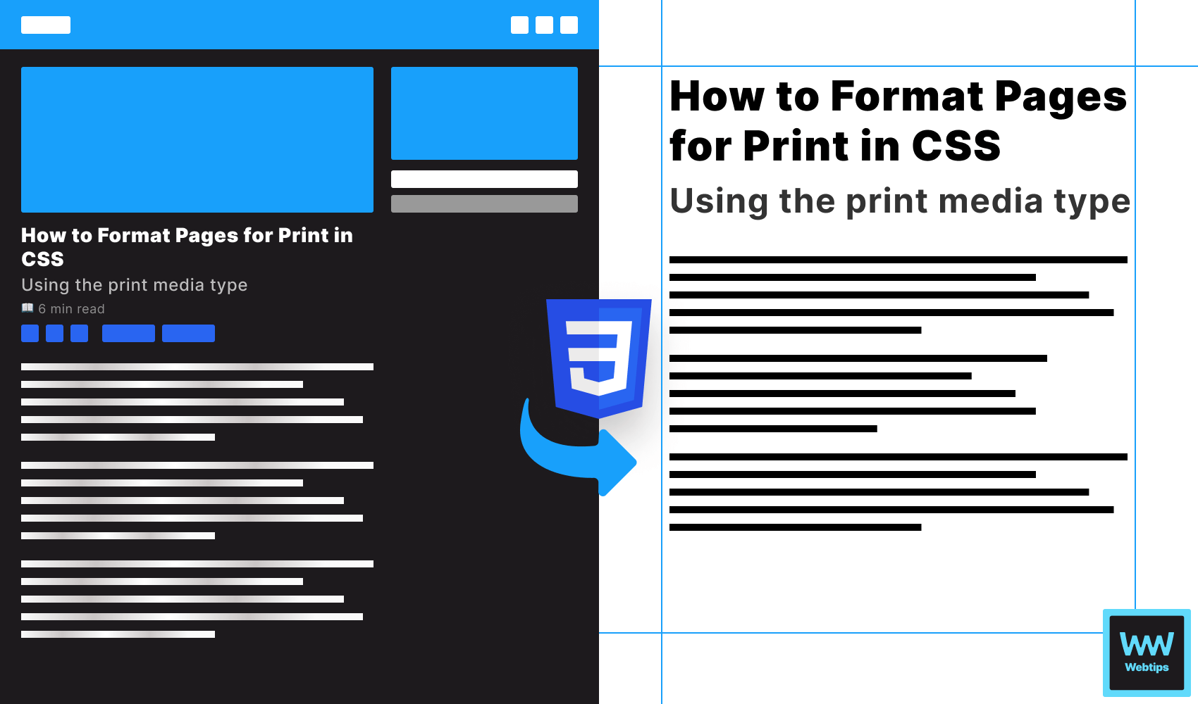
How to Format Pages for Print in CSS
6 min read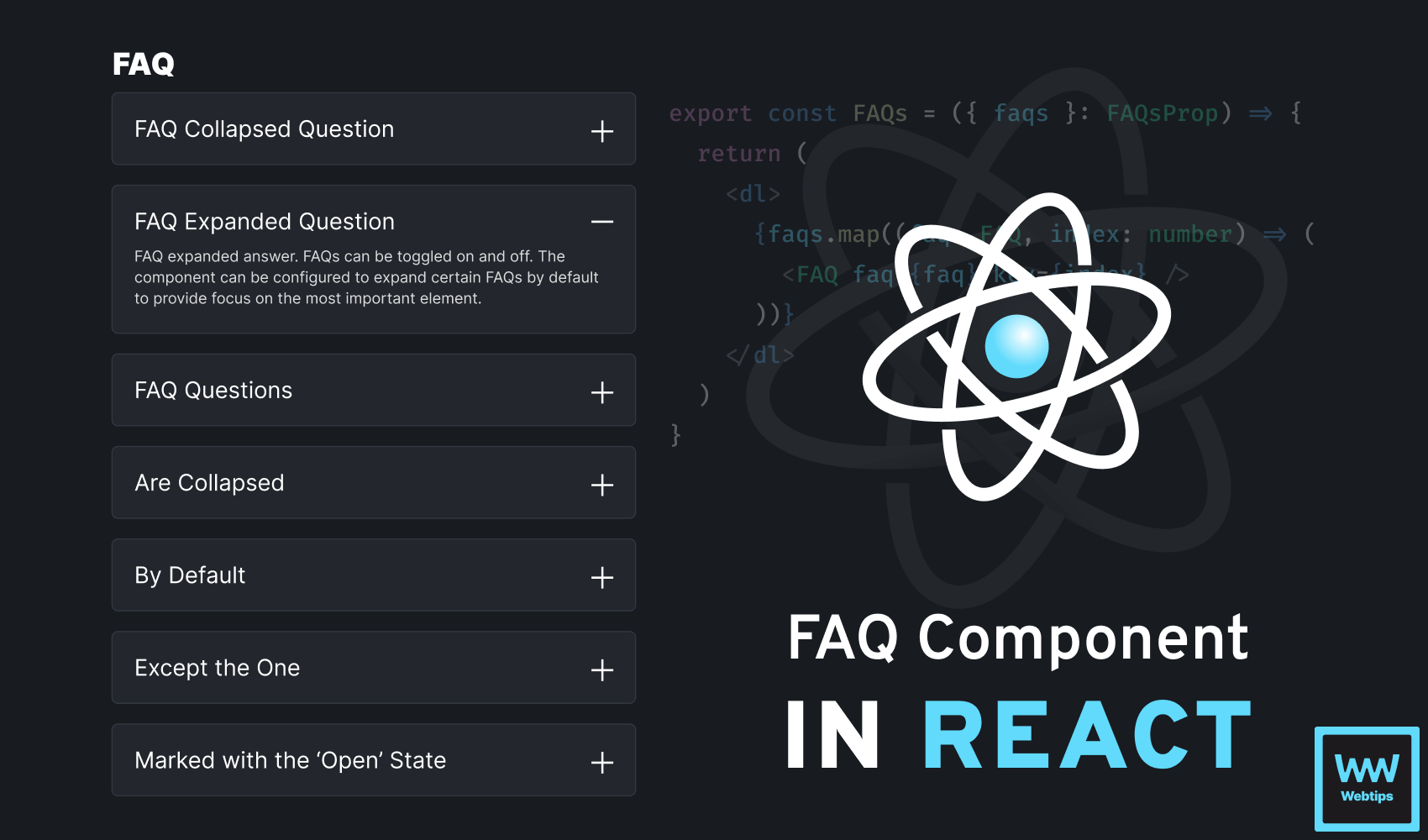
How To Create a Toggleable FAQ Component in React
7 min read