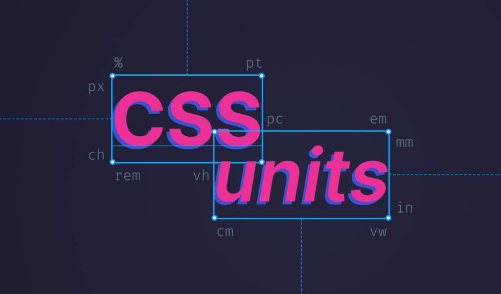
Everything You Need to Know About CSS Units
 2023 22 May •
  8 min read
There are currently 15 different CSS units that browsers support, and the majority of them are unknown by most. In this tutorial, you’ll be going to learn everything you need to know about CSS units. In order, we are going to take a look at the following:
If you’re only interested in some of them, feel free to use the links above to jump to the relevant section.
We can broke down CSS units into two categories. A unit can be either an absolute length or a relative length. Let’s see what is the difference between them. First, we are going to take a look at what type of units are absolute length units, as they are easier to understand how they work.

Absolute Lengths
There are a total of 6 units that are absolute lengths. They are called absolute length units because they base their dimensions on real-world lengths. Because of this, using absolute lengths is a good fit for prints. Among them, we have:
Pixels
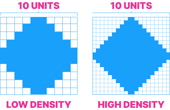
The most common unit you will come across is pixels, or px for short.
.pixels {
    width: 100px;
}Note that pixels are based on device pixels, meaning if you have a higher density screen, the number of pixels drawn on the screen will also be more. Take a look at the following comparison:
Points
Next, we have points, denoted by pt. Points are based on typographic measurements, they equal to exactly 1/72 of an inch. You would usually use it to set font sizes.
.points { font-size: 12pt;}Centimeters, Millimeters and Inches
You can also use real-life measurements such as cm, mm or in. They are self-explanatory, all you need to know is that 1 inch equals to 96px. (or 2.54cm)
.units { width: 1cm; // Usage of centimeters width: 2mm; // Usage of millimeters width: 3in; // Usage of inches}Picas
Lastly, we have picas (pc), which is also a typographic unit of measurement, which equals to exactly 12pt.
.picas {
    font-size: 1pc; // This will equal to 12 points
}Relative lengths
Unlike absolute lengths, relative lengths base their measurements on other things, like parent elements, font sizes, or viewport dimensions. Let’s start by taking a look at the most used relative length, percentages.
Percentages
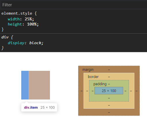
Percentages base their size on their parent’s dimensions. Among relative lengths, you’re going to come across them the most. To see them in action let’s start with a smaller value:
In the example above, the width of the parent is set to 100px. Making one of the child elements width 25%, will make its width 25px.
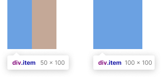
Note that by floating them next to each other, you can create equal-width columns. Don’t forget to clear float after them.
<style>
    .column {
        width: 25%;
        height: 100%;
        float: left;
    }

    .clearfix::after {
        content: '';
        clear: both;
        display: table;
    }
</style>

<div class="container">
    <div class="column"></div>
    <div class="column"></div>
    <div class="column"></div>
    <div class="column"></div>
</div>
Now if you set the width of the element to 50% or 100%, it will take up exactly half or the full size of its parent container respectively, just as expected.
But what happens if you have your element set to 100% of its container, and you add some padding on top of it?
.item {
    width: 100%;
    padding: 20px;
}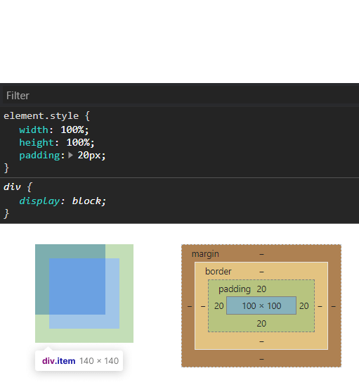
What will happen, is that the item will overflow its container. This is because when you set the width of an element by a percentage, the width is calculated for the content only (inner width). In order to fix this, you need to take the borders into consideration as well.
The same happens of course for other values higher than 100%. In the example below, the element will overflow the container by exactly 50%.
.overflow { width: 150%;}Font Units
Let’s move on to font specific units. The following four units are all based on fonts in some way or another.
EMs
EMs are relative to the font-size of the element. This means if you have a font-size set to 12px, 1em will equal to 12px.
body {
    font-size: 12px;
}

.paragraph {
    font-size: 1em; // em in this case will be 12px.
    font-size: 2em; // em in this case will be 24px.
}As you can see, em duplicates the value of the parent element’s font size. Note that it also cascades.
<style>
    main, div, p {
        font-size: 2em;
    }
</style>

<main>
    main set to 2em
    <div>
        div inside main set to 2em
        <p>p inside div set to 2em</p>
    </div>
</main>
REMs
While em is relative to the font size of the element, rem is relative to the font size of the root element. It stands for root em. Because of this, it works similarly to em. The only difference is that it does not cascade.
:root {
    font-size: 12px;
}

.rem {
    font-size: 2rem; // This will make the font-size 24px
}This unit is really useful for responsive design, as you can change only the font size of your :root element to also update all other font sizes across your page.
EX
We also have less commonly used units that are relative to certain font types. One of them is ex. It is relative to the “x” height of the current font. To better explain, take the following as an example:
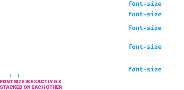
In the example above, the size of the first line is exactly 1 height of an “x”. The whole text fits inside the height of the “x”. If you increase it to two, it basically means that the size should be two “x”s stacked on top of each other, and so on. Because of this, if you only change the font family and nothing else, you will still get a different size as the height of the letter x is different across types.
CH
Another rarely used unit is ch. Just like for ex, it is relative to a certain font type, but instead of “x“, it is using “0” as a baseline. This means if you set your font-size to 1ch, the whole text should fit into the height of 1 zero character.
Now let’s focus our attention to dimensions that are affected by viewports.
Viewport dimensions
Viewport dimensions are useful for responsive design, as this unit basically splits the viewport into 100 equal units. They almost behave like using percentages, only this time, their size is relative to the viewport.
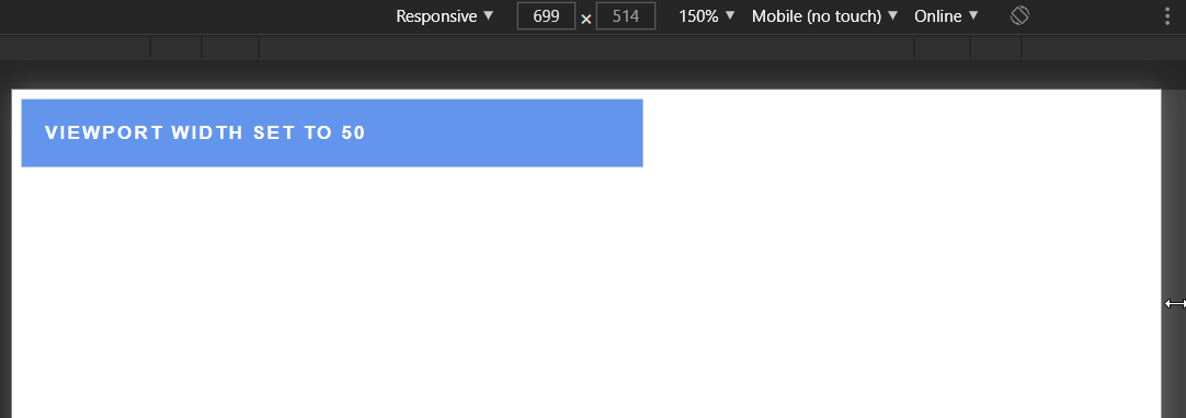
VW
Viewport width or vw for short is relative to 1% of the width of the viewport. This means the following element will have a width of 1%, whether it be a small device like a phone or a widescreen like a TV.
.vw {
    width: 1vw;   // Will take up 1% of the viewport
    width: 100vw; // Will take up 100% of the viewport
}
VH
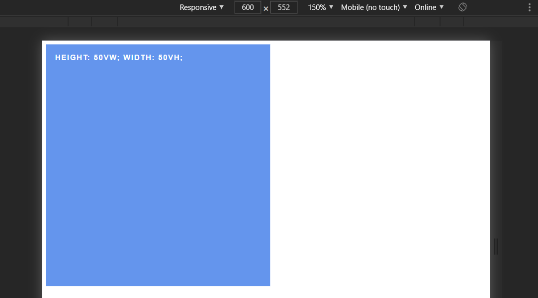
Viewport height or vh for short, works similar to vw, only this time, it is relative to the height of the viewport.
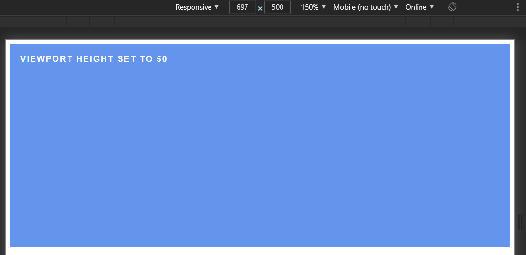
Make sure you apply vh to the height property and vw to the width property, otherwise, you get the opposite effect:
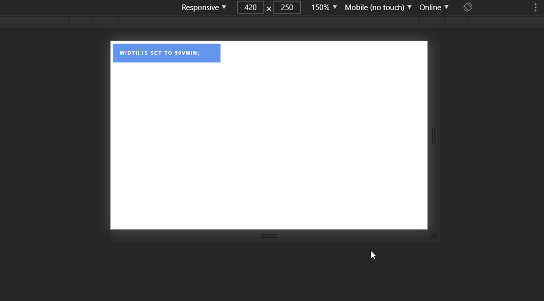
VMIN
Viewport min or vmin for short is relative to the smaller dimension of the viewport. This means that if you set the vmin of an element to 50, then it will depend on two dimensions.
.viewport-min {
    vmin: 50;
}If the width of the viewport is smaller than its height, it will depend on the width. However, if the height of the viewport is smaller than the width, the value will be set relative to the height. Note how the width changes when you change the width or height of the viewport.
VMAX
Lastly, we have viewport max or vmax for short. It works very similar to vmin, but instead, it is relative to the larger dimension of the viewport. This means that if the width is larger than the height, then the value will be relative to the width and vice-versa.

 Remove ads
Summary
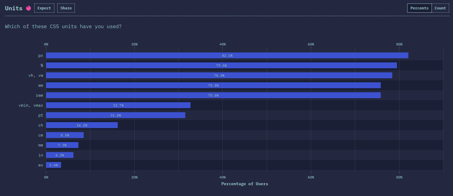
If you’ve reached this far, it means you know more about CSS units than 99% of developers. Most probably you’ll never have to use certain lengths like ex or ch, even though, according to the 2020 State of CSS survey, 16% of developers have used ch, while 3.4% used ex.
Hopefully the rest will come handy in some shape or form in the future. Do you have any addition to CSS units? If so, let us know in the comments below! Thank you for taking the time to read through, happy styling!


Rocket Launch Your Career
Speed up your learning progress with our mentorship program. Join as a mentee to unlock the full potential of Webtips and get a personalized learning experience by experts to master the following frontend technologies:
Courses

CSS - The Complete Guide (including Flexbox, Grid and Sass)

The HTML & CSS Bootcamp

The Creative HTML5 & CSS3 Course
Recommended

How to Render React on the Server-Side With Next.js
2021 11 November • 10 min read
How to Make Simple Feature Flags in React
2021 13 July • 18 min read
How to Create Dictionaries in JavaScript
2024 08 February • 7 min read