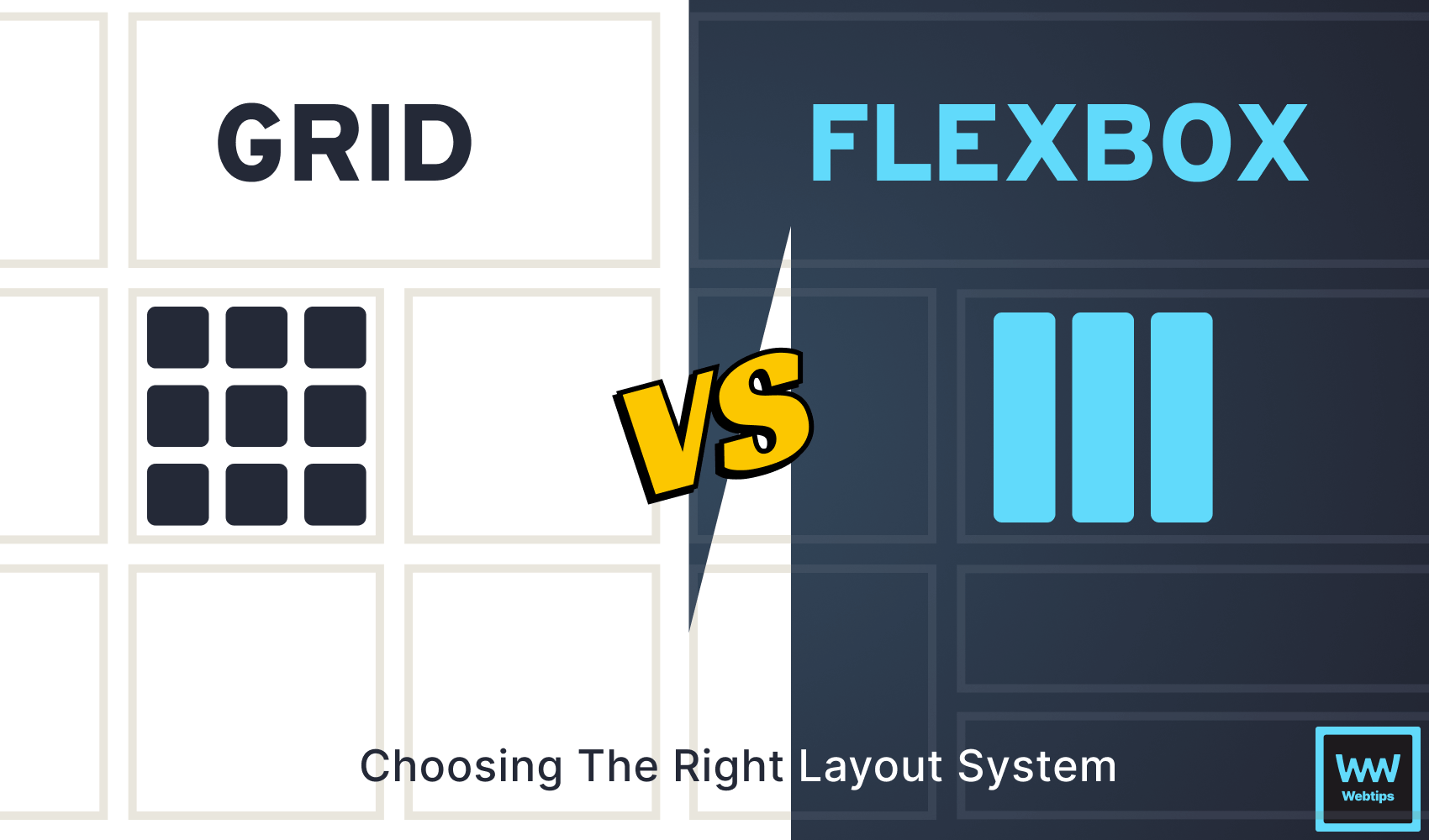
CSS Grid vs Flexbox - Which One to Use and Why?
 8 min read
Choosing the right layout system, whether it’s CSS Grid or Flexbox is paramount for web developers and designers. This decision significantly impacts the structure, design, and responsiveness of a website.
Choosing between CSS Grid and Flexbox is not a matter of one being superior to the other; it’s about understanding their strengths and selecting the most appropriate tool for the specific task at hand. A well-informed choice ensures smoother development, better user experiences, and a more efficient workflow in web design and development.
Both CSS Grid and Flexbox are great tools; you can use either or decide to use both. In this article, I’m going to give you my opinion on what each one of these is better suited for, and when you should use them. But before then, let me give you a run-down on CSS Grid and Flexbox.

Key Concepts and Features of CSS Grid
CSS Grid is a powerful layout system in CSS that allows you to create a two-dimensional grid-based layout for web pages. It provides a way to design complex structures with rows and columns, making it easier to create responsive and flexible designs.
To start working with CSS grid, create a grid layout by defining an element as a grid container. This is done using the display: grid property in CSS:
<style>
    .grid-container {
        display: grid;
    }
</style>

<div class="grid-container">
    <!-- Grid items go here -->
</div>
The direct descendants of a grid container are called grid items. These items are placed within the grid container like so:
<div class="grid-container">
    <div class="grid-item">...</div>
    <div class="grid-item">...</div>
    <div class="grid-item">...</div>
    <div class="grid-item">...</div>
</div>CSS Grid allows you to define the number of rows and columns in your grid, as well as their size and distribution. For this, you can use properties like grid-template-rows and grid-template-columns to define the grid structure:
.grid-container {
    display: grid;
    grid-template-columns: 1fr 1fr;
    grid-template-rows: 1fr 1fr;
}fr (fraction) is a CSS unit that takes up a fraction of the available space.
You can also specify the gap between grid items using the grid-gap or grid-row-gap and grid-column-gap CSS rules:
.grid-container {
    grid-gap: 10px;
}These are just some of the key concepts and features of CSS Grid. To gain more knowledge about CSS Grid, I advise you to take the CSS Grid Layout Crash Course by Traversy Media where he teaches about CSS Grid in greater detail.
Advantages of CSS Grid
Overall, CSS Grid is a powerful layout system in web design that offers several advantages:
- Two-Dimensional Layout: CSS Grid allows you to create two-dimensional layouts with rows and columns, providing more control and flexibility than one-dimensional layout systems like Flexbox.
- Responsive Design: It simplifies responsive design by enabling you to define how elements reorganize and resize on different screen sizes without the need for complex media queries.
- Grid Template Areas: You can name and visually organize grid areas using
grid-template-areas, making it easy to create complex layouts while maintaining readability in your code. - Alignment Control: It offers precise control over content alignment both horizontally and vertically, ensuring that elements align as intended, even in complex layouts.
- Accessibility: Grid can enhance accessibility by structuring content logically and ensuring proper reading order, which is essential for screen readers with disabilities.
- Reduced Dependency on Frameworks: CSS Grid reduces the reliance on third-party frameworks and libraries for layout, allowing you to have more control over your design and performance.
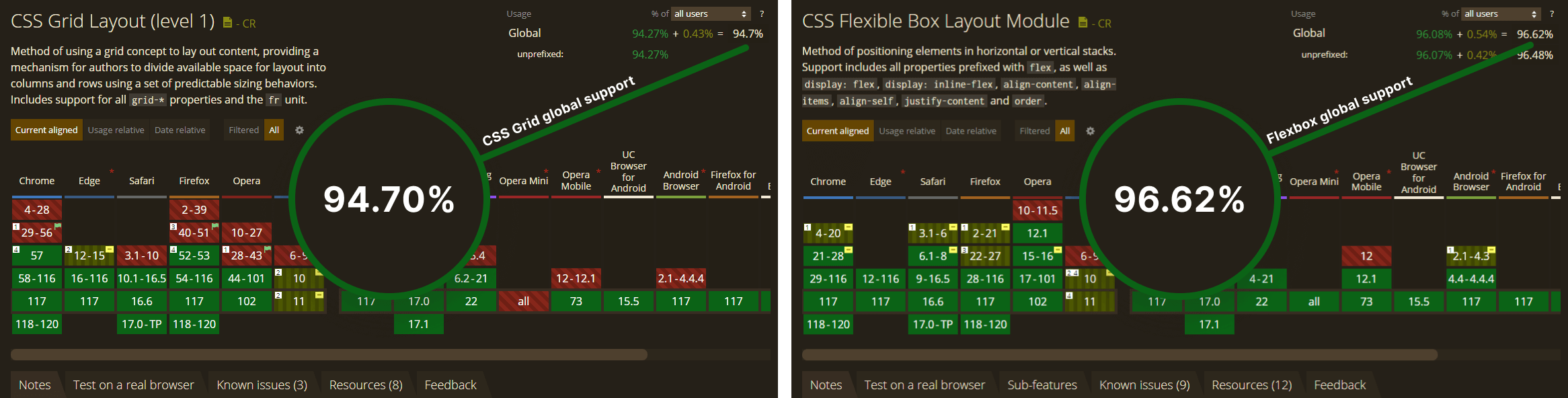
- Browser Support: It’s widely supported in modern browsers, making it a viable choice for most web development projects.

 Remove ads
Key Concepts and Features of Flexbox
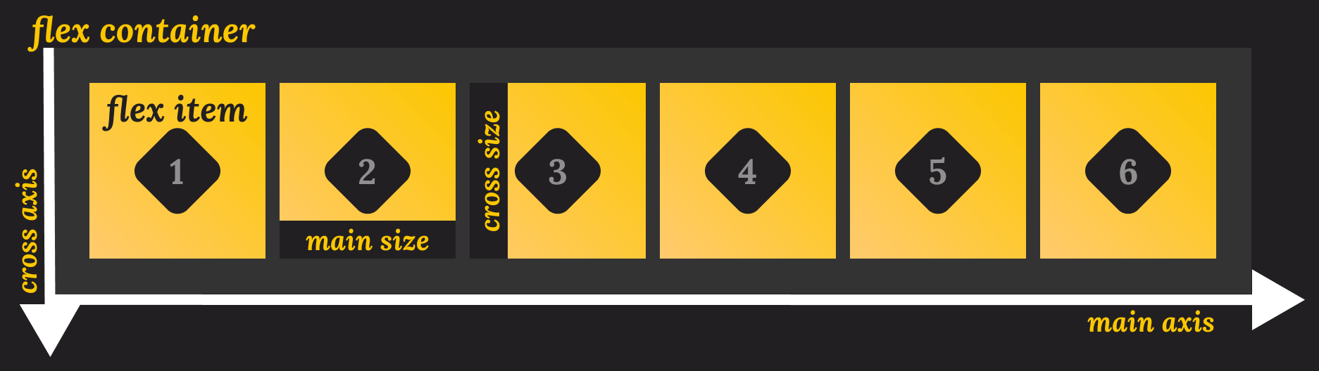
Flexbox is a CSS layout model that allows you to design one-dimensional layouts with ease. It’s particularly well-suited for creating components, such as navigation menus, lists, and aligned content within a container.
To create a flexible layout, you make an element as a flex container by setting its display property to flex or inline-flex. This container holds the flex items:
<style>
    .flex-container {
        display: flex;
    }
</style>

<div class="flex-container">
    <!-- Flex items go here -->
</div>The child elements of a flex container are referred to as flex items. These items are automatically arranged within the container along a single axis (either horizontally or vertically), depending on the flex container's orientation:
<div class="flex-container">
    <div class="flex-item">...</div>
    <div class="flex-item">...</div>
    <div class="flex-item">...</div>
    <div class="flex-item">...</div>
</div>To handle the direction, you can set the main axis using the flex-direction property, allowing you to create row or column layouts:
flex-direction: rows: Align items in a horizontal direction.flex-direction: column: Align items in a vertical direction.
/* Using a column layout: */
.flex-container {
    display: flex;
    flex-direction: row;
}

/* Using a row layout: */
.flex-container {
    display: flex;
    flex-direction: column;
}Flexbox provides various properties like justify-content and align-items to control how items are aligned and spaced within the flex container:
.flex-container {
    display: flex;
    align-items: center;
    justify-content: space-around;
}These are just some of the main characteristics of Flexbox. To learn more about Flexbox, make sure to take a look at the Flexbox crash course by Traversy Media.
Advantages of Flexbox
To better understand when to use Flexbox, here are some of its advantages:
- Simplified Layouts: Flexbox simplifies the creation of one-dimensional layouts, such as navigation menus, lists, and card layouts, by automatically handling the alignment and distribution of items along a single axis.
- Flexible Sizing: Items can expand or shrink proportionally based on the available space, making it easy to create a responsive design that adapts to different screen sizes and content lengths.
- Alignment Control: It provides properties like
justify-contentandalign-itemsto control how items are aligned and spaced within the container along both the main and cross-axis. It also provides an order property that can be used to order elements within a flex container in any variation, making it a great choice for layouts where different orders are required on different screen sizes. - Improved Positioning: It reduces the reliance on floats and absolute positioning, leading to cleaner and more maintainable CSS.
- CSS Grid Integration: Flexbox can be combined with CSS Grid to create more complex and adaptive two-dimensional layouts, allowing for even greater flexibility in web design.
- Cross-Browser Compatibility: Just like CSS Grid, Flexbox is well-supported in modern web browsers making it a reliable choice for cross-browser compability.
Differences Between CSS Grid and Flexbox
CSS Grid and Flexbox are two different layout systems, each with its own unique strengths and use cases. To summarize, here are the key differences.
Layout model
CSS Grid is a two-dimensional system, meaning it deals with both rows and columns simultaneously. It’s best for overall page layout where items are organized in a grid-like structure.
Flexbox, on the other hand, is one-dimensional, focused on arranging items along a single axis (either horizontally or vertically). It’s ideal for distributing space within a container in a single direction.
Axis Control
CSS Grid provides control over both the horizontal (main) and vertical (cross) axes, allowing precise positioning and alignment of items along both axis. Flexbox primarily focuses on the main axis (either horizontal or vertical) for alignment and distribution, with less control over the cross-axis.
Alignment
When it comes to alignment, CSS grid offers properties like justify-content and align-items for alignment and spacing along both axes, providing more control over item placement.
Just like CSS Grid, flexbox provides properties like justify-content and align-items as well, but for the single main axis. To align items along the cross-axis, you’d use align-items or align-self on individual items.
Responsiveness and Browser Support
Last but not least, both CSS grid and flexbox offer responsive design capabilities, allowing you to define how items should adapt to different screen sizes and orientations within the layout. They are also widely supported and can be used with no compatibility concerns in modern browsers.
When to Choose CSS Grid and Flexbox
Choosing between CSS Grid and Flexbox mostly comes down to whether you need a two or one-dimensional layout. CSS Grid is a two-dimensional layout, while Flexbox is one-dimensional.
CSS Grid is suitable for large-scale projects like grid-based galleries, magazine-style layouts, e-commerce product listings, dashboard layouts, etc. On the other hand, Flexbox is suitable for smaller projects, such as navigation menus, card layouts, form layouts, headers, and footer layouts.
Remove adsConclusion
CSS Grid allows you to create grid structures, perfect for complex designs. Flexbox, on the other hand, excels at arranging elements in either a row or column, making it a great choice for elements, such as navigations, tabs, or card layouts. Happy Codding!

Rocket Launch Your Career
Speed up your learning progress with our mentorship program. Join as a mentee to unlock the full potential of Webtips and get a personalized learning experience by experts to master the following frontend technologies:
Courses

CSS - The Complete Guide (including Flexbox, Grid and Sass)

The HTML & CSS Bootcamp

The Creative HTML5 & CSS3 Course
Recommended
How to Create an Editable Table Component in React
13 min read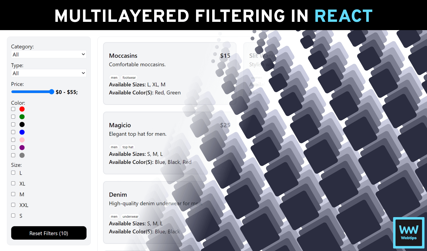
How to Manage Multilayered Attribute Filtering in React
16 min read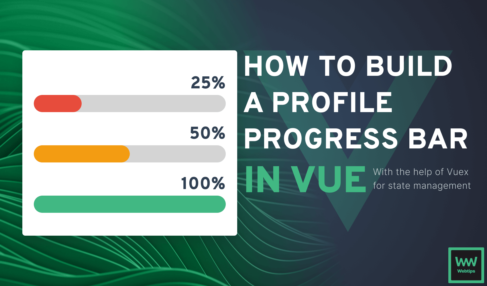
Building an Interactive Profile Progress Bar with Vue.js
12 min read