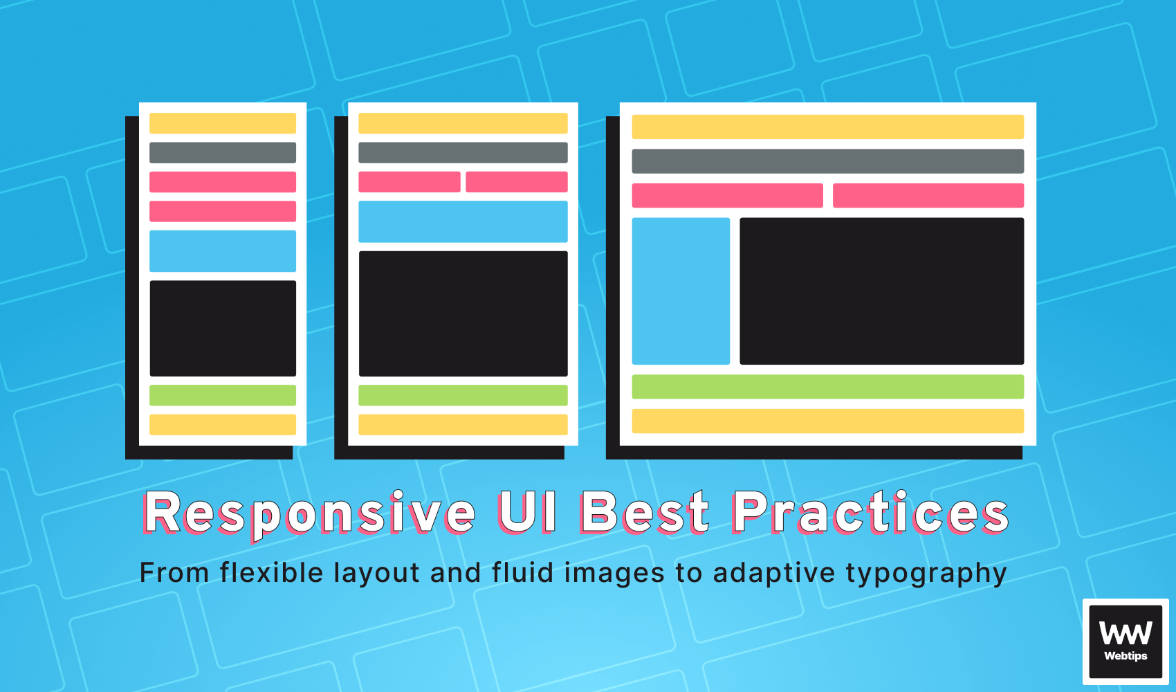
Best Practices for Responsive User Interfaces Using CSS
 13 min read
Responsive web design is a web development approach for creating user interfaces that adapt and respond smoothly to different screen sizes and devices. It involves coding and designing websites for optimal viewing and user interaction, regardless of the type of device used.
The use of flexible grids, fluid images, and media queries in responsive web design ensures dynamic adjustment and reflow of content to fit various screen sizes. This ensures a seamless user experience on desktops, computers, laptops, tablets, and smartphones.
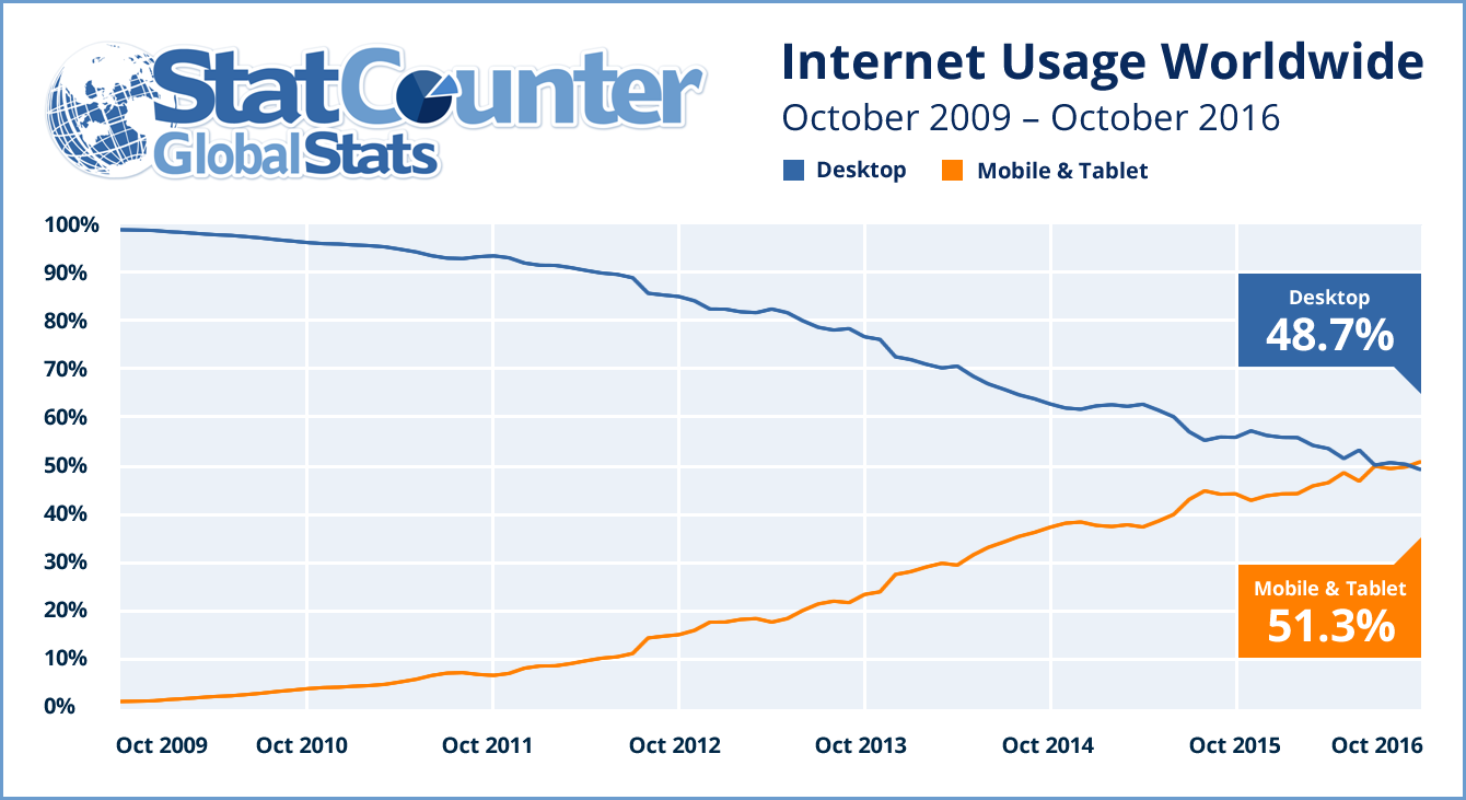
In today's world, where an increasing number of users access the internet through mobile devices, all websites should be responsive with a mobile-first design. Since mobile traffic surpassed desktop traffic, most users expect websites to load quickly and display effectively on their devices. Websites that are not responsive and properly designed for mobile devices often lead to frustrating user experiences, causing users to leave the site and find other alternatives.
Additionally, search engines like Google give preference to mobile-responsive websites in their SERP results. Therefore, websites need to consider and adopt responsive web design practices to improve their online visibility.
This article focuses on the best practices for designing responsive user interfaces. It covers features of responsive design, such as using fluid images, designing flexible layouts, adaptive typography, and testing and optimizing designs. These best practices allow front-end developers to create superb user experiences for a wide range of devices and screen sizes.

Designing Flexible Layouts
Flexible layouts are important and necessary in responsive web design because they enable the adaptation and reflow of content based on the screen size of the accessing device. When we leverage flexible layouts in the design and development process, website users will have optimal viewing experiences across a wide range of devices.
With flexible layouts, a website can seamlessly reposition, resize, and stack content, keeping the user interface visually appealing and easy to use. Flexbox and CSS grid are two of the most powerful layout techniques in front-end development that facilitate responsive web design.
CSS Grid
CSS grid is a two-dimensional layout system used to divide a webpage into rows and columns. The main benefit of using a CSS grid is the precise control it provides over the placement and sizing of elements within a grid container. This example demonstrates the use of CSS grid to create a flexible layout:
.container {
    display: grid;
    grid-template-columns: repeat(auto-fit, minmax(250px, 1fr));
    grid-gap: 20px;
}

.item {
    /* Styles for grid items */
}In the snippet above, the .item class represents the grid items, while the .container class represents the grid container. The columns of the grid are defined by grid-template-columns, and the repeat(auto-fit, minmax(250px, 1fr)) rule allows the columns to automatically fit the available space within the specified dimensions.
Flexbox
Flexbox is a layout system that is one-dimensional and provides a flexible method of distributing and aligning elements inside a container. With Flexbox, we can easily control the size, order, and alignment of items. This example showcases using Flexbox to create a flexible layout:
.container {
    display: flex;
    flex-wrap: wrap;
    justify-content: space-between;
    align-items: flex-start;
}

.item {
    /* Styles for flex items */
}The .container class represents the flex container, while the .item class represents the flex items. The flex-wrap property with a value of wrap allows the items to wrap onto multiple lines when the width cannot fit.
The justify-content property set to space-between distributes the items evenly along the main axis, creating space between them. The align-items property set to flex-start aligns the items at the start of the cross axis.
We need to consider the following tips when creating effective flexible layouts.
- Use percentages for measurements: Percentage-based measurements are better for widths, heights, and margins instead of fixed pixel values. Percentage measurements ensure that elements adapt proportionally to the available space.
- Avoid fixed widths: You should refrain from setting fixed widths for elements whenever possible and instead allow them to fit the available space. This increases the flexibility and responsiveness of the website.
- Utilize media queries: You should employ media queries to apply specific styles to elements based on different screen sizes. Adjusting the layout, font sizes, and other design elements at specific breakpoints allows for a unique and effective user experience regardless of the device.
Using Fluid Images
Handling images in responsive web design poses a challenge for front-end developers because their dimensions are normally fixed, leading to adaptive issues when viewed on different screen sizes. When images on a website don’t adjust and scale proportionally, they can become distorted, overflow, or cause layout inconsistencies. Implementing fluid images that dynamically adapt to the available space while maintaining their aspect ratio is an effective way to overcome these challenges.
Fluid images are images that seamlessly resize and scale for different screen sizes. With the appropriate CSS properties set, we can ensure that images adjust and fit within their containers without any distortions or layout issues. The most common methods of creating fluid images are by using the max-width property and the picture element.
Max widths
The max-width property is used to set a maximum width for an image, which ensures proportional scaling as the container width increases or decreases. Here is an example of the max-width property in action:
img {
    max-width: 100%;
    height: auto;
}In the snippet above, the maximum width of the image is set to be 100% of its container, while the height: auto property maintains the image’s aspect ratio.
Picture elements
The picture element is also effective for creating fluid images in responsive web design. This element allows us to provide multiple versions of an image, which will then be displayed based on media conditions such as screen size and resolution. The following example shows how the picture element works:
<picture>
    <source srcset="image-large.jpg" media="(min-width: 1200px)">
    <source srcset="image-medium.jpg" media="(min-width: 768px)">
    <img src="image-small.jpg" alt="Responsive Image">
</picture>In the above code snippet, different versions of the image are defined using the source element. Each source element is specified by a srcset attribute with the corresponding image source and a media condition is defined using the media attribute. The img element is a fallback that loads the specified image when none of the media conditions are present.
Other considerations
We need to consider a few important tips when working with fluid images to ensure optimal responsiveness. First, you should ensure multiple image resolutions and sizes are provided for different screen sizes and resolutions. This generally optimizes loading times while also minimizing bandwidth usage.
Additionally, the images should be compressed and optimized to find the right balance between quality and file size, using image optimization tools or content delivery networks (CDNs). Lastly, you need to include the alt attribute that describes the image content to visually impaired users, thereby increasing accessibility.
<img src="image-small.jpg" alt="Responsive Image" />
 Remove ads
Adaptive Typography
Typography plays a crucial role in creating visually appealing user interfaces. In responsive design, typography becomes even more important as the text should adapt to different screen sizes to maintain readability. By implementing adaptive typography, you can make the text content adjustable, providing a consistent and optimized reading user experience on various devices.
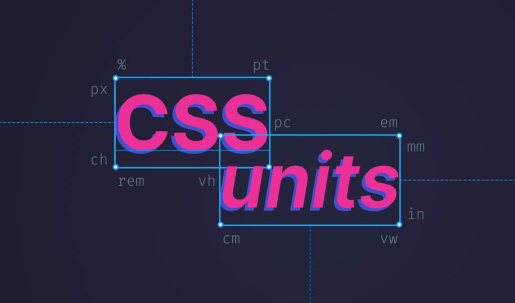
Adaptive typography involves the use of media queries and relative units to adjust the size, styling, and spacing of text content on different screen sizes. Relative units such as em and rem are used to define font sizes and line heights relative to the base font size on the website.
When these relative units are utilized in web development, the text content is proportionally scaled on different screen sizes. You can also use media queries to apply different styles that are adjustable on different screen widths, ensuring readable and appealing typography. This example showcases adaptive typography utilizing relative units and media queries:
body {
    font-size: 16px;
    line-height: 1.5;
}

h1 {
    font-size: 1.5rem;
    line-height: 1.2;
}

@media (min-width: 600px) {
    body {
        font-size: 18px;
    }

    h1 {
        font-size: 2rem;
    }
}

@media (min-width: 800px) {
    body {
        font-size: 21px;
    }

    h1 {
        font-size: 2.5rem;
    }
}In the example above, the base font size of the document is set to 16px, and the line height is set to 1.5. The h1 heading is defined with a font size of 1.5rem and a line height of 1.2, making it stand out while maintaining proper spacing. By utilizing media queries, the example adjusts font sizes for different screen widths.
In addition to using relative units and media queries in responsive design, there are other effective tips for creating adaptive typography. For instance, you should use appropriate line heights for comfortable reading experiences, avoid excessive use of decorative fonts, and optimize font loading to minimize delays in text rendering.
By following these tips when developing a website, effective typography adaptation on different devices can be achieved, enhancing the overall user experience.
Testing and Optimizing Responsive Designs
The most crucial step in the development of responsive web designs is testing and optimization. Since there are many different devices and screen sizes available, testing and optimizing designs is essential for proper functionality and a consistent user experience.
Through testing and optimization techniques, we can identify layout and functionality issues on specific devices while also enhancing the loading speed and performance of the website.
You can utilize several tools when it comes to testing and evaluating the responsiveness of your designs. Here are a few notable tools:
- Device Mode in Chrome DevTools: Most web browsers offer built-in developer tools that include a responsive design mode. This tool allows developers to simulate different devices and monitor how the website responds to different screen sizes, orientations, and pixel densities. It also has a feature for performance metrics.
- BrowserStack: This is a cloud-based tool that allows developers to test for different devices and browsers when creating websites. It also enables testing for different operating systems, browsers, and screen sizes. We can use this tool to ensure cross-compatibility and to identify issues specific to certain configurations before deployment.
Optimizing responsive web designs includes more than just testing for proper functionality. These tips will improve the performance of a responsive website and optimize the user experience across various devices:
- Optimize Images: Utilize tools such as ImageMagick or TinyPNG to compress and optimize images without affecting quality.
- Caching: You should implement browser caching for storing static resources, which ensures faster loading times in subsequent visits. Caching techniques such as setting
cache-controlheaders or using a content delivery network will significantly improve performance. - Minification: You should minimize JavaScript and CSS files by writing clean code and employing bundlers for minification during builds. This leads to faster loading times.
- Performance monitoring: You need to continuously monitor and analyze the performance of websites using tools such as Google PageSpeed Insights or GTmetrix. The insights and suggestions provided by these tools help in optimizing website speed and performance.
Example of Responsive Design in Action
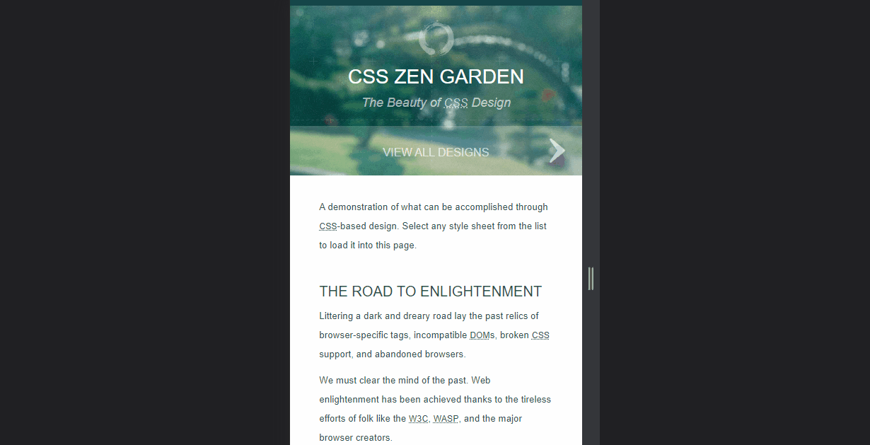
A popular example that exemplifies effective responsive design is CSS Zen Garden. This website seamlessly adapts to different screen sizes, offering an intuitive and visually appealing user interface. Moreover, it demonstrates how CSS can significantly alter the appearance of the same layout, resulting in distinct visual styles.

The layout intelligently rearranges elements, and the typography adjusts gracefully, ensuring readability on both desktop and mobile devices. The designs excel in responsive design due to their careful attention to key principles:
- Flexibility: The website utilizes flexible layouts, adjusting content positioning and size to fit various screen sizes. Elements are stacked or rearranged when needed, ensuring a seamless user experience.
- Fluid images: The website incorporates fluid images that resize and scale smoothly, maintaining their aspect ratios and preventing distortion. This allows images to adapt seamlessly to different screen sizes, enhancing the overall visual appeal of the websites.
- Adaptive typography: The showcased website implements adaptive typography, ensuring that text content remains readable and visually pleasing on all devices. It utilizes relative units and media queries to adjust font sizes, line heights, and spacing, providing optimal legibility across various screen widths.
By examining this successful example, we can glean valuable takeaways for enhancing our own responsive designs:
- Prioritize flexibility: Design layouts that can adapt and rearrange content to fit different screen sizes, ensuring a consistent user experience across devices.
- Embrace fluid images: Implement techniques like setting maximum widths and using the picture element to create fluid images that resize and scale proportionally, maintaining their aspect ratios.
- Focus on adaptive typography: Utilize relative units, media queries, and appropriate line heights to ensure readable and visually appealing typography across various screen widths.
- Test and optimize: Make use of testing tools, such as responsive design modes in browsers and services like BrowserStack, to identify and address any issues specific to different devices. Additionally, optimize your responsive designs by compressing images, leveraging caching, and minifying CSS and JavaScript files to improve performance.
By incorporating these key principles and learnings from successful examples, we can elevate our own responsive designs, delivering exceptional user experiences on a wide range of devices and screen sizes.
Conclusion
In conclusion, designing responsive user interfaces is essential in today's mobile-first world. Responsive web design allows websites to adapt seamlessly to different screen sizes and devices, providing a consistent and optimized user experience. Throughout this article, we have explored best practices for designing responsive user interfaces, covering various aspects such as flexible layouts, fluid images, adaptive typography, testing, optimization, and showcasing examples of successful responsive designs.
By implementing flexible layouts using CSS grid and flexbox, and avoiding fixed widths, you can create dynamic and adaptable interfaces that adjust gracefully to different screen sizes. The use of fluid images through techniques like the max-width property and the picture element, ensures that images scale proportionally, maintaining their aspect ratios and avoiding distortion. Adaptive typography, achieved with relative units and media queries, allows for readable and visually pleasing text across devices.
To get the most out of your responsive design, be sure to check out the following CSS tutorials.
 2021 23 July • 8 min read
 2021 11 November • 13 min read
 2021 11 November • 4 min read
Testing and optimization are vital steps in the development process of responsive designs. By utilizing tools like responsive design modes in browsers, BrowserStack, and Chrome DevTools' Device Mode, you can identify and address any layout or functionality issues specific to different devices. Optimization techniques such as image compression, caching, and minification improve performance, loading times, and the overall user experience.
It is crucial for developers to embrace responsive design principles and implement best practices in their projects. By prioritizing flexibility, utilizing fluid images, focusing on adaptive typography, testing rigorously, and optimizing performance, you can create highly responsive interfaces that deliver a seamless and engaging user experience across a wide range of devices.
Let's commit ourselves to implementing these best practices and continually refining our skills in responsive web design, ensuring that our websites and applications are accessible, user-friendly, and future-proof in this ever-evolving digital landscape.

Rocket Launch Your Career
Speed up your learning progress with our mentorship program. Join as a mentee to unlock the full potential of Webtips and get a personalized learning experience by experts to master the following frontend technologies:
Courses

CSS - The Complete Guide (including Flexbox, Grid and Sass)

The HTML & CSS Bootcamp

The Creative HTML5 & CSS3 Course
Recommended

How to Render Anchors Without Href in React
4 min read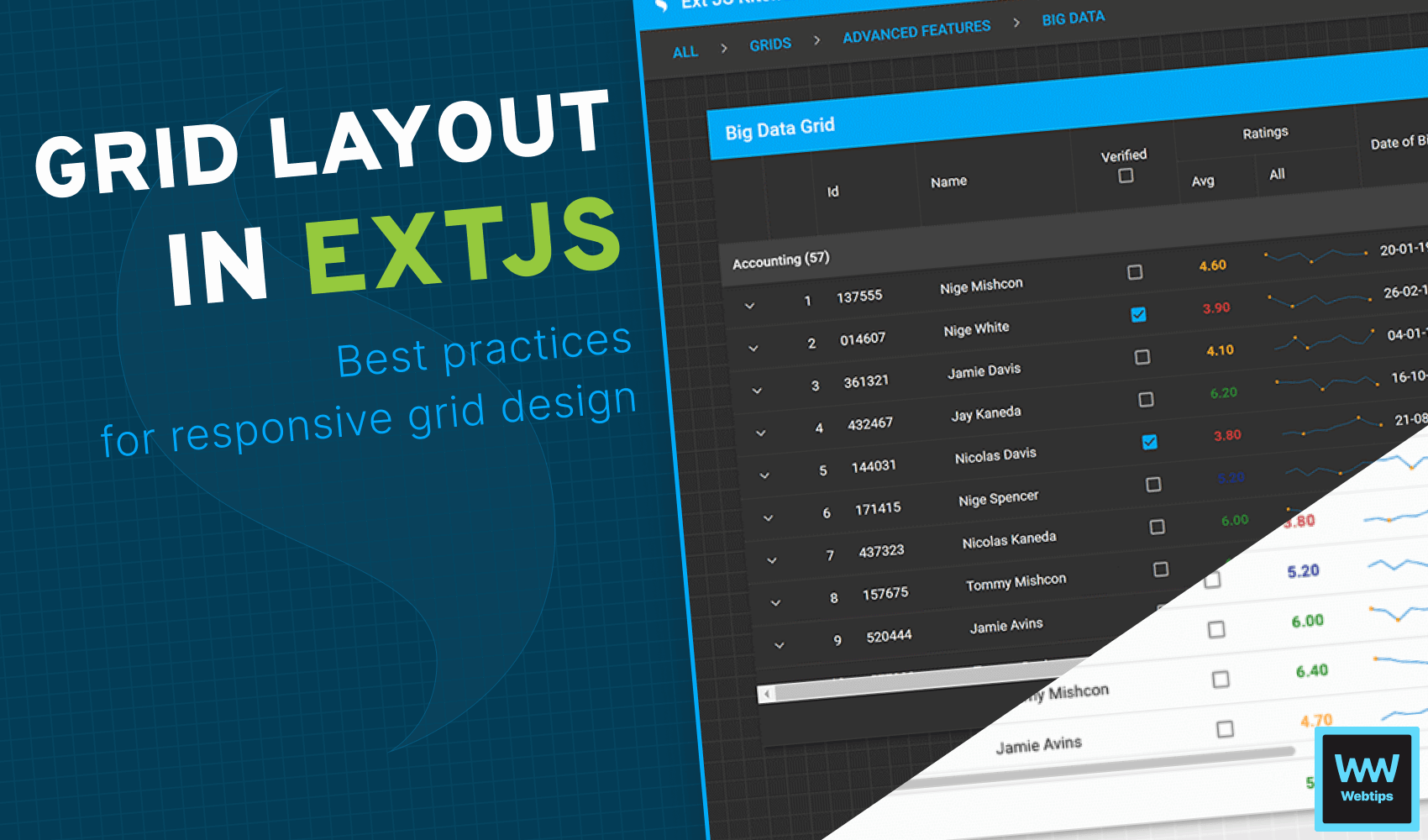
Effective Web App Development with Sencha Ext JS Grid Layout
7 min read
How to Display Key-Value Pairs in React in a Table
5 min read