
How to Create an Animated Carousel in React
 2024 01 March •
  17 min read • React v18.2
Carousels are a common way to present a list of media in a limited space. In this tutorial, we'll take a look at how you can create a Carousel component in React that can receive a list of images and be animated using CSS transitions. By the end of this tutorial, we'll have the following carousel ready to be used:


How to Call the Carousel
First, we're going to need to see how we want to call the carousel. It'll accept an images prop through which we can pass an array of images for display:
import { Carousel } from './Carousel'

const App = () => {
    const images = [
        {
            src: '/path/to/img.png',
            alt: 'Alternate text for image',
            url: '/link-to-page',
            caption: 'Image Caption next to CTA'
        },
        { ... },
        { ... },
        { ... }
    ]

    return <Carousel images={images} />
}Each image object within the images array can have the following four different properties:
src: The file path to the image.alt: The alternative text for the image, used as thealtattribute.url: The URL to which the user will be directed when clicking the carousel image.caption: A caption to be displayed on the image.
Building the Carousel
Now that we know how the carousel will work, let's take a look at the component itself. If you haven't done so already, create a new file named Carousel.jsx and include the following:
export const Carousel = ({ images }) => {
    return (
        <div className="carousel">
            <ul>
                {images.map((image, index) =>
                    <li key={index}>
                        <a href={image.url}>
                            <img
                                src={image.src}
                                alt={image.alt}
                            />
                            <div className="meta">
                                <span className="cta">Learn More</span>
                                <span className="caption">{image.caption}</span>
                            </div>
                        </a>
                    </li>
                )}
            </ul>
        </div>
    )
}This code generates a ul with a list of images that are passed to the component. It's important to wrap the ul within a wrapper for proper carousel styling later. Inside each li element, we need to reuse the image properties in various places:
- Line 7: Use
image.urlfor thehrefattribute of the anchor. - Line 9-10: Apply
image.srcandimage.altfor thesrcandaltattributes of the image. - Line 14: Use
image.captionwithin the.captionelement.
Here is where you can modify the CTA text if you'd like to use different wording.
 Remove ads
Styling the Carousel
Now that we have the necessary DOM elements for the carousel, we need to style it accordingly so it actually looks and behaves like a carousel. For the carousel container, we'll need the following rules:
.carousel {
    max-width: 2500px;
    width: 100%;
    overflow: hidden;
    padding: 150px 0;
}We need to include overflow: hidden to ensure that the width of the carousel doesn't exceed 100% of the screen.
Optionally, you can choose to add an ::after element to create a fade-out effect for the images that are farthest from the center. This effect can be achieved using a radial gradient:
.carousel::after {
    content: '';
    display: block;
    position: absolute;
    top: 0;
    left: 0;
    width: 100%;
    height: 100%;
    pointer-events: none;
    background: radial-gradient(circle, rgba(17,12,17,0) 30%, rgba(17,12,17,1) 90%);
}If you opt for this effect, make sure you include pointer-events: none to allow the images to receive click events; otherwise, they'll be blocked by the overlaying element.
Moving forward, the list is displayed as a flex container, centered on the screen. Since we want to apply a sliding animation when navigating the carousel, we need to add a transition: transform:
.carousel ul {
    margin: 0;
    padding: 0;
    display: flex;
    gap: 20px;
    list-style-type: none;
    justify-content: center;
    transition: transform .6s cubic-bezier(0.4, 0.0, 0.2, 1);
}

.carousel ul.even {
    transform: translateX(-250px);
}

.carousel img {
    width: 500px;
    height: 250px;
    object-fit: cover; /* Make sure you set this to avoid streching */
    display: block;
    border-radius: 5px;
}This is also where we want to adjust the carousel for even number of images. To achieve this, we'll use a helper class called .even. Given that each image has a width of 500px, we'll need to apply half of that width for the adjustment.
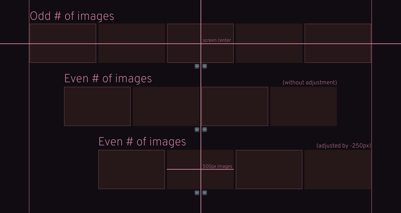
By using half the width of an image for adjustment, we can ensure that the active image remains centered on the screen, regardless of the number of images present. Next, we have the anchor that wraps the entire image along with its caption.
For this, we need to set its position to relative and its overflow to hidden, as we'll be positioning the CTA and the caption absolutely within this element.
.carousel a {
    position: relative;
    overflow: hidden;
    display: block;
}This will ensure that whenever the CTA and the caption overflow the image, it'll not be visible. As we navigate through the carousel, we want the CTA and the caption to smoothly slide and fade in from the bottom. To achieve this, add the following code to your CSS file:
.carousel .meta {
    position: absolute;
    display: flex;
    align-items: center;
    gap: 10px;
    bottom: 20px;
    left: 20px;
    font-weight: bold;
    transition: all .6s cubic-bezier(0.4, 0.0, 0.2, 1);
    transform: translateY(75px);
    opacity: 0;
}

.carousel ul li.active .meta {
    transform: translateY(0);
    opacity: 1;
}

.carousel .cta {
    background: #FFF;
    padding: 10px 15px;
    display: inline-block;
    color: #222;
    border-radius: 5px;
}

.carousel .caption {
    color: #FFF;
    text-shadow: 0 0 5px #000;
}The important parts are highlighted. Initially, the .meta element is offset by 75px and has an opacity of 0, placing it outside of the visible image area. Because we have overflow: hidden set on the anchor, it'll not be visible.
The image in the center will always have an .active class, which resets both the transform and opacity properties to their initial values. This brings the CTA and the caption back into view.
Adding State to the Carousel
Now that we have all the CSS details sorted out, let's dive back into coding the actual interactivity. We're going to need two useState hooks to keep track of the internal state of the carousel. Extend the Carousel component with the following lines of code:
import { useState } from 'react'

export const Carousel = ({ images }) => {
    const even = images.length % 2 === 0

    const [activeIndex, setActiveIndex] = useState(Math.floor(images.length / 2))
    const [transform, setTransform] = useState(even ? -250 : 0)

    return (
        <div className="carousel">
            <ul
                className={even ? 'even' : undefined}
                style={{ transform: `translateX(${transform}px)` }}
            >
                {images.map((image, index) =>
                    <li
                        key={index}
                        className={index === activeIndex ? 'active' : undefined}
                    >
                        <a href={image.url}>
                            <img
                                src={image.src}
                                alt={image.alt}
                            />
                            <div className="meta">
                                <span className="cta">Learn More</span>
                                <span className="caption">{image.caption}</span>
                            </div>
                        </a>
                    </li>
                )}
            </ul>
            <div className="arrows">
                <span
                    className={activeIndex == 0 ? 'left disabled' : 'left'}
                />
                <span
                    className={activeIndex == images.length - 1 ? 'right disabled' : 'right'}
                />
            </div>
        </div>
    )
}Let's go through the changes to see what has been added:
- Line 4: We can use the remainder (modulo) operator on
images.lengthto calculate if there's an even number of images. This is used for center-aligning the images, adjusting their alignment based on the number present in the carousel. - Line 6: We need to store the index of the currently active image to apply corresponding styles. The initial index will consistently be the midpoint of the array, which we can get using
images.length / 2. - Line 7: We also need a state variable for tracking the transformation amount. If the number of images is even, we want this value to be adjusted to -250 (half the width of an image); otherwise, it'll be 0.
- Lines 12-13: Both the
evenandtransformvariables can be used to apply specific CSS styles to our carousel. - Lines 33-40: Additionally, we need two navigation arrows that we can use for traversing the carousel. Based on the
activeIndexstate, we can apply a.disabledclass to the icon, indicating that no more items are available in that particular direction.
Styling the Navigation
To style the navigation, we'll need to add some additional CSS to our styles file. For creating arrows in CSS, include the following rules:
.carousel .arrows {
    display: flex;
    justify-content: center;
    gap: 50px;
    margin-top: 20px;
    user-select: none;
}

.carousel .arrows span {
    cursor: pointer;
    border: solid #FFF;
    border-width: 0 4px 4px 0;
    display: inline-block;
    padding: 4px;
}

.carousel .arrows span.disabled {
    border-color: #555;
    cursor: default;
}

.carousel .arrows .left {
    transform: rotate(135deg);
}

.carousel .arrows .right {
    transform: rotate(-45deg);
}Here, you'll want to set user-select to none, and cursor to pointer to ensure that the arrows are unselectable while displaying a pointer cursor, indicating interactivity.
To create arrows in CSS, apply styling to only the bottom and right borders, and introduce a rotation effect. Take a look at how they appear both without and with transformations applied:
Adding the Navigation Functionality
Now, there's one final step remaining: adding the navigation functionality. To achieve this, we need to introduce a new function. Extend the Carousel component with the following function before the return statement:
const slide = direction => {
    if (direction === 'left' && activeIndex !== 0) {
        setActiveIndex(activeIndex - 1)
        setTransform(transform + 520)
    }

    if (direction === 'right' && activeIndex !== images.length - 1) {
        setActiveIndex(activeIndex + 1)
        setTransform(transform - 520)
    }
}This function is responsible for sliding the carousel in both directions. The direction parameter can take values of either "left" or "right". Regardless of the direction, we need to update both states:
- Increment or decrement the
activeIndexcount by one, based on the direction. - Update the transform of the carousel by +/-520 (accounting for a 20px gap between images).
Ensure you validate activeIndex against 0 and images.length to prevent navigation beyond the available number of images.
This function needs to be called when interacting with the arrows. Add the highlighted parts to Carousel.jsx:
<div className="arrows">
    <span
        className={activeIndex == 0 ? 'left disabled' : 'left'}
        onClick={() => slide('left')}
    />
    <span
        className={activeIndex == images.length - 1 ? 'right disabled' : 'right'}
        onClick={() => slide('right')}
    />
</div>In essence, our carousel is now fully functional. However, let's also improve the accessibility by enabling users to navigate by clicking on the surrounding images. Add another click event to the li that calls another function with the index of the image:
<li onClick={(event) => slideByImage(event, index)}>Make sure you pass the event along, as it's required inside the function. The slideByImage function only needs to internally call the slide function with the appropriate value:
const slideByImage = (event, index) => {
    if (index !== activeIndex) {
        event.preventDefault()
        slide(index < activeIndex ? 'left' : 'right')
    }
}If the index doesn't match activeIndex, it signifies that we've clicked on a neighboring image rather than the focused image. In this case, we need to include event.preventDefault to prevent triggering the default browser action (navigating to the anchor URL).
Based on whether the index is less or greater than activeIndex, we can determine whether to call the slide function with a "left" or "right" value.
Remove adsSummary
Congratulations! You've just completed the creation of your very first CSS-animated carousel in React! Interested in elevating this project even further? Here are some ideas to enhance the configurability of this carousel:
- Introduce infinite scrolling
- Allow navigation through swipes and keyboard interactions
- Display dots instead of arrows for navigation
Are you looking for more React projects? Check out our React projects roadmap, a comprehensive guide that offers inspiration on what to build next and how to approach it. Thank you for reading through, happy coding! 🎠


Rocket Launch Your Career
Speed up your learning progress with our mentorship program. Join as a mentee to unlock the full potential of Webtips and get a personalized learning experience by experts to master the following frontend technologies:
Courses


Recommended
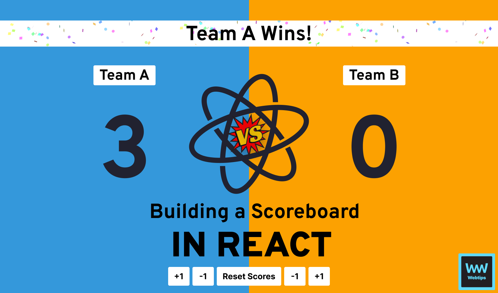
How to Build a Dynamic Scoreboard with React
20 min read
How to Wait for a Function to Finish in JavaScript
7 min read
How to Format Pages for Print in CSS
6 min read