
10 Best Practices for Quickly Improving Your CSS
 2021 11 November •
  13 min read
CSS may seem like a pretty straightforward language, one that’s hard to make mistakes in. You just add your rules to style your website and you’re done, right? With small sites that require only a couple of CSS files, this might be the case. But in large applications, styles can quickly spiral out of control. How do you keep them manageable?
The reality is that, just as with any other language, CSS has its own nuances that can make or break your design. Here are 10 tips for CSS — best practices that can help you bring out the best from your styles.

1. Do You Really Need a Framework?
First of all, decide whether you really need to use a CSS framework. There are now many lightweight alternatives to robust frameworks. Usually, you won’t be using every selector from a framework, so your bundle will contain dead code.
If you’re only using styles for buttons, outsource them to your own CSS file and get rid of the rest. Also, you can identify unused CSS rules using code coverage in DevTools.
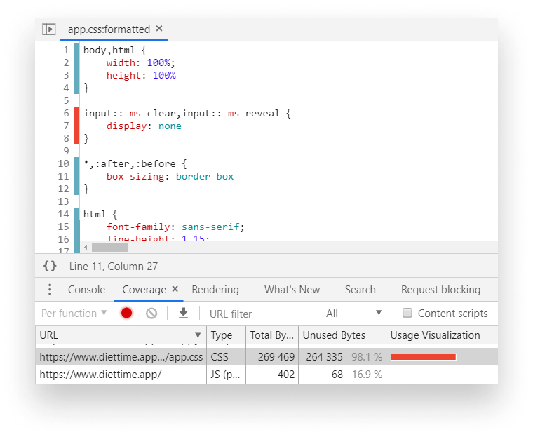
To open it, search for Coverage in the Tools panel. You can open the Tools panel by clicking Ctrl + Shift + P. Once open, start recording by clicking on the reload icon. Everything shown in red is unused.
You can see that in the example above, it says that 98% of the CSS is not used. Note that this is not actually true — some CSS styles are only applied after the user interacts with the site. Styles for mobile devices are also flagged as unused bytes. So before you remove everything, make sure you verify that it is indeed not used anywhere.
2. Prefer Using a CSS Methodology
Consider using a CSS methodology for your project. You can use CSS methodologies to create consistency in your CSS files. They help in scaling and maintaining your projects. Here are some popular CSS methodologies that I can recommend.
BEM
BEM —Block, Element, Modifier — is one of the most popular CSS methodologies out there. It’s a collection of naming conventions you can use to easily craft reusable components. The naming conventions follow this pattern:
.block { ... }
.block__element { ... }
.block--modifier { ... }.block: Blocks represent a component. They’re standalone entities and are meaningful on their own..block__element: These are parts of a.block. They have no standalone meaning and must be tied to a block..block--modifier: These are used as flags on blocks or elements. We can use them to change the appearance, behavior, or state of elements. For example, to use a hidden flag, we could say.block--hidden.
ITCSS
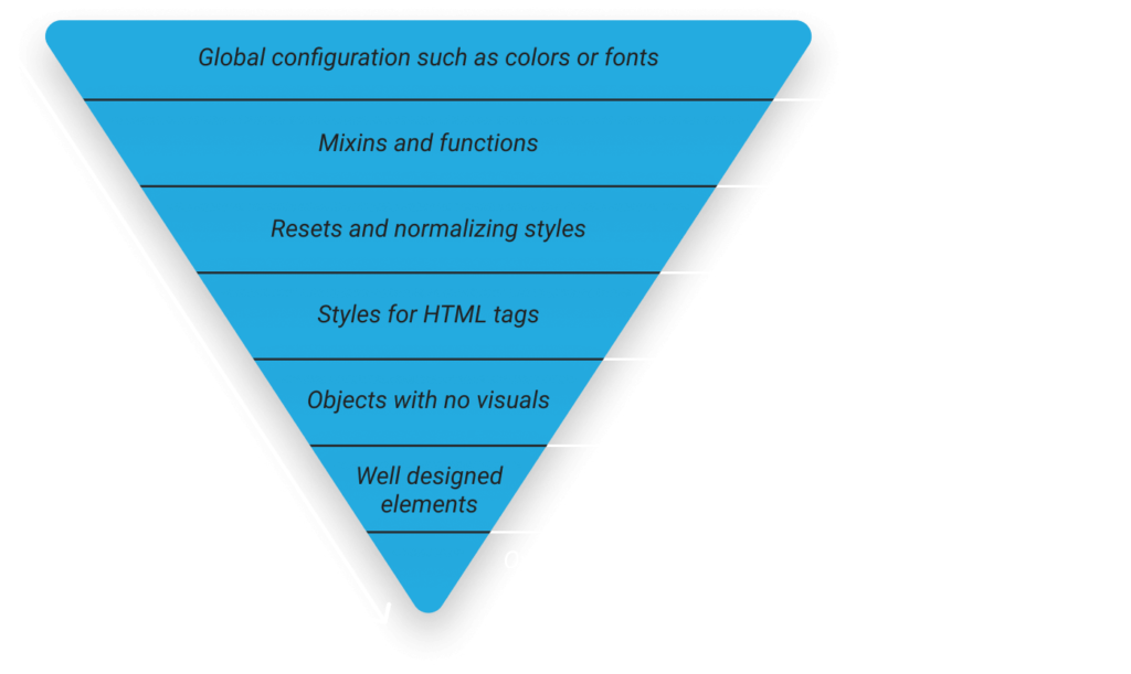
Inverted Triangle CSS helps you better organize your files by introducing different layers to different specificities. The deeper you go, the more specific.
OOCSS
Object-oriented CSS, or OOCSS, has two main principles.
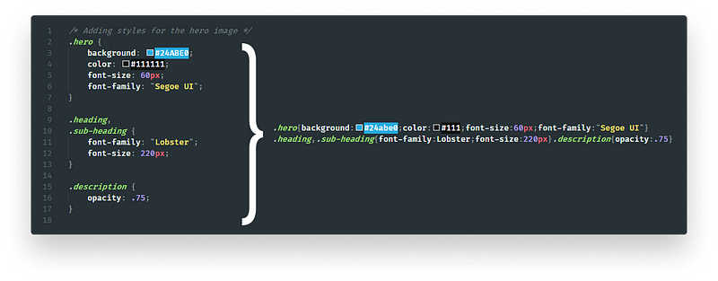
Separating structure and skin
This means you want to define visuals separately from structural code. What does this mean in practice?
/* Instead of  */
.box {
    width: 250px;
    height: 250px;
    padding: 10px;
    border: 1px solid #CCC;
    box-shadow: 1px 2px 5px #CCC;
    border-radius: 5px;
}

/* Do */
.box {
    width: 250px;
    height: 250px;
    padding: 10px;
}

.elevated {
    border: 1px solid #CCC;
    box-shadow: 1px 2px 5px #CCC;
    border-radius: 5px;
}2. Separating container and content
This means you don’t want any element to depend on its location. The same elements should look the same regardless of where they are on the page.
/* Instead */
.main span.breadcumb { ... }

/* Do */
.breadcrumb { ... }
 Remove ads
3. Set Up a Pre-Processor
Setting up a pre-processor can benefit you in various ways. A pre-processor is a tool that lets you use advanced features that don’t exist in CSS. These can be things like variables for loops, or even functions.
There are plenty of pre-processors out there. Probably the most famous three are Sass, Less, and Stylus. I recommend using Sass because of it’s thriving community and the extensive documentation you can find for it on the web.
So, how can pre-processors help you?
Organize your styles better
Pre-processors help you organize your styles better. They have the ability to break down your files into smaller, reusable pieces. You can import them into each other, or later separately into your application.
// Import different modules into one SCSS file
@import 'settings';
@import 'tools';
@import 'generic';
@import 'elements';
@import 'objects';
@import 'components';
@import 'trumps';Nest your selectors
Another great way to enhance readability is by nesting your selectors. This is a simple, powerful feature that CSS lacks.
.wrapper {
    .sidebar {
        &.collapsed {
            display: none;
        }

        .list {
            .list-item {
                ...

                &.list-item--active {
                    ...
                }
            }
        }
    }
}The hierarchical structure makes it easier to visualize how different elements tie together.
Automatically vendor prefix your rules
Some nonstandard or experimental features are prefixed in CSS. Different browsers use different prefixes for them, such as:
-webkit-: used for WebKit based browsers such as Chrome, Safari, or newer versions of Opera.-moz-: for Firefox.-o-: is for older versions of Opera.-ms-: for IE and Edge.
To support all major browsers, we have to define certain properties multiple times.
.gradient {
    background: rgb(30,87,153);
    background: -moz-linear-gradient(top, rgba(30,87,153,1) 0%, rgba(41,137,216,1) 50%, rgba(32,124,202,1) 51%, rgba(125,185,232,1) 100%);
    background: -webkit-linear-gradient(top, rgba(30,87,153,1) 0%, rgba(41,137,216,1) 50%, rgba(32,124,202,1) 51%, rgba(125,185,232,1) 100%);
    background: linear-gradient(to bottom, rgba(30,87,153,1) 0%, rgba(41,137,216,1) 50%, rgba(32,124,202,1) 51%, rgba(125,185,232,1) 100%);
    filter: progid:DXImageTransform.Microsoft.gradient(startColorstr='#1e5799', endColorstr='#7db9e8', GradientType=0);
}Pre-processors help us tackle this with mixins — functions that can be used in place of hard-coded values.
@mixin gradient() {
    background: rgb(30,87,153);
    background: -moz-linear-gradient(top, rgba(30,87,153,1) 0%, rgba(41,137,216,1) 50%, rgba(32,124,202,1) 51%, rgba(125,185,232,1) 100%);
    background: -webkit-linear-gradient(top, rgba(30,87,153,1) 0%, rgba(41,137,216,1) 50%,rgba(32,124,202,1) 51%, rgba(125,185,232,1) 100%);
    background: linear-gradient(to bottom, rgba(30,87,153,1) 0%, rgba(41,137,216,1) 50%,rgba(32,124,202,1) 51%, rgba(125,185,232,1) 100%);
    filter: progid:DXImageTransform.Microsoft.gradient(startColorstr='#1e5799', endColorstr='#7db9e8', GradientType=0);
}

.gradient {
    @include gradient();
}Instead of writing out the same thing over and over again, you can just include mixins whenever you need them.
Using post-processors
An even better option is a post-processor. A post-processor can run additional optimization steps once your CSS is generated by a pre-processor. One of the most popular post-processors is PostCSS.
You can use PostCSS to automatically prefix your CSS rules, so you don’t have to worry about leaving out major browsers. They use values from Can I Use, so it’s always up to date.
Another great post-processor is autoprefixer. With autoprefixer, when you want to support the last four versions — you’re all done without having to write any vendor prefixes in your CSS files!
const autoprefixer = require('autoprefixer')({
    browsers: [
	'last 4 versions',
	'not ie < 9'
    ]
});Use configs for consistent designs
Apart from mixins, you also have the option to use variables. In conjunction with a linter, you can enforce design rules.
// Font definitions
$font-12: 12px;
$font-21: 21px;

// Color definitions
$color-white: #FAFAFA;
$color-black: #212121;4. Use Markup Instead of CSS
Now let’s move on to actual CSS. This is often overlooked. Usually, you can reduce the size of your CSS bundles by simply using the correct HTML elements. Say you have a heading with the following set of rules:
span.heading {
    display: block;
    font-size: 1.2em;
    margin-top: 1em;
    margin-bottom: 1em;
}You’re using a span element as a header. You override the default display, spacing or font style. This can be avoided by using an h1, h2, or h3 instead. By default, they have the styles you’re trying to achieve with other elements. You can immediately get rid of four unnecessary rules.
5. Use Shorthand Properties
To further reduce the number of rules, always try to go with shorthand properties. For the above example, we could have said:
.heading {
    margin: 1em 0;
}This is true for other properties such as paddings, borders, or backgrounds.
6. Reduce Redundancy
This goes hand in hand with the previous point. Sometimes it’s hard to spot redundancy, especially when repeating rules don’t follow the same order in both selectors. But if your classes differ in just one or two rules, it’s better to outsource those rules and use them as an extra class. Instead of this:
<style>
    .warning {
        width: 100%;
        height: 50px;
        background: yellow;
        border-radius: 5px;
    }

    .elevated-warning {
        width: 100%;
        height: 50px;
        font-size: 150%;
        background: yellow;
        box-shadow: 1px 2px 5px #CCC;
        border-radius: 5px;
    }
</style>

<div class="warning">⚠️</div>
<div class="elevated-warning">🚨</div>Try to go with a similar approach:
<style>
    .warning {
        width: 100%;
        height: 50px;
        background: yellow;
        border-radius: 5px;
    }

    .warning--elevated {
        font-size: 150%;
        box-shadow: 1px 2px 5px #CCC;
    }
</style>

<div class="warning">⚠️</div>
<div class="warning warning--elevated">🚨</div>7. Avoid Complex Selectors
There are two major problems with using complex selectors. First, your increased specificity will not only make it harder to later rewrite existing rules, but also increase the time it takes for the browser to match selectors.
Matching selectors
When your browser is trying to interpret selectors and decide which element it matches, they go from right to left. This is faster in terms of performance than doing the other way around. Let’s take the selector below as an example.
.deeply .nested .selector span {
    ...
}Your browser will first start from the span. It will match all the span tags then go to the next one. It will filter out the spans that are inside a .selector class, and so on.
I don't recommend to use tags for CSS selectors because it will match for every tag. While the difference can only be measured in a fraction of a millisecond, little things add up. More importantly, it’s good practice to reduce complexity for another reason.
Understanding the selector
It’s not only hard for machines to parse, but it’s also hard for humans to do so. Take the following as an example:
[type="checkbox"]:checked + [class$="-confirmation"]::after {
    ...
}When do you think the rule above will be applied? This can be simplified by making a custom class and switching it with JavaScript.
.confirmation-icon::after {
    ...
}Now it looks much more pleasant. If you still find yourself in need of an overly complicated selector and you believe you have no other option, please leave a comment below explaining your solution.
/**
 * Creates a confirmation icon after a checkbox is selected.
 * Select all labels ending with a class name of "-confirmation"
 * that are preceded by a checked checkbox.
 * PS.: There's no other way to get around this, don't try to fix it.
 **/
.checkbox:checked + label[class$="-confirmation"]::after {
    ...
}8. Don’t Remove Outlines
This is one of the most common mistakes developers make when writing CSS. While you may think there’s nothing wrong about removing the highlight that outlines create, in fact, you’re making the site inaccessible. It’s common practice to add this rule as a reset to your CSS.
:focus {
    outline: none;
}This way, however, users with only keyboard navigation will have no clue about what they’re focusing on your site.
If the default styling looks bad for your brand, create custom outlines. Just make sure there is some kind of indication when it comes to focusing elements.
9. Use Mobile First
When you have to deal with media queries, always use mobile-first. The mobile-first approach means you start writing CSS for small screen devices first and build from there. This is also called progressive enhancement.
This will ensure that you mostly add extra rules to cater for large screen devices, rather than rewriting existing CSS rules. This can reduce the number of rules you end up with.
How can you tell if you use mobile-first? If your media queries use min-width, you’re on the right track.
/* Mobile-first media query, everything above 600px will get the below styles */
@media (min-width: 600px) {
    /* your CSS rules */
}

/* Non mobile-first media query, everything below 600px will get the below styles */
@media (max-width: 600px) {
    /* your CSS rules */
}10. Compress
Lastly, compress your bundles to reduce their size. Compression removes comments and whitespaces so your bundles require less bandwidth to fetch.
If you haven’t already, enable compression on the server-side as well.
Another great way to further reduce the size of your CSS — and markup— is obfuscating class names.
To achieve this, you have a couple of options based on your project setup:
- Webpack: for Webpack, you can use the
css-loadermodule. - Gulp: for Gulp, you can use the
gulp-minify-cssnamesplugin. - Create your own: If you don’t have a dedicated package for your project setup, I have a tutorial that shows you how you can create your own implementation.
Remove adsSummary
Following these 10 simple steps will help you to write CSS files that are:
- more lightweight
- easier to maintain
- easier to scale
Not only that, but using utilities such as a predefined color palette or typography rules, will help you create more consistent designs. Your styles will also be more reusable, so you can save time on your next project.
What are some other CSS best practices you follow but were not mentioned in this article? Let us know in the comments!
Thank you for reading through, happy styling!


Rocket Launch Your Career
Speed up your learning progress with our mentorship program. Join as a mentee to unlock the full potential of Webtips and get a personalized learning experience by experts to master the following frontend technologies:
Courses

CSS - The Complete Guide (including Flexbox, Grid and Sass)

The HTML & CSS Bootcamp

The Creative HTML5 & CSS3 Course
Recommended

How to Master the Proxy API in JavaScript
2021 11 November • 11 min readHow to Connect CircleCI With Netlify
2021 11 November • 7 min read
How to Create Native Drag and Drop Functionality in JavaScript
2021 11 November • 7 min read