10 Accessibility Best Practices
When it comes to web optimization, accessibility is one of those topics nobody wants to talk about, but everybody should. Of course, it’s important to mention that accessibility will not always be your top priority, depending on the project. Still, high-traffic websites that are used by countless people need to have a strategy for making content accessible.
According to the World Health Organization (WHO), 15% of the world’s population lives with some kind of disability. That is over 1 billion people who can potentially have issues accessing and using your website.
The types of disabilities you need to think about
When it comes to improving accessibility, you need to think about the following disabilities:
- Visual impairments, for example, partial or complete blindness
- Motor or mobility issues, such as Parkinson’s disease, difficulty or inability to use hands
- Auditory impairments such as loss of hearing or deafness
- Prone to seizures caused by visual strobes or flashing lights
- Cognitive disabilities
With that in mind, let’s see what are the 10 best practices to improve your site’s accessibility for all of the above.
#1: Use of Semantic HTML
The issue:
Starting from HTML, one of the most common things is the lack of semantic HTML. Semantic elements are used to clearly describe the meaning of elements. Non-semantic elements such as div or span tells nothing about their content. Screen readers and assistive devices have a hard time finding out what your content is about when HTML is not descriptive.
The solution:
Use semantic HTML elements that define its content, such as header, nav, main, article, aside, or footer. Screen readers not only turn text into speech but also use information from HTML elements. By providing them with extra semantics, you make their job easier as they have a clear structure they can follow.
#2: Use Alternate Text
The issue:
Staying with HTML, another common issue is leaving out alternate text for non-text elements, such as images. These elements only provide visual clues that are hard or can’t be interpreted by users with visual impairments.
The solution:
Always provide alternate text for informational elements. An exception from this is decorative elements that are purely used for decoration purposes and don’t provide any additional information. This can be things like icons supplementing links, or background images. Using alternate text for these elements can be even disruptive. Imagine you have a link called “Airports” with an icon before it that has a plane on it. Defining “Airports” as an alternate text for the icon would make screen readers read out “Airports” twice, which only increases noise and brings confusion. In such cases, use an empty alt tag. For other cases, use the alt tag for img elements to specify what can be seen on an image. These will be read out loud by a screen reader.
#3: Use of aria Attributes
The issue:
Even with semantic HTML and alternate text for visual elements, HTML can still lack meaning. Roles or the state of different elements on the page can not be determined from HTML alone, which makes it hard for disabled people to interpret content.
The solution:
Make use of aria attributes to provide additional information to assistive technologies where appropriate. For example,
- use
roleattributes where a role for the element is unclear. - use properties to give extra meaning or semantic to elements, eg.:
aria-labelledby. - use states to define the state of an element, eg.: use
aria-disabled="true"to tell assistive technologies that an element is disabled.
In the previous point, we also discussed the use of decorative elements. If you need to keep decorative elements completely hidden from screen readers, you can use the aria-hidden="true" attribute on HTML elements.
#4: Ease of Navigation
The issue:
Without proper tab indexes, users without a mouse may have a hard time navigating your website. Elements may not get focus in order, or they may not get focus at all, which makes them non-interactive for users with only keyboard navigation.
The solution:
Use the global tabindex attribute to provide focus to elements where appropriate. For elements that should not be reachable via keyboard navigation, you can use tabindex="-1". Also, make sure you have outline set for interactive elements. Do not remove it through CSS, otherwise, users won’t be able to see which element is currently in focus.
#5: Properly Size Touch Targets
The issue:
Navigation for mobile is another sensitive topic. Small touch targets for small screen devices make it hard to navigate a site with ease, and interact with elements without misclicking.

The solution:
Make interactive elements such as buttons and links large enough — at least 48x48px — with enough spacing around them (minimum 8px) to make them easily tappable without clicking on other elements.
#6: Site is Usable at 200% Zoom
The issue:
Users with vision deficiencies need larger text to be able to consume content without issues. Therefore content should be scaled up to 200% without the loss of functionality. This means text needs to reflow well, and it should not be cut off. The layout should remain mostly the same, and functionality should not suffer.
The solution:
Make sure your site can be scaled up to twice its normal size without text overflowing or breaking the layout to let users with visual disabilities better see the content.
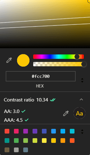
#7: Sufficient Color Contrast
The issue:
Users with bad vision have a hard time differentiating background from text with low color contrast.
The solution:
The minimum recommended contrast ratio by ISO-9241-1 is 3:1. If you aim for level AA, you need to provide at least 4.5:1 constant ratio, and for level AAA, the acceptable constant ratio is 7:1. To test contrast ratios for your website, you can use online tools such as contrast-ratio.com or extensions such as Axe by deque. You can also see directly if the contrast ratio is sufficient for your elements through Chrome’s DevTools color picker.
#8: Don’t Rely 100% on Color
The issue:
Color blindness affects approximately 1 in 12 men and 1 in 200 women worldwide. While using color can be an efficient way to communicate purpose — like using red for errors or green for success messages — elements that rely 100% on color only don’t do that for users with color blindness.
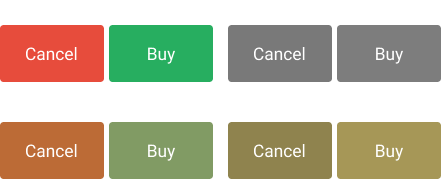
The solution:
Make sure you convey information for these elements in other ways, either by using shapes, images, or icons, or additional elements that are visually hidden but can be picked up by screen readers.
#9: Optimize Dynamic Content
The issue:
Dynamic content such as modals, slideshows, or carousels needs extra HTML elements to make them work properly. Screen readers and other assistive technologies can’t do much with those extra elements.
The solution:
Make sure that dynamic content is easily consumable by people with all kinds of disabilities. For example:
- Audio and video content should be captioned and transcribed to cater to people with loss of hearing or deafness. Do not autoplay videos as soon as the page loads.
- Sideshow and carousel images must be captioned as well and they should be navigable by keyboards.
- Make sure you avoid using flashing elements or visual strobes to avoid risking the lives of people with disorders, such as epilepsy.
#10: Accessible Errors
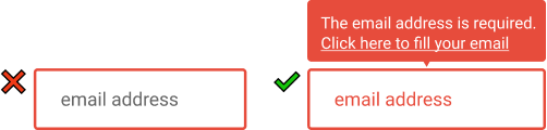
The issue:
Errors are also an example of dynamic content. It is not uncommon for users to get errors when filling out forms. Errors without labels and solutions on how to fix them, don’t provide a clear way for users on what went wrong.
The solution:
When dealing with error messages, make sure that besides color, you also provide:
- A clear message about what caused the error, and a solution on how to fix it
- A link navigating to the input that caused the error
- Visually differentiate invalid inputs
- Each error should have a specific message associated with them
Summary
If you address these 10 common accessibility issues on your site, you ensure that your content on it is consumable by the widest possible audience.
Do you have experience with improving web accessibility? Let us know in the comments below, which issues have you seen the most. Thank you for reading through, happy optimization! 📈

Rocket Launch Your Career
Speed up your learning progress with our mentorship program. Join as a mentee to unlock the full potential of Webtips and get a personalized learning experience by experts to master the following frontend technologies:
Courses

Recommended
![Why +(!![]+!![]+!![]+!![]+[!![]+!![]]) yields 42?](/assets/img/content/2021/02/understanding-type-conversion-in-javascript-1024x602.png)
Why +(!![]+!![]+!![]+!![]+[!![]+!![]]) yields 42?
How to Make Pixel Art With Box Shadows